The One with American Crafts June 2014 Layouts


Monday, June 30, 2014

Nothing like last minute to complete my monthly American Crafts layouts! They're due on the last day of the month - TODAY!
 photo SweetiePie.jpg
SWEETIE PIE by Paige Evans

DESCRIPTION: I actually made a completely different layout, but I did not like the way it turned out. It happens! Instead of sharing something I wasn't in love with, I started over. I had cut five different backgrounds this afternoon, including this rose design from watercolored paper that was another mishap from a couple months ago because I put blue before green instead of roygbv! But I held onto it so really, this layout is just one big happy accident! I was running out of light to photograph my layouts today in order to turn them in by the last day of the month, so I threw things on the page in a matter of minutes and I can honestly say this is one of my faves recently :) Love when that happens!

JOURNALING SAYS: I love taking pictures of you in your pretty church dresses. You're so darling!

HOW TO: Watercolor diagonal stripes in a rainbow across white cardstock and let it dry. Die cut the Violets Lace from the watercolored cardstock then staple it to a white cardstock layout. Adhere three photos across the middle then have fun layering embellishments all around, placing like-colors on like-colors of the painted background. Stamp the date and journal on a chipboard pennant and journaling spot sticker. 

SUPPLIES: Cardstock, wooden buttons, dimensional flower, dimensional tag sticker, enamel dots, pen, roller date stamp, adhesive, stapler: American Crafts; Die cuts: American Crafts (balloon, "moments"), Crate Paper (arrow, bows, flower, hearts); Badge, chipboard (dimensional arrow, hearts, pennant), journaling spot sticker: Crate Paper; Wood veneer: American Crafts (feather), Crate Paper ("sweetie pie"); Watercolors: Studio Calico; Die cut machine: Silhouette Cameo by QuicKutz; Rose background cut file: Violets Lace by American Crafts Design ID #22872
 photo SweetiePieDetail.jpg

*********************************************************************************

 photo DayTriptoBamberg.jpg
DAY TRIP TO BAMBERG by Paige Evans

DESCRIPTION: This was actually supposed to be my next Garden Girl layout for twopeasinabucket.com. As soon as I finished I found out 2Peas is closing. My heart is broken. So instead of it appearing there, I'm using it as my other American Crafts layout since it uses Crate Paper supplies and AC owns CP. Oh how I wish it was a Garden Girl layout though. Long live scrapbooking. I will forever remember 2Peas! I have a post all about my love for 2Peas for Wednesday.

JOURNALING SAYS: We had such a wonderful day exploring the historic town of Bamberg! So much to see and do and we loved it!

HOW TO: Punch hearts from patterned paper, trim them in half, then layer them down a cream cardstock layout base. Replace some of the hearts with small photos. Zigzag stitch down each heart. Embellish some of the hearts with a button. Create a title with chipboard and mini alpha stickers across the bottom and journal on either side. Stamp the date at the bottom. Drop light gray spray mist over the layout to finish.

SUPPLIES: Cardstock, pen, date stamp, heart punch, ink: American Crafts; Patterned paper, stickers (chevrons, mini alpha), chipboard ("Day Trip", letters), dimensional arrow die cut, bottle cap die cut: Crate Paper; Buttons, spray mist: Studio Calico; Sewing machine: Brother; Thread: Coats & Clark
 photo DayTriptoBambergDetail.jpg
Thanks for stopping by, means the world to me :)

The One with the Paper Heart Headband Tutorial


Sunday, June 29, 2014

I have a fun li'l tutorial to share today: a paper heart headband using supplies from the Studio Calico Camelot kits!
 photo DSC_0051.jpg
First, gather your supplies. You'll need patterned paper, a heart punch (this is a 1.5" heart punch from American Crafts), yellow ribbon, scissors, sewing machine with thread, and a hot glue gun.
 photo DSC_0020.jpg
Punch three hearts from each patterned paper. The finished headband looks best if the papers are double-sided.
 photo DSC_0022.jpg
Gather the hearts into their piles of three then straight stitch each stack together, one right after another.
 photo DSC_0030.jpg
Here's what your headband should look like at this point. Don't worry if the gaps between each heart are uneven, you can fix the spacing when hot gluing.
 photo DSC_0034.jpg
Bend up each heart to create dimension. 
 photo DSC_0039.jpg
Hot glue ribbon to the back of the hearts, leaving about 4" at each end for tying. 
 photo DSC_0099.jpg
This is what the back looks like. 
 photo DSC_0101.jpg
Show off your creation on the world's cutest model :)
 photo DSC_0049.jpg
You could coordinate the papers to match with a variety of events. 
 photo heartheadband2.jpg
Such as weddings, Easter, Christmas, birthday parties, favorite outfits, Valentine's Day, and more!
 photo heartheadband.jpg
You could even try using a different shaped punch like a flower, star, circle, diamond, hexagon, and more!
 photo heartheadband3.jpg
Granted this didn't last on her head longer than 15 seconds, but maybe someday she'll like wearing headbands again like when she was an infant. 
 photo DSC_0074.jpg
Cute accessory and made with supplies on hand!
 photo DSC_00623.jpg
So easy, so cute, so fun!

The One with Studio Calico PENNY ARCADE Layouts!


Friday, June 27, 2014

The PENNY ARCADE kits are now available at Studio Calico!

I had tons of fun making my layouts for this month - four of the five with the help of my Silhouette Cameo - also known as my best (non-human) friend :) (PS - I copied and pasted this sentence from last month because it's true again this month!!!)
 photo HelloGrumpyFriendbyPaigeEvans.jpg
HELLO GRUMPY FRIEND by Paige Evans

DESCRIPTION: Kim Stewart designed some of her signature flowers and now they're available for everyone as Flower cut files!
In true Paige fashion :) I die cut one extra large from white cardstock and backed it with the patterned papers from the PENNY ARCADE main kit.

JOURNALING SAYS: Is it too much to ask to take some pictures of you in your pretty little Easter dress?! Sometimes you can give the meanest evil death stare it's so funny!

HOW TO: Die cut one of the Flower cuts by Kim Stewart at about 11" from white cardstock then back each section with pink, yellow, green, and aqua patterned papers from the PENNY ARCADE main kit. Sew spirals over the flower centers. Layer the three doilies from the PENNY ARCADE main kit onto the kraft cardstock (flip the gold doily over so the white side is showing) then adhere the finished flower cut on top with foam dots. Place a photo on one of the doilies. Add the wood veneer letters from the PENNY ARCADE main kit in a curve around the top flower. Die cut the "hello friend" from the Penny Arcade Churros Digital Stamps from white cardstock and curve the words around the flowers to finish the title. Use a white pen to journal in curved rows on the bottom right then stamp the date below.

SUPPLIES: Scrapbook kit: PENNY ARCADE by Studio Calico; Cardstock, adhesive: American Crafts; Die cut machine: Silhouette Cameo by QuicKutzFlower cut file: Kim Stewart for Studio Calico; Hello Friend cut file: Penny Arcade Churros Digital Stamp by Studio Calico; Sewing machine: Brother; Thread: Coats & Clark; Roller date stamp: Kesi'ArtInk: StazOnWhite pen: Uniball Signo

*********************************************************************************

 photo 2014byPaigeEvans.jpg
2014 by Paige Evans

DESCRIPTION: We've been traveling. A lot. Like a lot a lot. So when I saw this world stamp by Amy Tangerine I just knew I had to turn it into a cut file and center a page around it using photos from our European travels.
This was my other PENNY ARCADE main kit only layout. I also used a bunch of printables by In a Creative Bubble, Labels by Hello Forever, and Printables by Hello Forever (all exclusively for the Penny Arcade Studio Calico kit!).

JOURNALING SAYS: Pretty darn lucky to be living our dream and traveling all over Europe for the next four years! So gosh darn happy!

HOW TO: Turn the turn the world from the Penny Arcade Scrapbook Kit Stamps by Amy Tangerine into a cut file, die cut it from the blue cardstock in the PENNY ARCADE main kit, then back the die cut with the globe paper from the PENNY ARCADE main kit. Place wood veneer numbers from the PENNY ARCADE main kit for the year inside the die cut. Print and cut the printables by In a Creative BubbleLabels by Hello Forever, and Printables by Hello Forever and layer them across the top and bottom edge of the layout topped with photos, more printables, and the metal circles from the PENNY ARCADE main kit. Type the location of each picture on a vintage typewriter then add them to the photos. Journal on one of the printables.

SUPPLIES: Scrapbook kit: PENNY ARCADE by Studio Calico; Cardstock, adhesive: American Crafts; Die cut machine: Silhouette Cameo by QuicKutzWorld cut file: Penny Arcade Scrapbook Kit Stamps by Amy Tangerine for Studio Calico; Printables: In a Creative Bubble for Studio CalicoLabels: Hello Forever for Studio CalicoPrintables: Hello Forever for Studio Calico; Typewriter: Smith Corona; .03 Black Precision Pen: American Crafts

*********************************************************************************

 photo TheGoodLifebyPaigeEvans.jpg
THE GOOD LIFE by Paige Evans

DESCRIPTION: For this layout I used the SKEEBALL add on plus a light gray cardstock background. So dang happy to have the opportunity to design cut files once again this month for Studio Calico! I designed these Word Cloud cut files and wanted to show how they can be used on a layout:
JOURNALING SAYS: We are so lucky and happy to live in Germany for the next three or four years! This is what we've always dreamed of doing! So thankful!

HOW TO: Die cut the Word Cloud cut files from white cardstock. Punch clouds from all the papers in the SKEEBALL add on, adhere them on scrap cardstock, set the cloud words on top, then trim around the clouds. Stitch the clouds to a light gray cardstock background. Glue a printable journaling card by In a Creative Bubble for Studio Calico at the bottom then layer a photo and watercolor die cut words from the SKEEBALL add on around the picture. Stamp the date below in black ink then stamp the sentiment from the SKEEBALL add on stamp set at the bottom. Sprinkle gems and apply gold star rub ons from the SKEEBALL add on below the clouds and drop Inky Black Mister Huey's spray mist around. Embellish with stickers, badges, and a banner as shown, all from the SKEEBALL add on.

*********************************************************************************

 photo FoxRocksbyPaigeEvans.jpg
FOX ROCKS by Paige Evans

DESCRIPTION: This layout is using mostly the FORTUNE TELLER add on and one of my favorite tools: a square punch!

JOURNALING SAYS: I'm so glad that you "know the drill" when it comes to me taking thousands of pictures every month: I tell you to go stand somewhere, you do, then automatically say, "Cheese!" Next step: get you to actually look at the camera! Love you!

HOW TO: Punch 2" squares from all the patterned papers in the FORTUNE TELLER add on, fold in opposite sides on each square, then stitch them in three rows across the woodgrain paper from the PENNY ARCADE main kit. Adhere two photos on the center and place the wood veneer star topped with wood veneer letters and stickers between the photo. Embellish with wood veneer asterisks, a camera paper clip, banner die cut trimmed in half, label, arrow, and star stickers, and more as shown. Drop white spray mist around the layout. Stitch paper tabs across the top and bottom and journal by them with a black pen. Stamp the date on tab stickers and place them on the top left and bottom right corners.

SUPPLIES: Scrapbook kits: PENNY ARCADE, FORTUNE TELLER, SKEEBALL, and SPUN SUGAR by Studio Calico; Adhesive, square punch: American Crafts; .03 Black Precision Pen: American Crafts; Sewing machine: Brother; Thread: Coats & Clark; Opaque White spray mist: Mister Huey's by Studio CalicoRoller date stamp: Kesi'ArtInk: StazOn

*********************************************************************************

 photo Oh2SweetbyPaigeEvans.jpg
OH 2 SWEET by Paige Evans

DESCRIPTION: I like creating a layout using ALL of the scrapbooking kits for the month: PENNY ARCADEFORTUNE TELLERSKEEBALL, and SPUN SUGAR and I wanted to feature the other cut file that I designed for July exclusively for Studio Calico, a butterfly background:
JOURNALING SAYS: It is just too cute watching you give Daddy hugs and especially kisses!

HOW TO: Die cut the 12x12 Butterfly Background from white cardstock then trim away some of the butterflies from the edges leaving 7 complete rows of butterflies. Watercolor seven stripes down a white cardstock background, matching the slightly angled rows of butterflies, using the Mister Huey's Watercolor Set. Back some of the butterflies with colors of patterned paper that match the watercolor stripe they'll be placed over. Stitch the butterfly die cut in place. Layer the doily from the SPUN SUGAR add on (upside down) slightly off-center then add a trio of photos on top. Sprinkle three of the chipboard diamonds from the SPUN SUGAR add on around the photos and create clusters using matching-colored embellishments from all the kits. Journal on a printable label by Hello Forever and tuck it under the left photo. Adhere the woodgrain chipboard letter stickers by October Afternoon in the FORTUNE TELLER add on across the bottom of the photos to complete the layout.

SUPPLIES: Scrapbook kits: PENNY ARCADEFORTUNE TELLERSKEEBALL, and SPUN SUGAR by Studio Calico; Sewing machine: Brother; Thread: Coats & Clark; Watercolors: Mister Huey's Watercolor Set by Studio CalicoLabel: Hello Forever for Studio Calico03 Black Precision Pen: American Crafts

August 27th - the date of the next reveal - will be here in the blink of an eye!

The One with Studio Calico PENNY ARCADE Sneaks!


Thursday, June 26, 2014

It's so typical of me to say, but it just has to be said, HOW CAN IT BE THE END OF ANOTHER MONTH ALEADY?! Where do the days go? But then again, by the end of every day I'm completely and utterly exhausted. The days are like weeks and the weeks are like days. Time flies when you're having fun! Anyway, back to the topic at hand - PENNY ARCADE Studio Calico sneaks! At 12pm Eastern Time subscribers will have first dibs on all the new super awesome PENNY ARCADE kits and add ons

HELLO GRUMPY FRIEND - featuring the PENNY ARCADE main kit and one of the gorgeous Flower cuts by Kim Stewart.
 photo HelloGrumpyFriendDetailbyPaigeEvans.jpg
THE GOOD LIFE - using the SKEEBALL add on and the Cloud Words cut files I designed exclusively for Studio Calico for July!
 photo TheGoodLifeDetailbyPaigeEvans.jpg
FOX ROCKS - using mostly the FORTUNE TELLER add on and one of my favorite tools: a square punch!
 photo FoxRocksDetailbyPaigeEvans.jpg
OH 2 SWEET - using all four scrapbook kits: PENNY ARCADE, SKEEBALL, FORTUNE TELLER, and SPUN SUGAR plus the Butterfly Background cut file I designed exclusively for Studio Calico!
 photo Oh2SweetDetailbyPaigeEvans.jpg
The reveal happens in 12 hours from the time this post goes live! I'll be back then to share these layouts in full!

The One with Zürich, Switzerland


We packed up the car and headed home - with a stop in Zürich, Switzerland first!

Zürich is a transportation hub where people fly in or change trains and don't tend to give stopping a serious thought. But even though you won't find a hint of Swiss Miss in Switzerland's leading city - and with limited time I'd certainly spend it up in the picturesque mountains - Zürich is surprisingly comfortable and enjoyable for a visit! Zürich was founded by the Romans as a customs post. Roman Turicam eventually became Zürich. It gained city status in the 10th century and by the 19th century it was a leading European financial economic center. Today, thanks largely to Switzerland's long-term economic and political stability, Zürich is a major hub of international banking. Its 370,000 people (1 million in greater Zürich) are known for their wealth and hard work. Zürich is the only place in Switzerland where you'll see men in ties running in the streets, haha. 
We parked in a garage by the Swiss National Museum - which looks like a castle!
Rick says this is the best museum in town offering an essential introduction to Swiss history. We had a 6 hour drive home ahead of us so we skipped it. But we admired the architecture :)

Across from the Swiss National Museum is the train station.

This major European hub handles 2000 trains a day including InterCity expresses to many major capitals. Built in 1870, its vast main hall was once lined with tracks. Today it hosts a farmers' market on Wednesdays and community hall - busy with concerts, exhibitions, and even "beach" volleyball. 
We found the fat blue angel, Zürich's "Guardian Angel" protecting all travelers. The angel was placed here in 1997 to celebrate the 150th anniversary of the Swiss rail system. We think it's super out of place and weird lookin'. And HUGE!
The front of the station is a huge triumphal arch built in 1871 to symbolize the triumph of industry. In the Industrial Age, Zürich emerged as Switzerland's leading city. Presiding over all this triumph is Helvetia, the personification of Switzerland. The Helvetii were the Celtic tribe that the Romans defeated in 58 BC to gain control of what is now Switzerland. Romans described them as "very good warriors with an affinity for bright and shiny metal." Helvetia was adopted as a symbol of the Swiss confederation in 1848 when the diverse cantons that banded together to create Switzerland needed some symbol of unity to transcend all their linguistic and regional differences. Helvetic ethnic heritage is the one thing all Swiss cantons have in common. The statue of Alfred Escher honors the man who spearheaded the creation of the infrastructure that allowed Switzerland to function efficiently within its mountains and connected this country with the rest of Europe. Without Escher it's quite possible Switzerland would never have become such an economic powerhouse.
We started strolling down Bahnhofstrasse - the mile-long road lined with all the big-name shops.
The only park along this pedestrian and tram only boulevard is dedicated to Zürich's most important teacher, Johann Heinrich Pestalozzi (1746-1827) and is called Pestalozzi Park. He promoted the notion, still prevalent in today's Switzerland, that a good education should be available for everyone - not only for sons of rich families. Parks like this are rare in central Zürich because of sky-high property values which are among the most expensive in the world.
In the far corner of the park is a copy of a Parisian Wallace Fountain. Chris' head was too big to get a sip. More than 1200 fun and fresh fountains are sprinkled around town spouting water that's as good as bottled mineral water (the city regularly checks its quality). This is a blessing in a town where restaurants charge for a glass of tap water. 
Crossing Bahnhofstrasse and loving the ginormous city flag overhead.
We walked a couple blocks following signs to the Stadtpolizei - city police. 
We walked inside and I took a picture (which wasn't allowed, oops, but I honestly didn't see the tiny sign!) of the amazing wall and ceiling painting by Swiss artist Augusto Giacometti. 
Giacometti's famous Hall of the Flowers (Blüemlihalle, 1926), awash in vibrant orange and red, reflects the relief and joy the artist felt when WWI ended. Augusto's nephew, Alberto, is the more famous Giacometti, much appreciated for his tall, skinny statues.

We walked by a cute arts'n'crafts store (right up my alley!) with these pretty tissue flowers glued on sticks out front. 
Unique table setting at the same store. | Loving the city outline painted on this building. 
We crossed the street to the riverside then took some stairs along the river.
Zürich across the river. 
More scenic Limmat River views. 
A momma duck with five babies! So cute!
Idyllic. Back when the city's trade depended on river traffic this small riverside street was Zürich's harbor. Today it retains its old river-merchant ambiance.
Rather than take a huge staircase up to our next point of interest we meandered through the city with our stroller and kids in tow to find an alternate route.
Important forts and strategic buildings stood on this square, Lindenhof, perched atop a mound of glacial debris - from Roman times through the Carolingian era. When Zürich became a free city in the 13th century the townspeople destroyed the fort here and established a law forbidding any new construction. The citizens realized that whoever lived on this hill would rule over the city - and they didn't want any more rulers. Today this is a people's square where locals relax under linden trees (for which the square is named) and enjoy the commanding city view.
The statue commemorates the local women who cleverly defended the town in 1291. Their men were engaged in another battle when the Habsburgs encircled the city. The women put on armor and made like a big, rowdy army, tricking the Habsburgs into thinking the whole city was prepared to attack. Girl power :)
Evans family on Monday June 16th 2014 in Zürich, Switzerland!
Views of Zürich from Lindenhof Park.
Props to Chris for this panoramic shot :) We could see the university (behind the green spire) which is the largest in Switzerland with 25,000 students. Left of that is Zürich's renowned technical college, the ETH (Eidenössische Technische Hochschule - the Federal Institute of Technology) with 15,000 students. The ETH has graduated 25 Nobel Prize winners including Albert Einstein and Wilhelm Röntgen (who discovered X-rays). 
We walked through little street after little street.
On the way to Glockengasse. 
St. Peter's Church was founded in the 7th century. It's the oldest church in Zürich and has one of Europe's largest clock faces (28 feet in diameter). The town watchman used to live above the clock. If he spotted a fire he would ring the alarm and hang a flag out of the window facing the blaze. This system seems to have worked - Zürich never suffered a devastating fire.
Down the narrow Thermengasse (Bath Lane) we looked under our feet through the grids at the lit-up excavations of a Roman bath, discovered by accident in 1984. 
I wonder if in 2000 years people will build right over our cities and then find the remains by accident. So interesting that people took baths here centuries ago. There was a big diorama with lots of information on the walls. 
Details from our walk. Love the peach walls with frescoes and aqua bike and the ornate doorway. 
Then we bought a new car. Not really.
We crossed the Rathausbrücke (town hall bridge) and gazed at the 17th-century Renaissance-style City Hall.
The City Hall faces a fancy Neoclassical police station.
Looking up at the fancy police station.
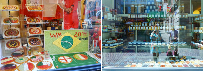
We walked a block uphill and wished we had bought a gummy pizza and dried fruits and such from the Cabaret Voltaire where Dada was born in 1916. 
Farther up the street we came to the Grossmünster - literally the "big cathedral". This is where Huldrych Zwingli - whose angry religious fervor made Martin Luther seem mellow - sparked the Reformation in German-speaking Switzerland. 
The domes of its towers (early examples of Neo-Gothic) are symbols of Zürich. They were rebuilt following a 1781 fire and after much civic discussion were left a plain stone color. 
Finally we went inside a church :)
Amazing doors.
In 2006 Sigmar Polke won the invited competition to design the church windows for the Grossmünster. It took three years to complete this ambitious project. Seven windows in the western part of the church consist of sliced ​​agate, creating brightly luminous walls of stone.
Um. Pretty much the coolest windows EVER!
So so so so so so so gorgeous!
Pictures weren't allowed in the cathedral but I snuck a few and the others are from the interwebs of these amazing windows. Good job Sigmar :)

I paid a few bucks to climb one of the towers for sweeping city views. 
Man oh man!
 I love views from way up high!
The Grossmünster doors once more and a blue building across from the Fraumünster. 
We crossed back over the river on the Münsterbrücke to go inside the Fraumünster.
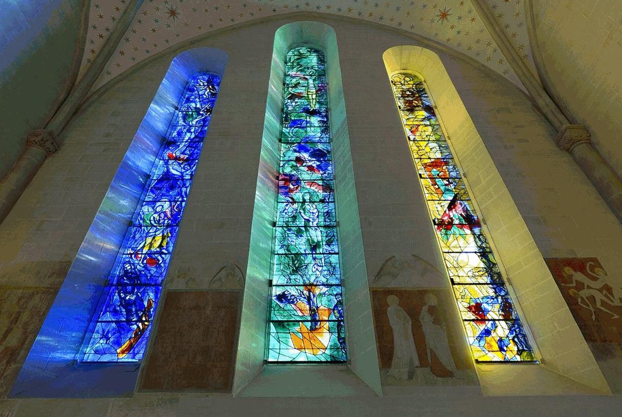
 This was founded as an abbey church for a convent in 853 when Zürich was little more than a village. The current building, which sits on the same footprint as its Carolingian predecessor, dates from 1250. With the Reformation of Zwingli the church was taken by the Zürich town council in 1524 and gutted to fit Zwingli's taste. Today it's famous for its 30-foot-tall stained glass windows by Marc Chagall.

Chagall (1887-1985) gave an exhibit in Zürich in 1967. It was such a hit that the city offered the world-famous artist a commission. To their surprise the 80-year-old Chagall accepted. He designed the windows to stand in the church's spacious choir - a space where he intuitively felt his unique mix of religious themes could flourish. For the next three years Chagall threw his heart and soul into the project, making the sketches at his home on the French Riviera then working in close collaboration with a glassmaking factory in Reims, France. After the colored panes were made Chagall personally painted the figures on with black outlines which were then baked into the glass. Chagall spent weeks in Zürich overseeing the installation and completion.
The five windows depict Bible scenes, culminating in the central image of the crucified Christ. 

We meandered through another square and more small and narrow lanes to reach Paradeplatz. 
We walked into the recommended Sprüngli - Zürich's top café for the past century. Its "Luxemburgerli" 1" mini macarons are a local favorite so we had to try one. Or, sixteen.
They were almost too pretty to eat! I love the shimmery pink ones! They tasted the best too with a jelly filling. Mmmm.
We munched on our Luxemburgerli all the way back to the car and drove home. Passing lots of castles on the way!
That concludes our whirlwind Switzerland trip! Our next big adventure is to Paris! Eeeps!
Paige Taylor Evans © // Quinn Creatives DESIGN