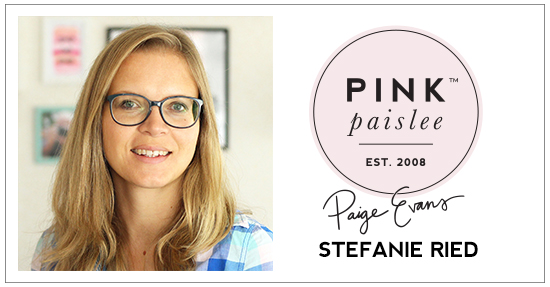
Continuing on with the circles theme, design team member Steffi Ried is back sharing a new and incredible layout!
Hello and welcome! I love circles, especially on layouts. On my first layout as a designer for Paige Evans I arranged the circles in the middle. This time I created a frame with the circles and photos and the journaling placed in the middle.
First I chose colors from the different collection papers and punched out circles in different sizes. Since I wanted to accommodate several photos on the layout, I also punched them out. These were integrated into the frame of circles.
First I chose colors from the different collection papers and punched out circles in different sizes. Since I wanted to accommodate several photos on the layout, I also punched them out. These were integrated into the frame of circles.
Before I arranged the circles, I typed the journaling on the computer and printed it. Then I painted a few circles with watercolors.
My sewing machine came next! Of course, these circles were not quite so round but I do not find that so bad. Must not be perfect, right?
I glued the circles with glue dots and sprinkled on some buttons - then the layout was finished!
I hope you like my layout today and thanks for stopping by!
SUPPLIES: OH MY HEART: Paper 10, Paper 17, 6x6 Paper Pad, Puffy Stickers, Ephemera Die Cuts; TAKE ME AWAY: Wood Veneer Shapes, Buttons; FANCY FREE: Paper 03, Buttons
Blog: steffiried.blogspot.com / Instagram: @steffiried / Pinterest: @steffiried / Facebook: stefanie.ried.96 YouTube: Steffi Ried
You can never go wrong with lots and and lots circles!!


This is WOW!!!!!!!! I loveeeeeeeeeeeee all the circles and the photos!!!!!!!!!!!!!!!!!!
ReplyDelete