Missy Whidden is back today sharing a layout with no pink!! (I do spy a little bit tho lolol ;)! Backing large cut file titles is a technique that will never get old - it always looks amazing! You can never go wrong! Tried and true! All those things :)
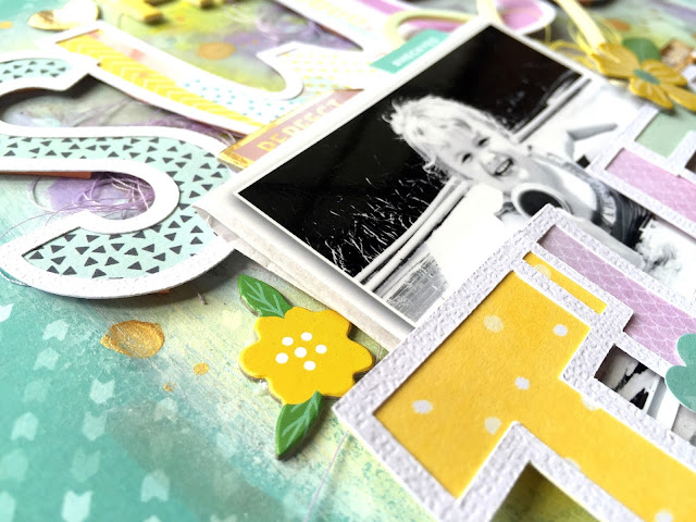
Hey there, friends! Missy here again and I’m sharing a new layout for our No Pink theme this week. Now this was a challenge for me! I truly love pink, and I never thought about how much I use it on my projects until I couldn’t. I have to say that I love how it turned out though! I still used my other two favorite colors…yellow and aqua. I sorted through all the papers from the Fancy Free and Take Me Away collections and decided to go with an aqua, yellow, purple, and gray color scheme. I created my large title using a cut file from The Cut Shoppe and backed all the letters with papers from the Fancy Free 6x6 Paper Pad, Take Me Away 6x6 Paper Pad and Take Me Away Paper 20. My background paper is Paper 12 from Fancy Free. I love that bold aqua!
To jazz up my background, I used a big dry brush and my fingers to smudge some white gesso down. Once that dried, I used various Shimmerz Paints and sprays using the packaging technique and just spraying directly on to the paper. I also used some Heidi Swapp Color Shine. I wanted a lot of the colors in the papers on the background but with a soft effect. I added some adhesive foam under the big cut files to create some dimension. I added a few embellishments around the photo including some Take Me Away Chipboard Stickers, Fancy Free Puffy Stickers, Oh My Heart Puffy Stickers, Chipboard Stickers, and some coordinating thread from my stash.
To jazz up my background, I used a big dry brush and my fingers to smudge some white gesso down. Once that dried, I used various Shimmerz Paints and sprays using the packaging technique and just spraying directly on to the paper. I also used some Heidi Swapp Color Shine. I wanted a lot of the colors in the papers on the background but with a soft effect. I added some adhesive foam under the big cut files to create some dimension. I added a few embellishments around the photo including some Take Me Away Chipboard Stickers, Fancy Free Puffy Stickers, Oh My Heart Puffy Stickers, Chipboard Stickers, and some coordinating thread from my stash.
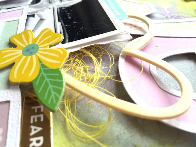
I couldn’t resist layering in this awesome Fancy Free Wood Veneer Heart. I love all the dimension going on here, and the wood veneer just adds to it. I love how the yellow thread pops from under it. I also used a fun label sticker from the Oh My Heart Sticker Book at the top of the photo.
As I was creating this, I knew my title was going to take up most of the page. I decided to tuck my photo under the bottom word and overlap it on the top word. The way my daughter is sitting in the photo allows her to fit right into the “H,” and I love how this looks. Even though a lot of the photo is covered up, you see the most important part of it. I added another Oh My Heart Chipboard Sticker. I’m so glad those flowers were yellow and not pink… haha! They matched perfectly. I added in a few more Take Me Away Chipboard Stickers in metallic gold as well as another Fancy Free Wood Veneer at the very top. I really love how this turned out! Sometimes your favorite pages can come from a challenge to do something out of your comfort zone. I have a process video for you if you’d like to check out how I created this page.
I hope it inspires you in some way!
SUPPLIES: OH MY HEART: Chipboard Stickers, Sticker Book, Puffy Stickers; TAKE ME AWAY: 6x6 Paper Pad, Paper 20, Chipboard Stickers; FANCY FREE: 6x6 Paper Pad, Paper 12, Wood Veneer, Puffy Stickers
Blog: littlenuggetcreations.blogspot.com Instagram: @missywhidden Pinterest: @missywhidden
Facebook: missy.whidden YouTube: Missy Whidden
Facebook: missy.whidden YouTube: Missy Whidden
I'm such a big fan of everything about this page! From the colors and mixed media to all the patterned papers and details!!


Love love love love this! LOVING that title work!!!!!!!!!!!!!!!
ReplyDelete