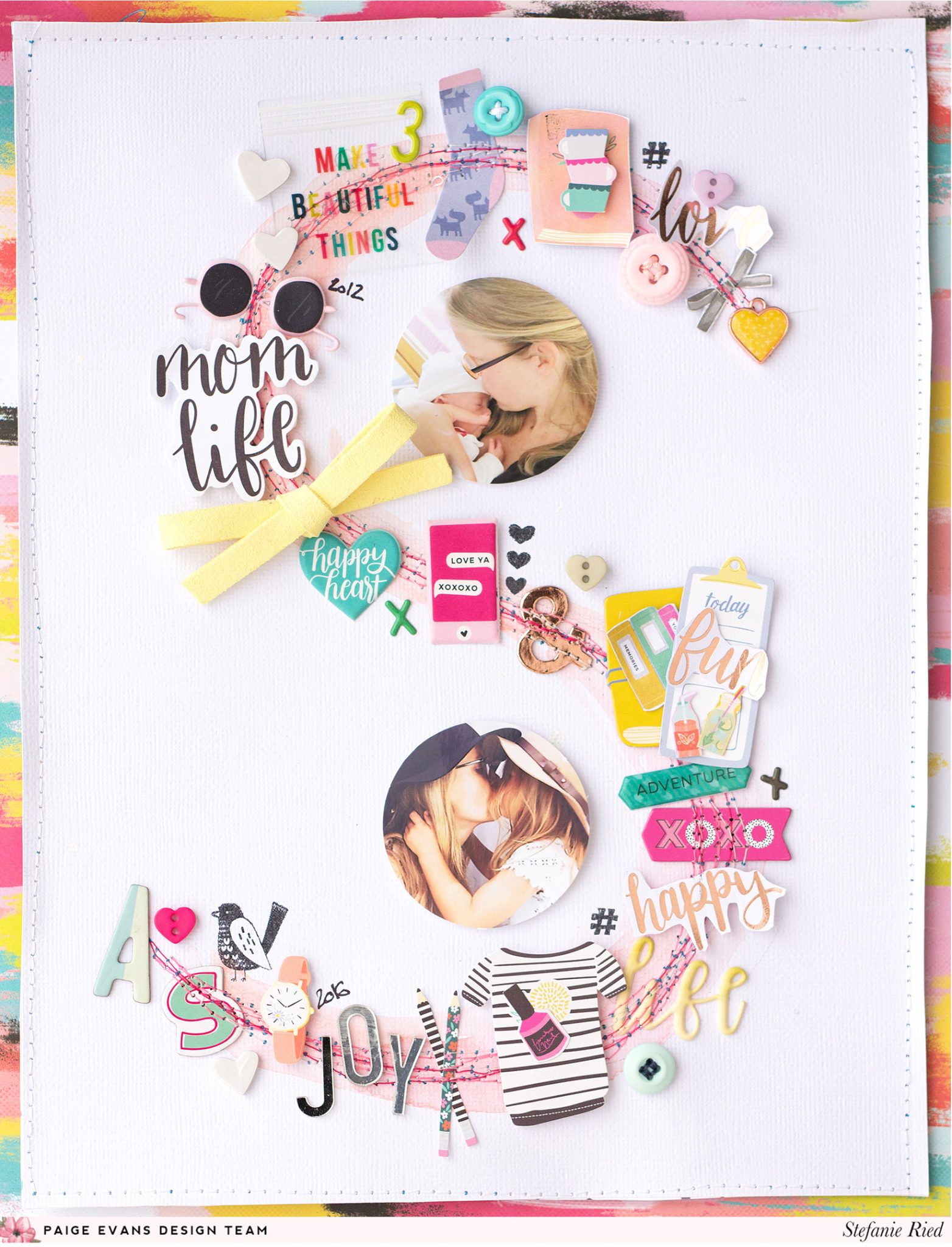
Even without flowers, Stefanie Ried sure knows how to make an amazing layout! By combining little bits and pieces from my first three collections, she created a large monogram layout that is equal parts amazing and awesome!
Welcome to a new project from me (Steffi)! I am very excited about the new collection "Turn the Page". I can’t wait to touch all the papers and embellishments :) But before that time I wanted to create a project with many embellishments from all three previous collections (Fancy Free, Take Me Away, Oh My Heart). I love to use a lot of stickers, buttons, alpha Thickers, and words on my layouts. I think the collections can be combined very well.

Creating a layout without flowers is not as easy as I thought. When I was almost finished with the layout, I noticed that on the books were small flowers. I had to laugh :) Sometimes I simply overlook the small details. Then I cut out small cups, books, and bottles from the Oh My Heart 6x6 Paper Pad and put them on the books to hide the flowers to fulfill the assignment.

In the past I have already created layouts with decorated shapes (such as an ampersand, circle, and heart). I like the effect very much. For this layout I used the letter "S" (for my initial letter). First I sketched the letter and then added peach and pink watercolors.

The title "Mom Life" is from the Ephemera Die Cuts. I used two of my favorite photos of me and my daughter on this layout. I love them so much. I punched the photos into circles and glued them with 3D sticky dots.

The words I cut out from a paper from the 12x12 Paper Pad. There are some papers covered with copper foil that shimmer so beautifully. They fit well with the colorful colors of the other embellishments.

The little buttons from Fancy Free and Take Me Away are also my favorites. I think I've used them on almost every project!
I think you can see how much I love all the embellishments from Paige's collections. They are so versatile. I love them! Thank you for looking :)

Creating a layout without flowers is not as easy as I thought. When I was almost finished with the layout, I noticed that on the books were small flowers. I had to laugh :) Sometimes I simply overlook the small details. Then I cut out small cups, books, and bottles from the Oh My Heart 6x6 Paper Pad and put them on the books to hide the flowers to fulfill the assignment.

In the past I have already created layouts with decorated shapes (such as an ampersand, circle, and heart). I like the effect very much. For this layout I used the letter "S" (for my initial letter). First I sketched the letter and then added peach and pink watercolors.

The title "Mom Life" is from the Ephemera Die Cuts. I used two of my favorite photos of me and my daughter on this layout. I love them so much. I punched the photos into circles and glued them with 3D sticky dots.

The words I cut out from a paper from the 12x12 Paper Pad. There are some papers covered with copper foil that shimmer so beautifully. They fit well with the colorful colors of the other embellishments.

The little buttons from Fancy Free and Take Me Away are also my favorites. I think I've used them on almost every project!
I think you can see how much I love all the embellishments from Paige's collections. They are so versatile. I love them! Thank you for looking :)
SUPPLIES: OH MY HEART: 6x6 Paper Pad, 12x12 Paper Pad, Acrylic Stamps, Thickers, Charms, Chipboard Stickers, Sticker Book, Ephemera Die Cuts; TAKE ME AWAY: Buttons, Mirror Stickers, Ephemera Die Cuts, Chipboard Stickers; FANCY FREE: Buttons
Blog: steffiried.blogspot.com / Instagram: @steffiried / Pinterest: @steffiried / Facebook: stefanie.ried.96 YouTube: Steffi Ried
I love the idea of creating a large monogram for a focal point on the background, and maybe adding a flower or two ;) Although this layout proves you don't need flowers to create a stunning page!


Love love love love this! LOVING that large "S"!!! Can so see me doing that with a "J"!!! PINNING this!!!!!!!!!!!!!
ReplyDelete