Destination Fussen Mini Album


Thursday, August 31, 2017

Here is the mini album that we made at Artescrap last weekend in Mexico City! The entire base is made from a single sheet of white cardstock which I learned from a tutorial by Elsie Robinson. I used my Oh My Heart collection with Pink Paislee for pretty much everything :)
Here is a flip through of the mini album:
To make the mini album base: start with a 12x12 piece of white cardstock. Fold the paper in half, top to bottom and score the crease. Lift the flap at the bottom and fold it up to the top edge then score the crease. Flip over and repeat on the other side. Open up the paper then fold it in half the other direction. Open up the paper and with the rectangles horizontal, cut from the center of the bottom up to the 3rd crease. Accordion fold the papers then fold the halves together. Mark between the pages with a pencil where adhesive needs to go then adhere those pages together to complete the base.

To make the cover: trim patterned paper to 6.5 x 6”. Add Thickers, mini alphabet stickers, a chipboard flower, hearts transparency sticker, and stamp the date on the front. If you have a sewing machine, stitch through the letters. Place adhesive all over the front and back of the book then wrap the patterned paper around the cover – trim any excess.

Paint white acrylic paint on the top left and bottom right corners of the first spread then splatter more white paint and watercolors on top. While it’s drying, fussy cut as many flowers from Paper 06 as you would like. Adhere the flowers to the top left and bottom right corners and trim the excess. Layer a 2” photo onto patterned paper then adhere it at an angle to the right page – trim off the edge before adhering so it’s flush with the crease. Add “the good life” Chipboard Sticker above the photo. Stamp journaling lines on the bottom left side and write journaling.

Paint and splatter white acrylic paint mostly on the left side and in the center of the next spread. Use the packaging technique to apply watercolors on top. While it’s drying, trim a 1” square from 16 of the patterned squares of Paper 24 then cut those 1” squares in half to make triangles. Adhere the triangles around the edges. Cut off the bottom of a tag, tie baker’s twine through the tag hole, add a photo on top, then adhere it to the left side. Embellish with flower die cuts, a rose gold foil scalloped border sticker, “#heckyes” tab sticker, rose gold chipboard flower, and pink puffy flower sticker. Stamp journaling lines on the right side then write journaling. Place a “the little things” transparency sticker under the journaling.
Paint and splatter white acrylic in the center of the spread. Use the packaging technique to apply watercolors on top. Once dry, add sock die cuts, a sticker t-shirt, and “wonderful you” die cut across a piece of baker’s twine like a clothesline. Use a bit of washi tape above each embellishment like clothespins. Add a bunch of flower stickers and flower die cuts to the ends along with a bird puffy sticker. Layer a 2” photo over patterned papers then tuck it into the clothesline. Stamp journaling lines on the bottom left and write journaling.
Paint and splatter white acrylic paint diagonally onto the last spread. Use the packaging technique to apply watercolors on top. While it’s drying, gather all of the heart embellishments you can find and fussy cut hearts from patterned paper. Scatter the hearts over the paint and add heart stamping in the empty spaces. Add a 2” photo into the mix.
I still had a ton of photos I wanted to include, but no more space! Pocket to the rescue! To make the pocket page: Trim patterned paper to 5.5 x 6”, fold it in half, and trim off the front at an angle; wrap washi tape around the bottom and right edges to create a pocket. Attach the pocket to the book with washi tape all along the edge. Journal on the pocket and add larger photos / memorabilia / embellishments inside the pocket.


That's all! :)

These little albums are so fun to make because they are handmade from scratch - even down to the construction of the base! Every little detail is something you get to decide, so it's truly unique!

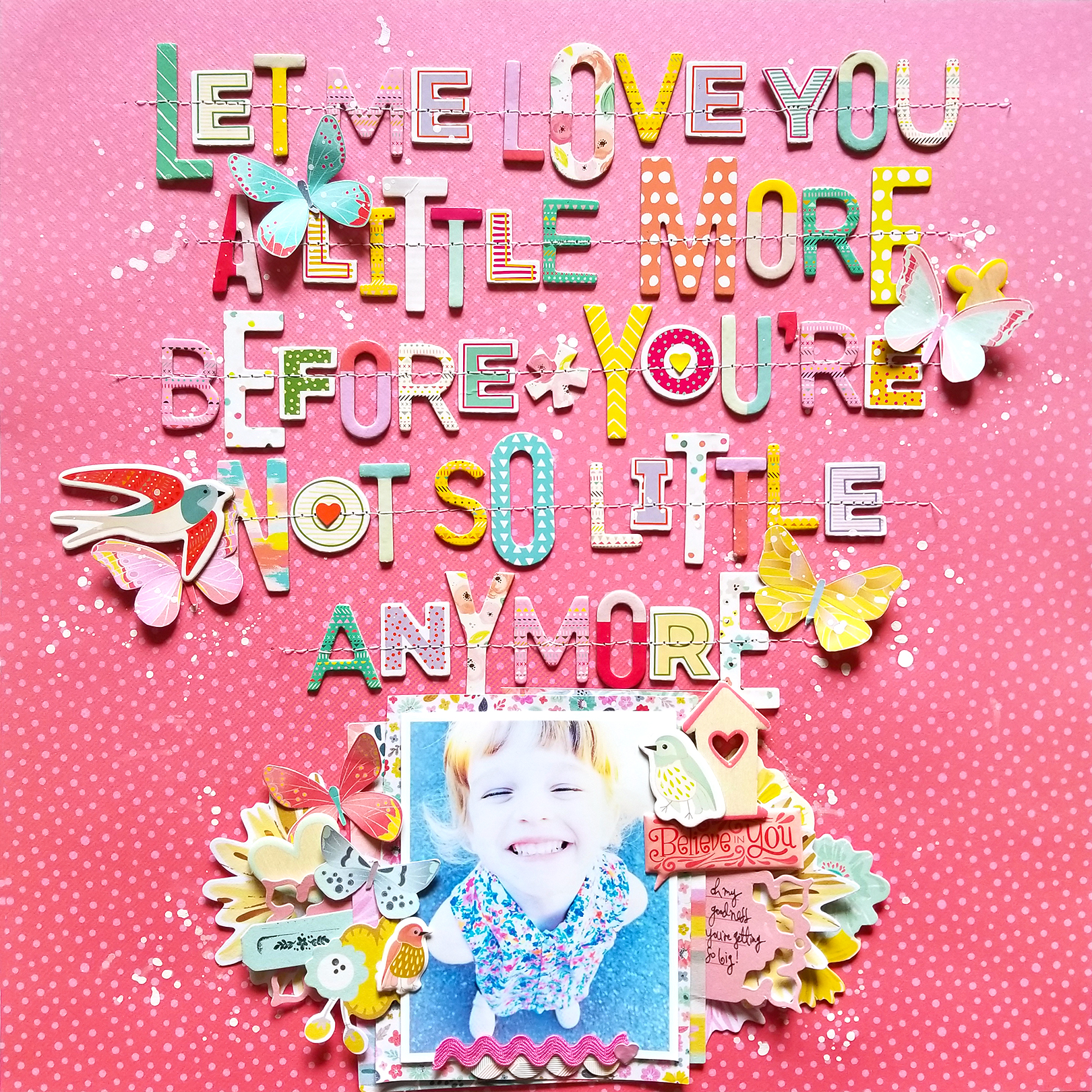
Let Me Love You Layout for Big Picture Classes


Wednesday, August 30, 2017

Today 10 Big Picture Classes teachers are having an instagram hop! We each were inspired by one lesson in another teacher's class - I had fun watching all of Meghann Andrew's TERRIFIC TITLES lessons and I was especially inspired by the idea of "mixing & matching"! Goodness knows I have more fonts and styles of Thickers than I care to admit, and this is the perfect way to start making a dent in my stash!  
  I have a process video to go along with this layout so you can see exactly how it came together!

BPC is giving away TEN month-long memberships in the hop so be sure to visit my instagram (@paigetaylorevans) and enter for your chance to win access to this amazing and inspirational online platform!
I loved learning from another teacher and I love how this layout turned out! The Thickers just go together splendidly eh?! :)

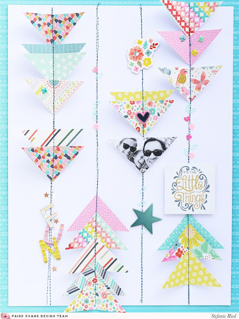
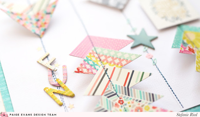
It's the Little Things Layout by Steffi Ried


Tuesday, August 29, 2017

One product I am super stoked about in my new Turn the Page collection is the mini 2x2 Paper Pads! There are two little swatch books - one with patterns and one with phrases. They're pretty dern cute :) I asked the designers sharing projects this week to feature the 2x2 Paper Pads and I LOVE Stefanie Ried's layout!
Hello and welcome! I immediately fell in love with the 2x2 Paper Pads! This size is perfect for so many things and they have all the colors and patterns from the collection. I had to hide the paper pads in my drawer, since small children's hands find this also very exciting, haha!

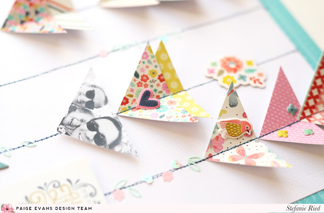
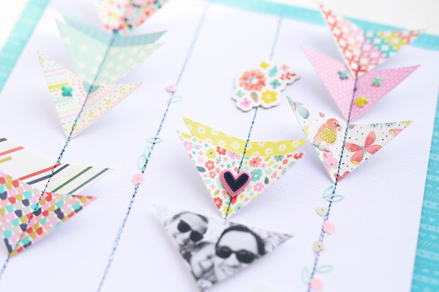
From the 2x2 Paper Pad with the colors and patterns I cut triangles - just cut from one corner to the other so you have two triangles of the same paper. I also did that with other papers.

The triangles serve as arrows which point upwards and downwards. I first sketched the lines with a pencil and then arranged the triangles. Next they were fixed with a glue stick on the paper so that the triangles wouldn't slip during sewing. Then I sewed lines over the triangles. I also cut my photo into the same size and shape of triangle.

From the other 2x2 Paper Pad with phrases I found a sweet sentiment to use for the title. I simply glued the title to the line with 3D glue dots.

To finish I decorated the lines and triangles with alpha Thickers and Sequins. As a frame for the layout I used Paper 24. Thanks for stopping by and until next time!
Blog: steffiried.blogspot.com / Instagram: @steffiried / Pinterest: @steffiried / Facebook: stefanie.ried.96 YouTube: Steffi Ried
The more patterns one can fit on a layout the merrier I say and the 2x2 Paper Pads are perfect for just that!

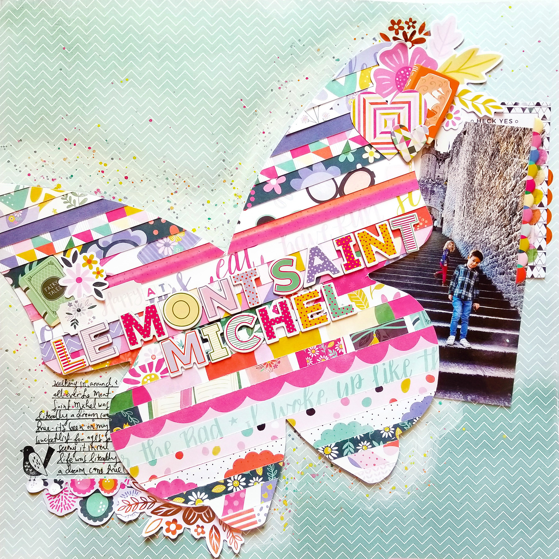
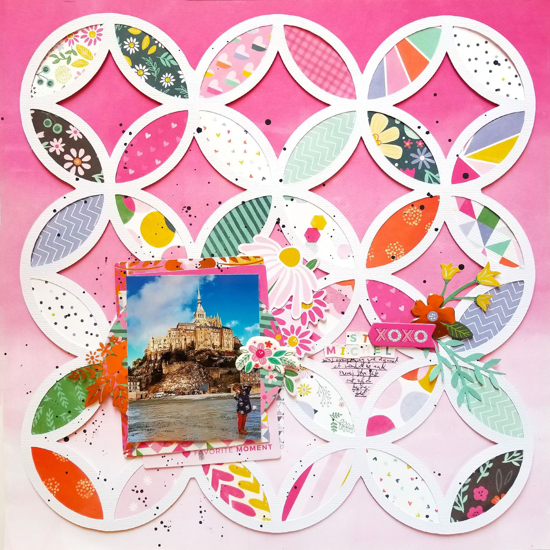
Mont Saint Michel Layouts


Monday, August 28, 2017

Hi friends! I just got back from a fantastic trip to Mexico City! We went a few days early to celebrate our 10 year anniversary and then I taught for two days at Artescrap! Here are the two layouts we made and there's also a mini album I'll share a bit later!

Trim off the barcode strips from all 24 patterned papers. Trace a butterfly onto another patterned paper or scratch cardstock, cut it out, then cover it with adhesive. Starting in the center, place a paper strip across the middle and continue placing paper strips above and below, just barely overlapping, until the entire butterfly is covered, then trim off the extra paper strips. On a patterned paper background, use the butterfly as a stencil to lightly trace it then paint over the traced butterfly with white paint. Splatter watercolors on top and let it dry. Stamp journaling lines on the bottom left side then add the paper strips butterfly over the painted butterfly using dimensional adhesive. Tuck a photo under the right side. Layer die cuts, washi tape, and puffy stickers under and around the photo. Create an embellishment cluster on the top right and bottom left. Make the title across the center of the butterfly using Thickers and embellish on the top left. Stamp a bird and write journaling on the journaling lines.
Trace one inside petal of the die cut background onto scratch paper then cut it out just slightly bigger to use as a template. Trim Paper 10 into individual patterned squares, fold them in half, trace the petal, then cut the petals out. Spray the backside of the background die cut with adhesive the quickly place the petals – add the backed die cut background onto pink ombre paper using dimensional adhesive. Splatter black watercolors over the background. Layer a photo over die cuts and chipboard stickers then place it on the bottom left side. Fussy cut stems and flowers from Paper 06 and adhere them along with a mini alphabet sticker title and chipboard stickers on the right. Journal below the title.

Recap of our adventures also coming soon! Yay for new blog material :)

Family Layout by Flóra Farkas


Friday, August 25, 2017

There are so many things that you can do with Washi Tape besides just stick it down on your projects! Designer Flóra Farkas used it to back a cut file! SO COOL!
Hi girls! Here is my new layout made with Turn the Page collection featuring the 6x12 Washi Tape Book. This pack includes three pages of 6x12 washi stripes, all with different patterns and sizes. They are perfect for backing a cut file! Can you believe I only used one scrapbook paper for this layout, what is actually the background. 
First I die cut a circle with my Silhouette Cameo then I placed it in the middle of Paper 15. I covered all the inner pieces with colorful Washi Stickers and adhered them back to their places. I added my photo with foam tape so I could add Ephemera Die Cut flowers under it. 
I created the title from a clear sticker from the Sticker Book, backing it with white cardstock. I love how it pops out from the busy background. I also added more Die CutsThickers, and Puffy Stickers around my photo. 
It’s so cool how the patterns of the washi stripes coordinate with other embellishments so I could complete their pattern and create a 3D look. I think the final result is so interesting! I love the colorful and happy center and the empty background. This creates such a huge contrast. How do you like it? Thanks for stopping by today!
Blog: pinkandpapergift.blogspot.com Instagram: @floramfarkas Pinterest: @floramfarkas
Facebook: pinkandpapergift YouTube: Flora Monika Farkas
Now I really want to give this technique a try! Washi tape is so versatile!!

Berlin Layout


Thursday, August 24, 2017

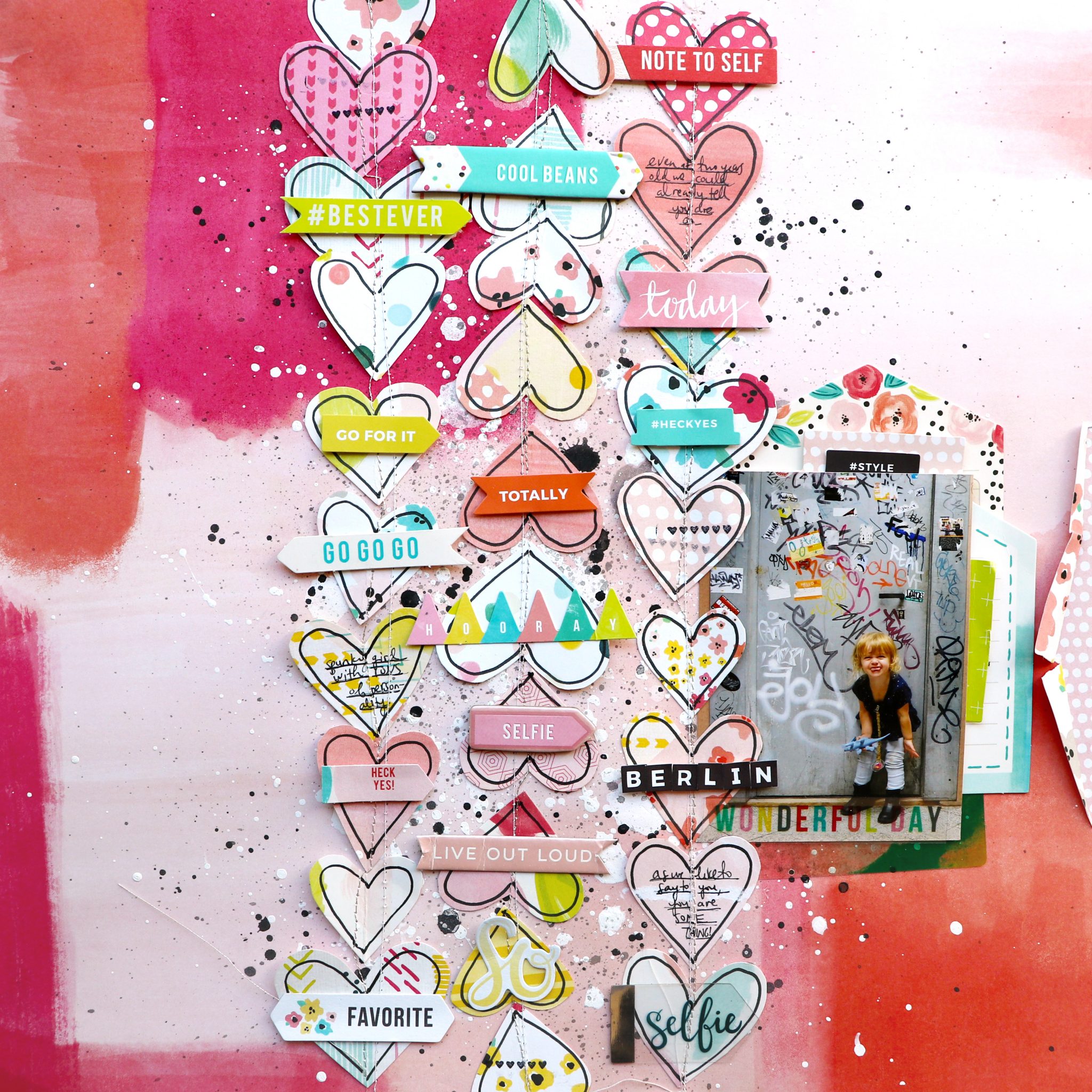
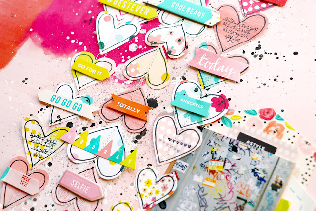
Here is the 3rd of 4 layouts from my Paige's Pages 13 class with Big Picture Classes! This layout is all about patterned paper heart garlands.

If you watch the start-to-finish video you'll see that not every layout is as easy to make as the next! I struggled for a long time to figure out the placement of the heart garlands and originally started with about 6 more strands of them and ended up only using 3!
 Then before I stitched the hearts down I needed to spice up the background so I tried to make it messy and crazy like all the graffiti of the door cute Jane is standing in front of. Be sure to pop on over to Paige's Pages 13 to check it out!
Supplies: Patterned paper, die cuts, chipboard, stickers, journaling spots: Fancy Free by Paige Evans / Pink Paislee; Roller stamp: Take Me Away by Paige Evans / Pink Paislee; Pen, adhesive: American Crafts; Watercolors: Loew Cornell; Paint: Folkart; Ink: StazOn; Sewing machine: Brother; Thread: Coats & Clark

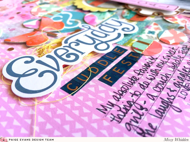
Everyday Cuddle Fest Layout by Missy Whidden


Tuesday, August 22, 2017

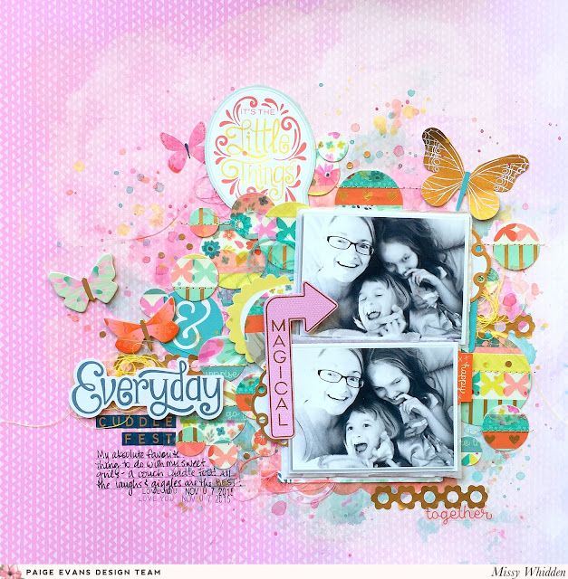
I love how Missy Whidden thinks outside the box when I give her assignments - this time I asked her to feature the new Washi Tape Book in my Turn the Page collection and instead of just plopping them down on the page, she went and got all creative and made darn cute custom washi circles! Check it out:
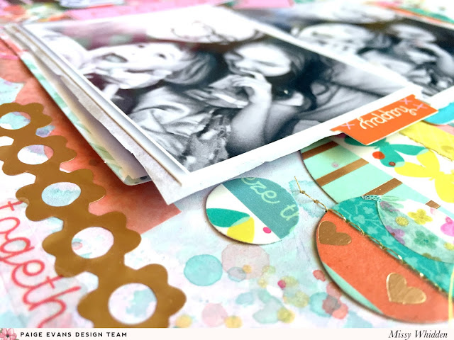
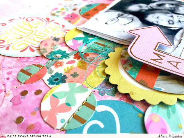
Hey, friends! Missy here, and this week we are focusing on the beautiful Turn the Page Washi Tape Book. This collection is just stunning and the Washi Tape is so colorful and versatile. I decided to create a circle design. I adhered several strips of the washi to a scrap piece of white packaging. I used a few different sized circle punches to create the circles. I used paper Paper 18 as my background - the gradient pink is so pretty! I used some white gesso to create even more of a white-to-pink gradient and then used some Shimmerz sprays to add watercolor splashes. I layered all the circles under and around my two photos which are of me and my sweet girls doing one of our favorite things… couch cuddles!
The punched washi circles turned out so well and the colors are just fantastic. I added a bit of machine stitching through some of the circles with metallic gold thread. Then I cut out a fun speech bubble from Paper 21. I also added in a yellow scalloped circle from the Journaling Spots and that fun “magical” arrow from the Ephemera Die Cuts. I think all the bright colors really stand out against the black & white photos.

I created a little title cluster to the bottom left. I combined the “Everyday” Ephemera Die Cut with some of the small alpha stickers from the Sticker Book. I tucked it all in and around the circles and then finished off the area with a few butterflies from the Chipboard Stickers.

One of my favorite strips from the Washi Tape Book is this gorgeous row of gold flowers! I cut it into pieces and used it in a few spots around the page. I used a piece from the Ephemera Die Cuts under the bottom photo and a Journaling Spot under the top photo. I added dimension with some adhesive foam. The small “happy” tag is from the Sticker Book.

I honestly can’t get enough of this collection! It’s truly beautiful and so much fun to play with. I hope this inspires you in some way! I have a process video here if you’d like to check it out:

Blog: littlenuggetcreations.blogspot.com  Instagram: @missywhidden  Pinterest: @missywhidden
Facebook: missy.whidden  YouTube: Missy Whidden
I am definitely inspired by Missy to bust out the washi tape book and get creative with it! Ok, enough blogging, off to scrapbook!! :) :) :) 

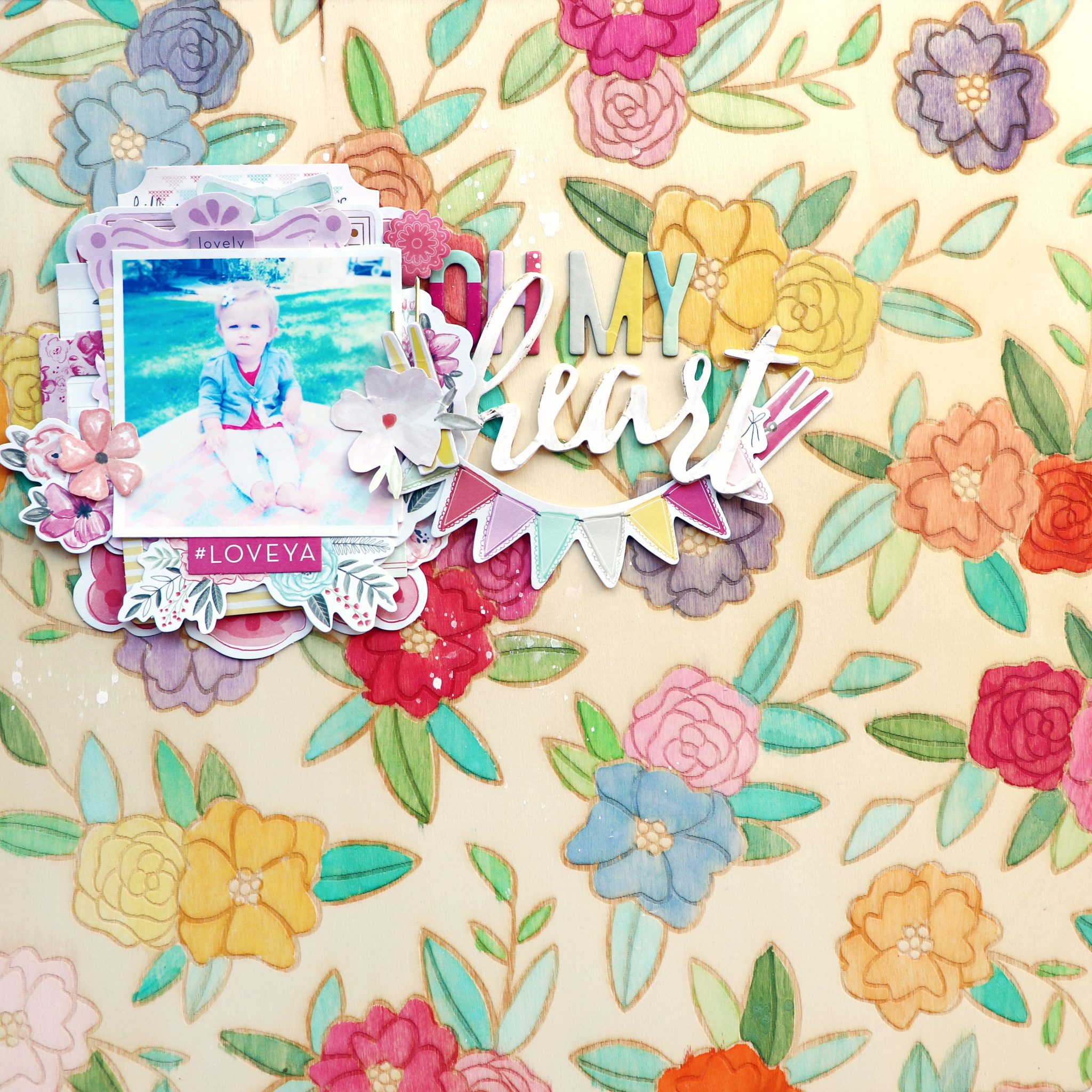
Oh My Heart Layout


Monday, August 21, 2017

Here is another layout from my Paige's Pages 13 class at Big Picture Classes!

I've never seen a full 12x12 piece of wood veneer before until the Hazelwood collection by 1canoe2 with American Crafts released last year! So clever and unique!
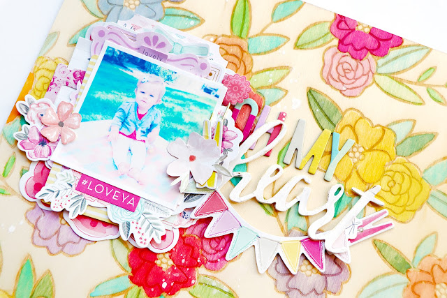
 I simply watercolored in the florals that are burned into the wood and created a single photo/title cluster to let the background really shine. Be sure to stop by Paige's Pages 13 to see this layout come together in a process video!
Supplies: Patterned paper, die cuts, Thickers, paperclip, chipboard: Take Me Away by Paige Evans / Pink Paislee; Wood veneer paper: 1canoe2; Watercolors: Loew Cornell

Moments in Munich Mini Album by Steffi Ried


Friday, August 18, 2017

Well this is a super cute mini album by design team member Stefanie Ried for several reasons: she used my new Turn the Page collection, every spread is a work of art, AND it includes photos of us together!! It was such a fun day at my last Scrappies workshop near Munich this past May!
Hello and welcome to a new mini of mine! When I saw the new collection Turn the Page for the first time, I could hardly wait to make a mini :) I had a hundred things in my mind about how the first mini would be. I used pictures of our weekend in Munich in the album. I was at one of the last workshops that Paige had in Germany in May. It was a great, creative day and it was a great pleasure to see each other again. I hope that it will be repeated. I really hope so :)
I love to put transparent elements into my albums so I used a page protector for the cover and incorporated many embellishments from the new collection. For this I used the sewing machine. There is also a video about the creation of the cover and a walk through at the end. The finished pages are 6x6". I cut the papers to 6x7" and folded it after 1" then each page was glued to the next side. This binding is very quick and easy.
For the pages I used a lot of materials from Turn the Page. I wanted to use as much as possible so that the mini is very colorful. The planes on Paper 22 have inspired me from Paige's great layout. I like this very much.
The sayings from the Paper 21 are my favorite! Are not they great!? I created a small pocket for some more pictures and journaling.
And how great are the colorful Ribbons? I fastened the ribbons with a tiny attacher and glued them with glue dots on the side.
Here I show you some pictures of the workshop with Paige. We created beautiful layouts and had lots of fun. The flowers fit perfectly to the colorful photos. And my sewing machine came back to work.
Aaaah... and a photo with Paige also had to be in the album. I have sewn quite a few small ornament pieces in the square and added the photo on top. The cute Sequins are very versatile.
The coffee and tea cups from Paper 07 are absolutely amazing!! I cut out a few cups and stuck them in a collage around the Puffy Sticker. I will certainly use the cups more often.
Finally, a photo of the Hofbräuhaus along with a sweet Pennant Paper Clip
The album is finished!

I hope you like this mini and many thanks for stopping by!

Blog: steffiried.blogspot.com / Instagram: @steffiried / Pinterest: @steffiried / Facebook: stefanie.ried.96 YouTube: Steffi Ried
I mean really. Totally speechless! I love everything about this album from cover to cover and every single page between!

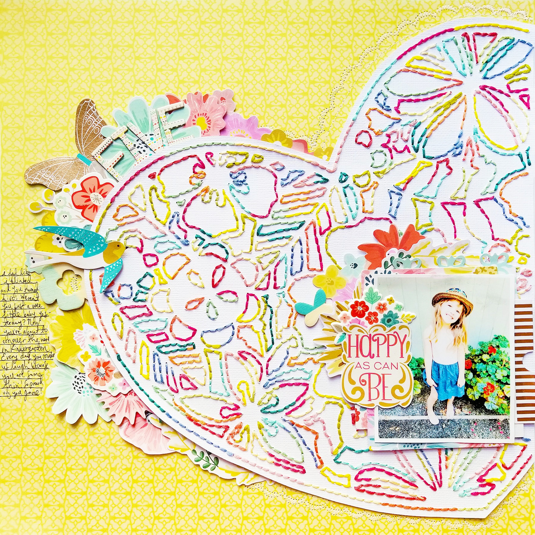
Happy As Can Be Layout


Thursday, August 17, 2017

New layout to share!
It all started with this beautiful floral heart cut file from Inna Moreva's etsy shop! Back in Germany as we were leaving to go on a road trip I prepared several cut files and projects to stitch. I didn't finish them all so I brought them with me back to the states. On our road trip to the Evans family reunion down in Oregon, I brought this one along! I debated long and hard about how to stitch it. I feel like I usually stitch in all white and then fill in the spaces with watercolors. Or I stitch all the individual shapes and elements in their natural colors (pink for flowers, green for leaves, etc.) I wanted to try something slightly different. And so, every 10 stitches, I changed colors of thread! It made the entire project take at least twice as long because I was stopping so often to switch colors, but I love it twice as much!
I started by stitching the outside edge of the heart - it took 16 different colors to go all the way around and then I only used those colors to stitch the entire project. I didn't really have a color scheme in mind, I just used all my favorites! When it came time to turn the stitched heart into a layout, I was happy that Turn the Page matched so well! The "HAPPY AS CAN BE" sentiment actually came from the 2x2 Paper Pad and I loosely cut around it - I like how the curvy edges match the flourishes and what not of the stitching. 
On my insta stories I polled the audience and asked if the layout should be made on a yellow or pink background. Yellow won! Before adhering the stitched heart in place I used my sewing machine to straight stitch and make a fancy scallop around the edge. A lot of the stitching got covered up by various floral embellishments tucked under the heart, but you can still see the details on the other sides! I love how this turned out and it was fun to make it a collaborative project :)
Supplies: Patterned paper, die cuts, wood veneer, chipboard, Thickers: Turn the Page by Paige Evans / Pink Paislee; Cardstock, pen, adhesive: American Crafts; Floral heart cut file: Inna Moreva; Die cut machine: Silhouette Cameo; Embroidery floss: DMC; Sewing machine: Brother; Thread: Coats & Clark
Paige Taylor Evans © // Quinn Creatives DESIGN