Bea Valint's Mini Album Featuring Cut Files


Saturday, September 30, 2017

It's been a minute since I made a mini album and now I'm utterly convinced my next project has to be a mini album featuring cut files after seeing this album that design team member Bea Valint created for today's post! All supplies are from my Pink Paislee Turn the Page, Oh My Heart, and Take Me Away collections - if you have a question about a specific product, please don't hesitate to ask!
For the cover, I die cut the HEART WORD HAPPY out of white cardstock and filled the heart shape with fussy cut flowers from Oh My Heart.
On the left side, I added extra embellishing using the PIE CHART HEART cut file. I cut the inner pieces from patterned paper and stitched them to the page in a rainbow. On the right side I used the FLOWER HALF cut file for creating a tiny extra page, it makes my album more interactive and is a good place for hidden journaling!
The HELLO CIRCLE FRAME looks so pretty on the photo!
Do you need somewhere to write journaling? Die cut some labels using the LABELS SET OF 3 cut file! Done and done!
Here I created a soft background using mist paints and the POINSETTIA BACKGROUND cut file. On the left side I used the cut file as a mask and sprayed mist on it. Then I adhered the painted flowers to the opposite side. Just love how it turned out! 
A special page for a special photo! I backed the FLOWER BACKGROUND cut file with patterned papers and inserted it into the album.
I painted with watercolors one flower from the FLOWER CLUSTER cut file and added a colorful frame for my journaling. Then I added a pretty divider using the FLOWER DOT BACKGROUND cut file.
Last but not least, use the FEATHERS OR LEAVES cut file to tie in some painted embellishments!
I mean, I can't even! Such a special, beautiful, pocket-sized album featuring my cut files - what a treasure! Lovely album from cover-to-cover by Bea Valint!

Quilt Layout by Stefanie Ried


Friday, September 29, 2017

It's my favorite thing to see how the designers interpret the assignments I give them! For Stefanie Ried's quilt-inspired page she churned out something I never in a million years would have thought of! That's the beauty of creativity and being unique :)
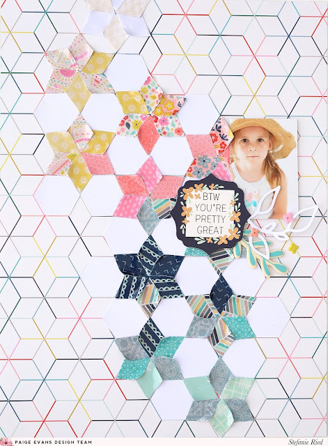
Hello and welcome to a new layout from me! In the subject of quilts I have to think of my girlfriend. She makes so many lovely quilt blankets. Each one more beautiful than the other. My favorite blanket is also from her. I admire anyone who can do it and has that kind of patience!

When I looked at the papers from the new collection, many of them immediately showed me a lot of great patterns. You could create some layouts with a quilt pattern. I picked Paper 20. That pattern I liked immediately.

Then I chose the right patterned papers for paper piecing. For this I used the 6x6 Paper Pad and Paper 12 since I only needed small bits.

 I have a small punch in the shape of a diamond. With this I cut all the papers. Next, the papers were arranged on the layout. I attached the stars with a glue stick. For the pattern to stand out from the background, I applied glossy accents. After drying, the corners bent upwards so the stars shimmer better. In the areas between the patterned papers I added white cardstock.

Finally, the photo, leaves, and chipboard stickers with the nice saying were glued. The layout is finished :) I hope you'll also create a layout with quilt patterns!
Blog: steffiried.blogspot.com / Instagram: @steffiried / Pinterest: @steffiried / Facebook: stefanie.ried.96 YouTube: Steffi Ried
I simply love everything about this layout. I want to make my own in a 12x12 version! How 'bout you?

Phoebe the Bunny


Thursday, September 28, 2017

We got a bunny!

We've been talking to a lionhead breeder over at Twin Peaks Rabbitry all year and finally the time came to pick her up and bring her home! Every Sunday they would send updates and the world's cutest photos of little Pheebs.

Last weekend we drove up to Redmond to meet her. It was love at first sight!
Fox and Jane couldn't keep their hands off of her and even though Chris looks a little unsure, he is head over heals for this little bun.

I can't believe she's real!
 Somewhere in there she has eyes of blue hahaha.
As soon as we got home we had to have a little photoshoot to debut her cuteness!
 
Just look at that forehead fur! Every night during TV time and frequently throughout the day I snuggle her. She LOVES to be cradled like a baby and sleep on her back in a little ball.
 So now we have Joey the Dog, Rachel the Cat, and Phoebe the Bunny. #friends. What's next?! Ross the fish? Monica the bird? Chandler the turtle? :)

These are the sweetest, cutest, most doted upon and loved bunnies that you will ever find, I highly recommend Twin Peaks Rabbitry!

Fall 2017 Scrapbook & Cards Today Magazine


Wednesday, September 27, 2017

The Fall 2017 issue of Scrapbook & Cards Today Magazine is now available and free to download! I have a couple of layouts inside that I want to share!
This was one of the very first pages I made using Turn the Page! I started by stitching a sunburst, changing the color of thread every line, and then used the packaging technique to apply watercolors. Then I trimmed squares of patterned paper (or I could have used the 2x2 Paper Pads!) and made a 3x3 grid. On the corner and center squares I added a photos. In the top middle square I wrote journaling and placed my title above (it's a gold foil transparency sticker from the Sticker Book). Then came the embellishing with all kinds of things - Pennant Paper ClipJournaling SpotsRibbonEphemera Die CutsChipboard Stickers, and Puffy Stickers. You can never go wrong with a grid design!

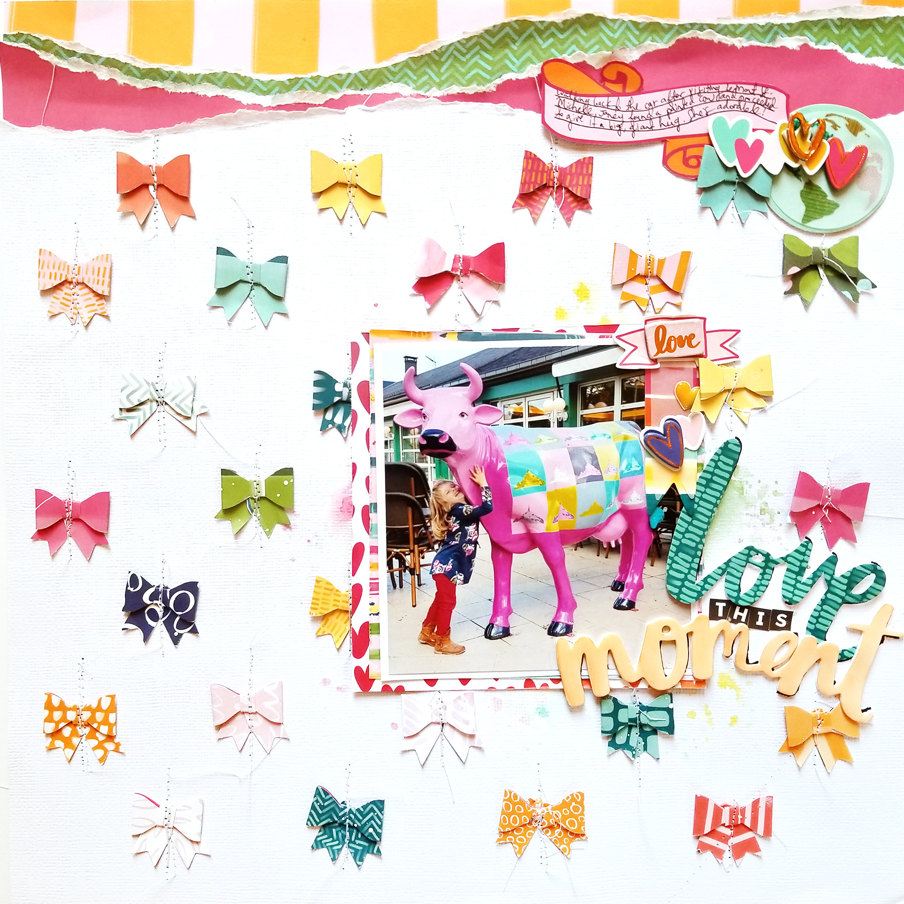
On this page I utilized my Fiskars mini bow punch and the super cute Hustle & Heart collection by Amy Tangerine! I love including lots of patterned papers and repeating elements in my designs and this punch made creating bows quick & easy! I used my sewing machine to stitch them in place and watercolored over the foam "moment" sticker to help it stand out against the white background.

Find these layouts and SO.MUCH.MORE in the incredible new Fall 2017 issue of Scrapbook & Cards Today Magazine! It's FREE to download!! Can't beat that :)

Quilt Layout by Flóra Farkas


Tuesday, September 26, 2017

If I'm ever in a rut I know I can always turn to quilts for inspiration: the little fabric pieces translate perfectly into patterned paper pieces and always create stunning results! This week I asked the two designers who are sharing projects to make quilt-inspired pages. First up is Flóra Farkas with an eye-catching layout!
Hi ladies! For today’s layout I used hexagon shapes and lovely soft colors. I started the process by gathering all the pink and mint embellishment from the Turn the PageOh My Heart, and Take Me Away collections. The background was inspired by Turn the Page Paper 17. First, I cut out pink, blush, and mint hexagons from the paper, then I traced the shape onto Paper 02 and Paper 18. I arranged the elements on a white cardstock background and placed my photo.
I fussy cut two sentiments from Paper 21 and placed them next to the photo. On the right I created a cluster using Turn the Page Chipboard Stickers & Oh My Heart Ephemera Die CutsThickers and a Charm.

On the left I added gold foiled flowers from Oh My Heart Ephemera Die Cuts and the Sticker Book. The lovely butterfly is from the Turn the Page Chipboard Stickers. Under my photo I adhered a scallop washi from the Oh My Heart Sticker Book along with a clear sticker. In the end I scattered Foam Heart Thickers and few enamel dots.

Thanks for stopping by today! I hope you like my layout with the hexagon quilt-inspired background!
SUPPLIES: TURN THE PAGEPaper 02Paper 17Paper 18Paper 21Chipboard StickersOH MY HEARTSticker BookEphemera Die CutsThickersCharmsTAKE ME AWAYFoam Phrase Thickers
Blog: pinkandpapergift.blogspot.com Instagram: @floramfarkas Pinterest: @floramfarkas
Facebook: pinkandpapergift YouTube: Flora Monika Farkas
I love how simple the background is with just a few patterned paper hexagons and then a few clusters of embellishments around a darling photo and this layout is complete! Simply stunning! I encourage you to turn to quilts for inspiration and see the amazing designs you can come up with!

Hello Oslo Layout & Process Video Featuring Hobby Lobby Ribbon


Monday, September 25, 2017

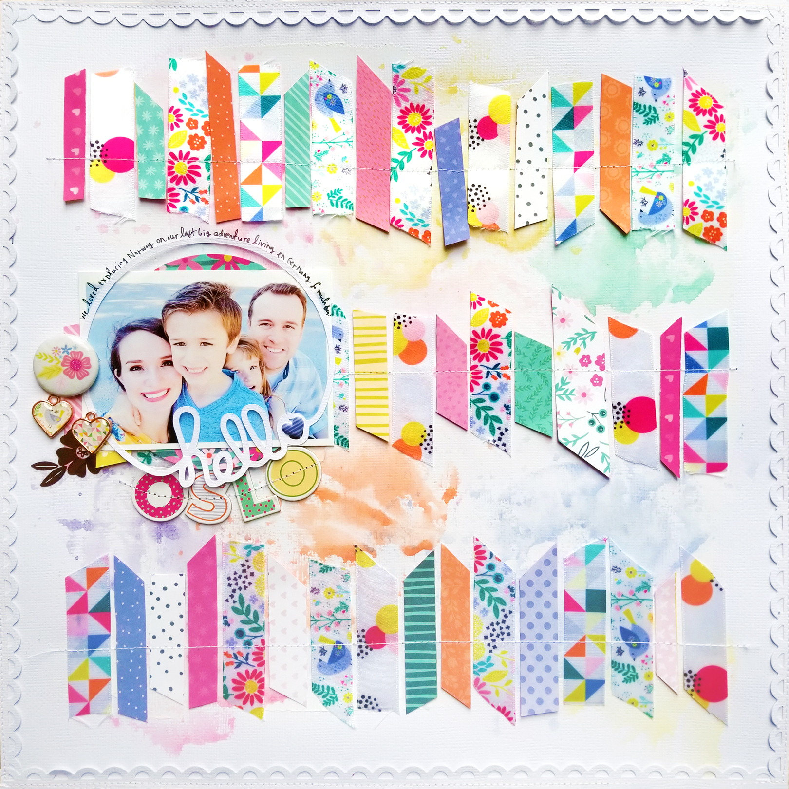
Hobby Lobby has four ribbon spools with my mug on 'em! Crazy and cool and surreal and fun all rolled into one :) Each ribbon features a pattern that coordinates with my Oh My Heart collection with Pink Paislee.
Here is a layout I made with these Hobby Lobby exclusive ribbons:
Watch and see how this layout came to be in a process video:

Now check out these three awesome layouts that my design team made!!
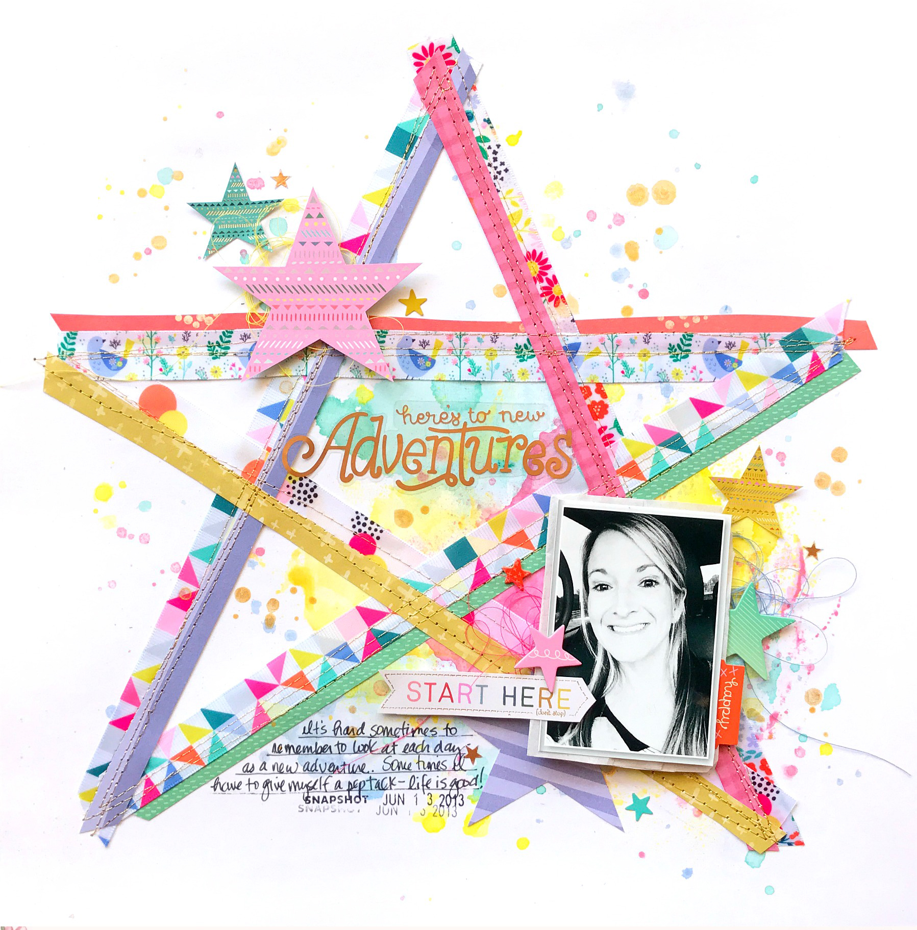
First, design team member Missy Whidden also created a stunner of a layout with the ribbons and supplemented with Oh My Heart and Turn the Page.
Next, design team member Stefanie Ried made SUPER CUTE paper clips featuring the ribbon and embellished with Turn the Page!
And finally, design team member Flóra Farkas created a unique and stunning background featuring the ribbon and embellished with a little bit of everything: Oh My HeartTurn the Page, and Take Me Away!
I hope you're inspired to swing by your local Hobby Lobby and pick up one or two or three or all four of these ribbon spools!

Silhouette Design Team Layouts #2


Saturday, September 23, 2017

Comin' at ya with a whooooooole bunch of inspiration using my Silhoutte Cut Files! First, I asked the design team gals to create a layout using my new and most favorite cut file called Flower Garden Background! I am amazed at how one cut file can be used in so many different artistic ways.
Lorilei Murphy classically backed the the Flower Garden Background with patterned papers from Turn the Page. TOTALLY SWOONING.

Then Lorilei used the Flower Garden Background as a mixed media stencil! WOW! I never would have thought to do that! I also love the colors she pulled from Turn the Page to embellish.
Next, Bea Valint used Silhouette Sketch Pens to draw the Flower Garden Background. I am speechless!! It's so "BEA"UTIFUL! (See what I did there? ;)
Zsoka Marko got creative as always and altered the Flower Garden Background into a circular designer then backed each shape with patterned paper. This gal is the queen of making cut files unique! All papers and embellies are from Turn the Page!

Zsoka Marko also made this amazing pair of cards with Turn the Page using a couple different cut files: the left card uses the Bright Star cut file while the right card uses the Spooky Stars. Both are equally stunning.
Earlier this week I shared this pair of layouts by Lorilei Murphy on Facebook and now they need to be shown here - they're just that awesome! First she used the Flower Background and die cut it from a Turn the Page patterned paper - I LOVE this idea! I seem to always die cut things from plain white cardstock. I need to change things up a bit!

Then Lorilei used the inner flower pieces from the Flower Background to frame the Heart Word Happy cut file. All embellished with Turn the Page!

Next, I spied pages on instagram and blogs from talented scrappers using my cut files! I just had to share a few here!
This page by Suz Lee using the Snowflake Dots cut file as a template for adhering sequins goes above and beyond! The time and effort is so worth the effect!!
Check out this stunner by Rachel Lowe using the Butterfly Background paired with Turn the Page. Gorgeous right?!

Check out all of my cut files and do share what you make with them!

Stars Frame by Missy Whidden


Friday, September 22, 2017

There are so many different kinds of stars in Turn the Page: patterned paper, die cut, chipboard sticker, wood veneer, washi, stamps... Why not combine them all to make a stunning project?! That's exactly what designer Missy Whidden did and now I pretty much want to sneak into her home and take this for my own :)
Hey friends! I’m so happy to be sharing a fun project featuring stars today. The new Turn the Page collection has a lot of stars and I decided to jazz up an old photo frame using them. I started by fussy cutting out several stars from Paper 11 and Paper 19. I took a small piece of white cardstock and added some clear gesso and watercolors to it for a base. I added more stars by using the Layerable Stamp Set - I heat embossed them with gold powder to add some sparkle and then sort of created a tiny layout using a photo of my daughter. At first I hadn’t planned on using a photo. I was going to create more of a motivational piece with a few of the speech bubble quotes. But I decided to add the photo and add all the stars around it and I love how it turned out!
  
Here you can see the detail of the heat embossing. I also hand stitched around a few of the stars for added interest and texture. I added a few of the Chipboard Stickers and fussy cut the Dream quote bubble from one of the gold foiled papers from the 12x12 Paper Pad. The foiling is just so pretty. I also added in some thread from my stash.
Most of the embellishments are under the frame’s glass, but the Chipboard Stickers are on the outside of the glass. I love the dimension this creates and just keeps things interesting. I also added a few of the rose gold stickers from the Sticker Book on top of the glass.
On the outside corners of the frame I glued down the rest of the fussy cut stars, which I layered together. I even added a few of the Wood Veneer stars. I tucked in this “magical” arrow from the Ephemera Die Cuts because it looked perfect right there. I love how it’s more of a vertical element and works with this design.
I hope this inspires you try something different and be inspired by all the stars in this collection! This was fun to make and now I have a fun home décor piece to add to my shelves!
Blog: littlenuggetcreations.blogspot.com  Instagram: @missywhidden  Pinterest: @missywhidden
Facebook: missy.whidden  YouTube: Missy Whidden
Stars, stars, stars, and more stars, you can never go wrong with so many stars!
Paige Taylor Evans © // Quinn Creatives DESIGN