HAPPY NOVEMBER! I can't even believe 2017 is almost over! Feels like yesterday that it was January... anyway :) I'm looking forward to this holiday season! Onto the layout: it's trendy in scrapbooking to just use a single photo. I for one am 100% guilty of it! But I'm not even gonna say guilty, scrapbooking is art and to each their own! For me scrapbooking is about the process, the actual cutting and gluing and piecing something together. 99% of the time my photo is one of the last things to go on my page. And that's OKAY!! But this week I'm asking the two designers sharing projects to feature five photos so you can see it can be done! First up is this epic page by Stefanie Ried.
Hello and welcome to a new layout! When I saw the challenge was to use five pictures, I immediately thought about my daughter. She is 5 years old. Perfect for pictures from the past 5 years of her life. So I first picked out the photos and printed them in black and white - that way the photos stand out more.
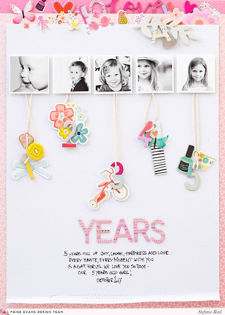
I arranged the pictures in a row, like a little time series. I was quite surprised how my little daughter changes from year to year. She's growing up so fast!
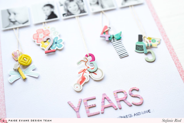
I had the idea to hang embellishments on yarn for each photo and a number for how old she is in each photo, 1, 2, 3, 4, and 5.
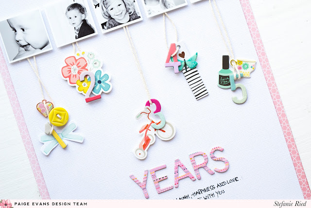
The stickers and the die cuts are from the different Paige Evans collections and are so beautiful and make it very easy to decorate. I like the many beautiful motifs, such as the tricycle from the Sticker Book from the Turn The Page collection.
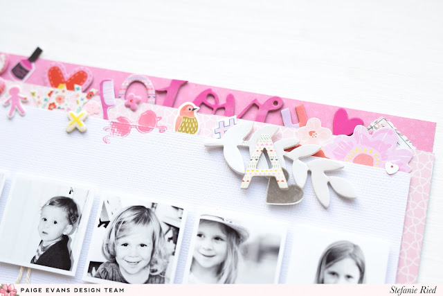
To get a little bit more color on the layout, I stuck various stickers, sequins, and die cuts at the top. This makes the layout seem more harmonious. Thanks for stopping by and I hope you have as much fun creating a layout with multiple photos as I did!

I arranged the pictures in a row, like a little time series. I was quite surprised how my little daughter changes from year to year. She's growing up so fast!

I had the idea to hang embellishments on yarn for each photo and a number for how old she is in each photo, 1, 2, 3, 4, and 5.

The stickers and the die cuts are from the different Paige Evans collections and are so beautiful and make it very easy to decorate. I like the many beautiful motifs, such as the tricycle from the Sticker Book from the Turn The Page collection.

To get a little bit more color on the layout, I stuck various stickers, sequins, and die cuts at the top. This makes the layout seem more harmonious. Thanks for stopping by and I hope you have as much fun creating a layout with multiple photos as I did!
SUPPLIES: TURN THE PAGE: Paper 01, Paper 08, Ephemera Die Cuts, Chipboard Stickers, Sequins, Wood Veneer, Thickers, Puffy Stickers, Sticker Book; OH MY HEART: Charms, Acrylic Stamps, Chipboard Stickers; TAKE ME AWAY: Mirror Stickers; FANCY FREE: Buttons
Blog: steffiried.blogspot.com / Instagram: @steffiried / Pinterest: @steffiried / Facebook: stefanie.ried.96 YouTube: Steffi Ried
I just wanna know how Steffi thinks of these beautiful designs?! So much talent in her fingers :)




Post a Comment