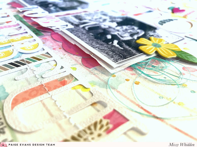
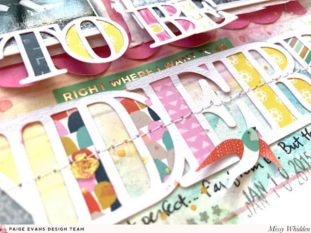
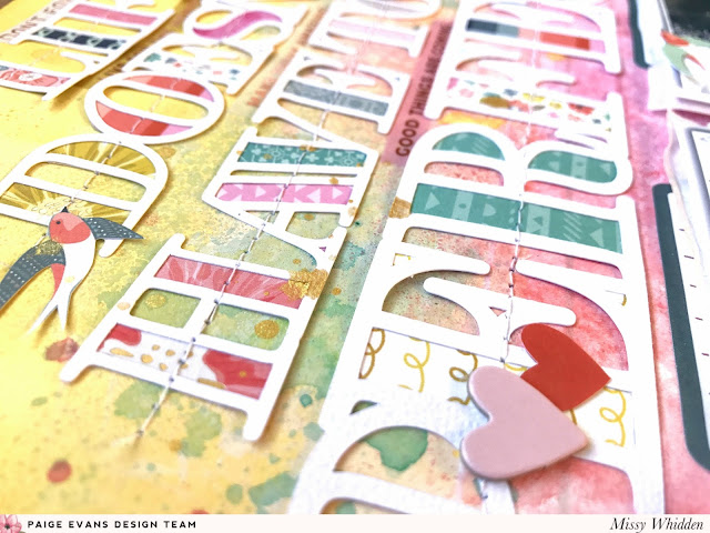
Hello again, friends! Missy here, and this week we are featuring layouts using our signature styles. I think my signature style is definitely mixed media. But I also use cut files and I sew and fussy cut a lot on my pages. So I combined all of those together for this layout! I did a bit of mixing and matching with papers and embellishments from the Turn the Page, Oh My Heart, and Take Me Away collections. I also used the Life Doesn’t Have to be Perfect cut file designed by Paige, which is available in the Silhouette Store. I enlarged parts of the cut file and made it fit my entire page. I used my Silhouette Cameo to cut it from white cardstock and used a mix of Turn the Page Paper 12 and the 6x6 Paper Pad to back the open spots. I love the mix of patterns and colors. I pulled a paper from the Take Me Away 12x12 Paper Pad to use as my background. I love the big yellow block at the top and the white striped bottom part allowed for lots of fun watercoloring.
I chose this cut file because it’s a perfect statement for me and my family. And these photos say it all… haha! We never get a perfect photo, so I have come to embrace the imperfect. I jazzed up this background paper by smudging a lot of white gesso down first. Next I used some pink, yellow, gold and aqua spray inks with plastic packaging. I smooshed and splattered until a great deal of the paper was covered. I wanted it to show through the letters and around the photos. Once it dried and I arranged the letters, I ran each word through my sewing machine. I fussy cut a few birds from the Turn the Page 6x6 Paper Pad and added a few chipboard heart stickers from the Oh My Heart Chipboard Stickers and the Take Me Away Chipboard Stickers.

I knew I wanted to have lots of color on the layout, so I printed my photos in black & white. I backed them with some tissue paper and adhesive foam for dimension and tucked in some aqua thread on both sides. I used a few chipboard flower stickers from the Oh My Heart Chipboard Stickers as well. I wanted a pop of hot pink under the pictures so I fussy cut the scalloped border piece from Oh My Heart Paper 17.

As a final touch, I added in a few phrase stickers from Paige’s 30-page #StickerBook. They’re so fun because they go with any theme you’re working with. I did add a bit of journaling down at the bottom as well as few more splatters of ink.

I hope this inspires you to create something using your signature style! And don’t forget to check out Paige’s amazing cut files over in the Silhouette Store. There are a ton to choose from, and they’re the best!
SUPPLIES: TURN THE PAGE: Paper 12, 6x6 Paper Pad; OH MY HEART: Paper 17, Chipboard Stickers; TAKE ME AWAY: 12x12 Paper Pad, Chipboard Stickers; 30-page #StickerBook; Silhouette Cameo 3; white cardstock
Facebook: missy.whidden YouTube: Missy Whidden
Do you have a signature style? What would you call or, or what do you do? I love color, patterned papers, repetition, cut files, hand and machine stitching, punching... lots of things :)


Loveeeeeee this! LOVING those colors, the title and the splatters!!!!!!!!
ReplyDelete