Love Layout by Heather Shank


Saturday, March 31, 2018

I love the perfect balance of white space and layered embellishments on this new layout by design team member Heather Shank!

Hi everyone! It's Heather here and I'm sharing another layout using the gorgeous Pick-Me-Up collection and the Polka Dot Circles Background cut file. I love circle layouts and thought it would be a fun idea to incorporate some round photos to go with the cut file.
First I used my Silhouette Cameo to cut the Polka Dot Circles Background cut file from white cardstock. I wanted to showcase all the beautiful berry tones in the Pick-Me-Up collection so I used Paper 24 to back the cut file. I fussy cut lots of beautiful flowers from Paper 02 and placed them along the left side of my layout for my photos to have some layering underneath.

I cut the same photo in three different circle sizes and backed them with a scalloped circle using the pink ombre paper with gold foiling from the 6x6 Paper Pad. I also added some hand stitching around the photos for texture. To finish off my layout I added some Chipboard Stickers for my title and had so much fun adding lots of the beautiful Rub-Ons and Puffy Stickers around the flowers.

I hope you enjoyed my layout!

SUPPLIES: PICK-ME-UPPaper 02Paper 246x6 Paper PadPuffy StickersChipboard StickersRub-Ons; Cut file: Moths by Paige Evans; Silhouette Cameowhite cardstock
Instagram: @crafts_by_heathers | Facebook: Heather Wilson Shank
I love how the photo and embellishment line is cascading at a slight angle down the left side of the page - so pretty!

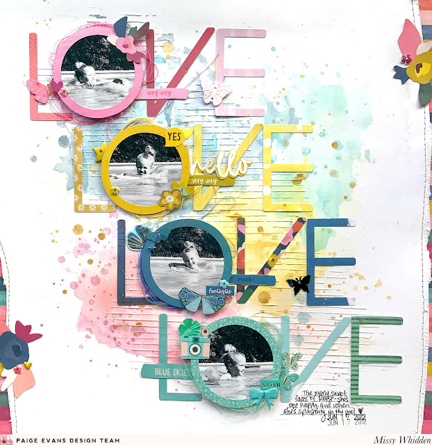
LoveLoveLoveLove Layout by Missy Whidden


Friday, March 30, 2018

How STUNNING and colorful and texturaly (yes, it's a word! :) is this new layout by design team member Missy Whidden?!
Hey, friends! Missy here, and I have a layout to share today combining four of Paige’s collections. I mostly used the Pick-Me-Up collection, but I also used some papers from Turn the PageOh My Heart, and Take Me Away collections.

I began with Paige’s LoveLoveLoveLove cut file. I cut each letter using a different patterned paper from the various collections. I decided to add smaller photos behind each of the Os and create a diagonal design. I used white cardstock as my background and jazzed it up using some Distress Oxides inks and Shimmerz Paints. I added some texture with a lined stencil and modeling paste. I embellished with lots of little goodies from the Pick-Me-Up collection.  I also added a bit of color to the edges of the layout using Pick-Me-Up Paper 16 with some fussy cut flowers from Paper 02.
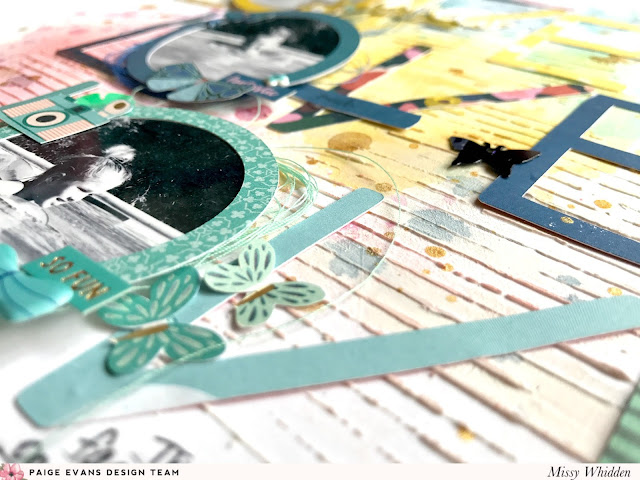
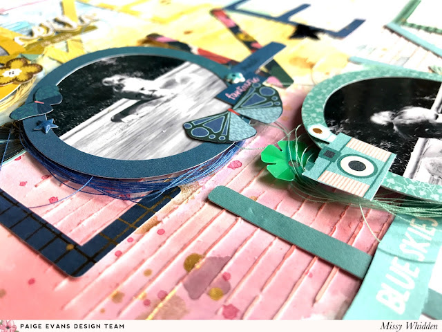
I added dimensional foam behind all the photos to make them stand up a bit and added matching thread under them for additional texture. I embellished around the photos with Pick-Me-Up Puffy Stickers, bits from the Haberdashery Multi-Pack, and some fussy cut pieces from the 6x6 Paper Pad and 2x2 Paper Pads. I did the same thing in coordinating colors for each of the photos. Here I added mostly yellow pieces.

Here you can see the coordinating embellishments for the darker blue and aqua areas. I love how the modeling paste on the background turned out. Such a simple thing, yet it creates so much detail! It’s fun to create monochromatic areas on a layout like this. It helps you decide what to use in a specific area since you are limited to one color. Plus it’s fun to sort through all of your goodies to see what you have!

I hope this gives you some fun ideas to try next time!

Check out Paige’s cut files… there are so many to choose from. This was fun to create. Thanks for stopping by!

SUPPLIES: PICK-ME-UPPaper 02Paper 04Paper 05Paper 14Paper 15Paper 166x6 Paper Pad2x2 Paper PadsStickersPuffy StickersHaberdashery Multi-PackTURN THE PAGE6x6 Paper PadOH MY HEART6x6 Paper PadTAKE ME AWAYPaper 116x6 Paper Pad; Cut file: LoveLoveLoveLove by Paige Evans; Silhouette Cameowhite cardstockmodeling pasteinks
Blog: littlenuggetcreations.blogspot.com  Instagram: @missywhidden  Pinterest: @missywhidden
Facebook: missy.whidden  YouTube: Missy Whidden
I love every single thing about this layout!! From the mixed media background to the "Os" backed with photos and everything between!

SCT 365 Class Giveaway!


Thursday, March 29, 2018

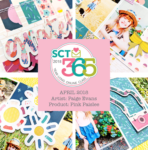
Who doesn't love a giveaway?! :) Today I am giving away one spot in Scrapbook & Cards Today's 2018 365 Year-Long online class! My month for guesting is April which is coming up in just a few days and here is a sneak of my projects - a two-page layout and coordinating card:
Some info about the class:
"SCT’s 365 Online Class was so popular in 2017 that we’re bringing it back for 2018, too! Another year is coming to an end and you’ve probably amassed quite a collection of memories and photos. SCT 365 is the perfect class to help you get those moments off your computer (or out of a shoebox) and onto pages in your family album, one month at a time! This double-page, sketch-based class features exclusive PageMaps sketches, trendy techniques (all spelled out in photos), a monthly bonus card, cutting files, complete instructions and so much more.
We’ve lined up an all-star cast of your favourite teachers, including Lisa Dickinson, Kelly Goree, Becki Adams, Paige Evans, Meghann Andrew, Jana Eubank, Jen Gallacher, Nicole Nowosad, Anya Lunchenko, Bea Valint, Stacy Cohen and Sheri Reguly!
On the 1st of each month, the new content will be available to you in the online classroom on the SCT website. Best of all, the content is available to you all year long so YOU can set the pace for this class. This class starts on January 1, 2018.
Are you ready for the amazing price? Only $25US/$28Cdn for this complete year-long class!"
***
To enter the giveaway to win a free spot in this year-long class, leave a comment on this post and tell me what is your favorite month of the year and why?! I will randomly choose a winner and update this post on Wednesday April 4th 2018 so make sure to check back then! Open internationally, please only comment once :) Thank you and good luck!
***
***UPDATED WITH THE WINNER - congrats Sarah Stegall! Please email me :) Thank you so much to everyone who entered! I loved reading all about your favorite month of the year! ***

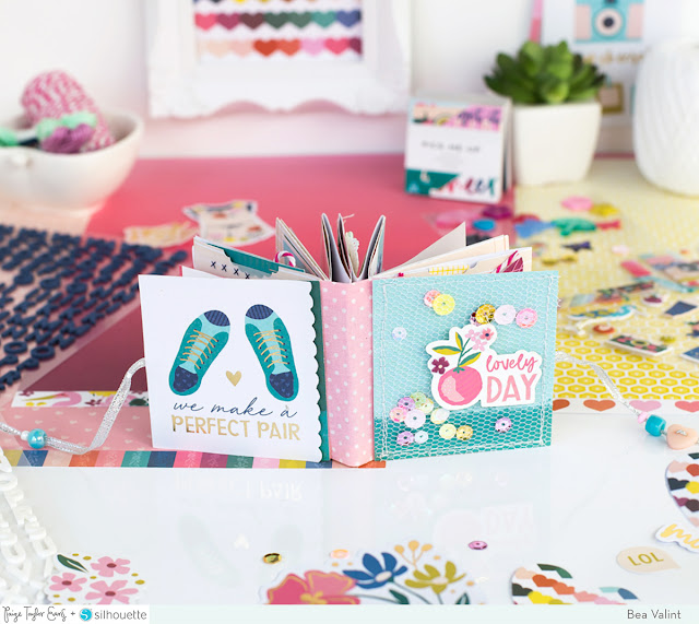
Lovely Day 1 Page Mini Album by Bea Valint


Wednesday, March 28, 2018

Mini albums are my jam and this new one by design team member Bea Valint gives me all the feels!
I think one-page mini albums are really fun and easy to put together. When I saw Paige new "1 piece of paper mini album cut file" it wasn’t a question that I had to create a mini album with it!

I started by choosing a light pink background paper from the Pick-Me-Up 12x12 Paper Pad, inserted 2 circles into the cut file ,and cut out the album from the paper. Then I folded the pages on the scored lines to finish the base of the album. To create pockets and interactive pages, I stitched together some pages. 

Usually I create the cover at the end of the process, but this time I didn’t keep the regular order. I trimmed a blue patterned paper, spread sequins, and machine stitched tulle on top. The lovely day Sticker was the perfect title for my mini album. I adhered patterned paper to the back too and placed a piece of pink material between them as the spine. This was a super easy way to create a mini album base and then I could fill it with photos and pretty bits and pieces.

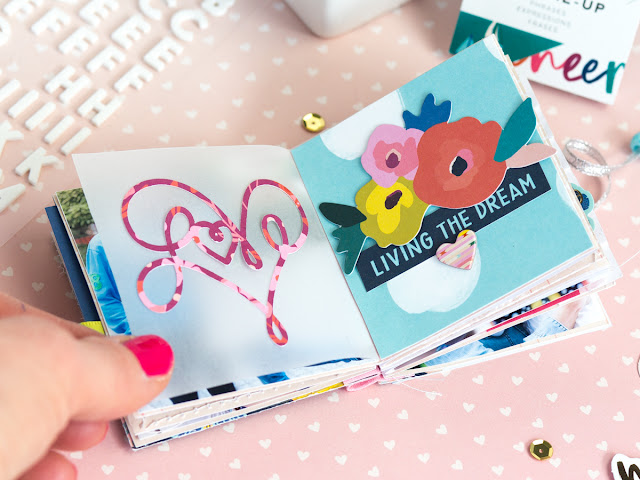
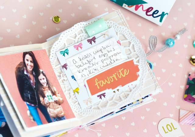
I wanted to keep my album airy and fresh, so I used light colors, a lot of vellum, rub-ons, and a few chipboard stickers and stickers from the Pick-Me-Up collection. I used them repetitively on my pages to create a cohesive look.

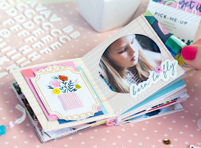
I love Paige’s beautiful heart cut files, I adhered the Heart Love cut file and the Geometric Heart cut file onto vellum to create transparent pages.

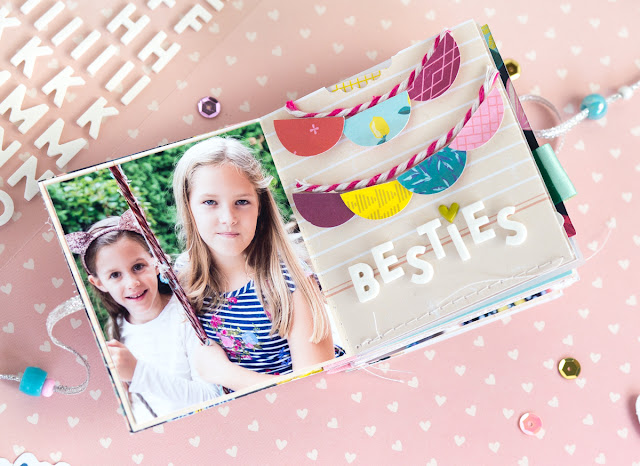
And here are some more photos of the mini album for you!
This mini album was so much fun to create! I hope I could inspire you to use Paige's "1 piece of paper mini album cut file" for your next mini album!

SUPPLIES: PICK-ME-UP12x12 Paper PadEphemera Die CutsChipboard ThickersChipboard StickersRub-OnsHaberdashery Multi-PackMini Thickers; Cut files: 1 piece of paper mini albumHeart Love, and Geometric Heart by Paige Evans; Silhouette Cameo 3white cardstock

Blog: myshinystudio.blogspot.com / Instagram: @beavalint / Pinterest: @valint7 /
Facebook: myshinystudio / YouTube: Bea Valint

I have the base for this mini album already cut and assembled, now I just need to add some photos and embellishments and hope it turns out half as pretty as Bea's! :)

Flower Layout by Stefanie Ried


Tuesday, March 27, 2018

GASP! This new layout by design team member Stefanie Ried is the bee's knees! Take a look:
Hello! It's me, Steffi. Today I want to show you a new layout. Since it is still cold and snowing here in Germany, I wanted to make something with fresh colors. I am anxiously waiting spring!
I really wanted to create a layout with flowers and I chose Paige's Rolled Flower 3 cut file. I cut out the flowers from white cardstock in different sizes using my Silhouette Cameo.

After that, I painted the lower edge of the flowers with pink acrylic paint. When the paint was dry, I rolled and glued the flowers together.

I arranged my photo in the upper right corner and I added the flowers as a nice frame. So that the whole layout looks loose and fresh, I distributed even more flowers.

To finish I added the title (from the Ephemera Die Cuts) and a few Chipboard Stickers on the layout.

Thanks for stopping by, see you next time!

Blog: steffiried.blogspot.com / Instagram: @steffiried / Pinterest: @steffiried / Facebook: stefanie.ried.96 YouTube: Steffi Ried
This is one of those layouts that definitely need to be framed!

Happy 7th Birthday Layout


Monday, March 26, 2018

Scrapbook & Cards Today is celebrating their 12th birthday! Lots of prizes and giveaways happening on their blog and here is the layout I made for the festivities:
 First, check out the process video to see how this layout came together step-by-step:
I started by making a bunch of cupcakes using a Fiskars cupcake punch. I punched one or two from every Pick-Me-Up patterned paper, more from Paper 10 which has all of the squares of different patterns. Then I chose a blue textured cardstock for the background and machine stitched lines every 1.5" across it to create a grid. I got a little crazy with more machine stitching and used a variety of colors of thread - I only switched the main thread color, I kept the bobbin white the whole time to save on time.
 I did a poll on instagram to see if I should leave the thread ends long like I sometimes like to do, or trim them up for a cleaner look. It was about 75% trim, 25% leave. I was going to leave them, but after continuing to work on the layout the threads just got in the way so I did end up trimming them and am happy with the results. Next I placed a cupcake inside each square using dimensional adhesive. I printed five 1.5" square photos and placed them over five of the cupcakes. Then I created the title "happy birthday" using the white Mini Foam Thickers. I added a "7" Chipboard Thickers number and typed "th" on my WeR Memory Keepers Typecast Typewriter to complete the title. Next I splashed white acrylic paint under each photo. The last step was to remove one of the cupcakes and write journaling in that open square with a .03 black precision pen.
  I hope this layout inspires you in some way, whether it's to dust off your punches, play with the stitches on your sewing machine, or add five tiny photos to your layout! Thanks so much for coming by today!
SUPPLIES: PICK-ME-UPPaper 01Paper 02Paper 03Paper 04Paper 05Paper 06Paper 07Paper 08Paper 09Paper 10Paper 11Paper 12Paper 13Paper 14Paper 15Paper 16Paper 17Paper 18Paper 19Paper 20Paper 21Paper 22Paper 23Paper 24Mini ThickersChipboard Thickers; Cupcake punch: Fiskars; Sewing machine: Brother; Thread: Coats & Clark; precision penwhite acrylic paint; Cardstock: American Crafts

Keep Dreaming Floral Layout by Audrey Yeager


Sunday, March 25, 2018

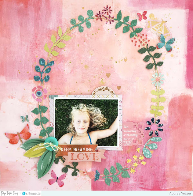
Audrey Yeager has a new layout to share today using a beautiful combination of collections and a cut file!
I love the colors in the original image of Paige's Wreath Garland cut file and I wanted to mimic that on my layout.
I pulled lots of scraps from several collections including Turn the PageFancy Free, and Pick-Me-Up. I began by separating all the bits of the cut file right in Silhouette Studio and arranged the images in a 2x2" grid, cutting papers to match.

Then I cut them with my machine and laid them out on my background paper.  The background patterned paper is from the Fancy Free collection, and I added some gesso and inks to adjust the colors a bit in the oval shape to fit the design of the cut file.


Once dry, I stitched with some green and white thread and glued down the leaves and flowers. I love the design so much, I wanted to just keep it simple, so I added a few chipboard phrases and a few more leaves. The butterflies came from chipboard, rub-ons, and ephemera packs.

SUPPLIES: PICK-ME-UPRub-OnsChipboard StickersFANCY FREE: Background paper, 6x6 Paper Pad; TURN THE PAGE6x6 Paper PadChipboard StickersEphemera Die CutsJournaling Spots; Cut file: Wreath Garland by Paige Evans; Silhouette Cameo
Blog: audreysreflection.blogspot.com / Instagram: @audreykit1 / Pinterest: @audreykit /
Facebook: Audrey L. Yeager  / YouTube: Audrey Yeager
Sometimes all you need is a pretty wreath to create a beautiful and stunning page!

Hang in There Layout by Lorilei Murphy


Saturday, March 24, 2018

Lorilei Murphy has gone and done it again - made another jaw dropping layout with the perfect balance of white space and interest!

I was perusing Paige's cut files and spotted the Hang In There - I thought it would be super cute on a layout with bits and pieces hanging from it!
I cut the file from white cardstock using my Silhouette Cameo 3 and then in the Silhouette software I used the offset feature and then deleted the original cut file so I would have a second layer with a large border. I painted the cut file with 2 coats of Martha Stewart gold paint and after it dried I glued it onto the border layer. I cut five of the Dipped Leaves and painted the tips gold as well.

On my background I splattered some Heidi Swapp Gold Color Shine and then selected some cute pieces from Pick-Me-Up. I added a gold eyelet to my photo and to one of the tags and then attached the bits to the hanger with white crochet thread. All of the tags are cut from Paper 13 and I added a cute little umbrella button from the Haberdashery Multi-Pack to the end of one of the strings.

Blog: roseyposeystudio.com / Instagram: @roseyposey_studio / Pinterest: @roseyposeygirl /
Facebook: 
Rosey Posey Studio / YouTube: Lorilei Murphy
I really love how Lor used the offset feature to create a mat for the cut file design!

Love Layout by Flóra Farkas


Friday, March 23, 2018

The more I look at this layout by Flóra Farkas the more details I find and the more I love it!
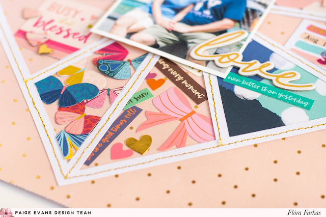
Hi girls! Today I want to show you my new layout made with the Pick-Me-Up collection, featuring the 12x12 Paper Pad and 6x6 Paper Pad that include fantastic gold foil! The shiny touch can make your creations so much prettier! For the background I used a peach paper with tiny gold foil dots from the 12x12 Paper Pad then I die cut Paige's Pie Chart Heart cut file from textured white cardstock and backed it with lots of papers and embellishments.
I backed few of the sections with papers from the 6x6 Paper Pad. The small paper pad is great for backing cut files because the patterns are much tinier.
Other sections I filled up with different embellishments. I used StickersRub-OnsHaberdasheryChipboard ThickersChipboard StickersEphemera Die Cuts, and Journaling Spots.
I machine stitched around the heart with gold thread. I just love the result, it's so lovely. In the middle I placed our photo and added the beautiful love title from the Chipboard Stickers. It was tons of fun to create this page. I really loved to back the cut file with wonderful and colorful products from the Pick-Me-Up collection. I hope you like my layout and will try it out!
Facebook: pinkandpapergift YouTube: Flora Monika Farkas
I love the simplicity of the idea behind this layout - filling each section with little things! So cute and lovely!

Books Layout


Thursday, March 22, 2018

Here is my last layout from Paige's Pages 15 at Big Picture Classes!
When it came time to make this last of four layouts, I was fresh out of ideas… I’d used them all up on the first three layouts! I asked Chris what I should do and he said I should make something minimalist. Hahaha! I just can’t, I don’t know how. But I decided to start simple – with my cut file called Frames Background. When all else fails I turn to cut files and I try to design them with scrapbookers in mind.
I backed the little photo openings with patterned papers and three little photos of Jane reading a book on THE pink couch. I say “THE” because this very couch was turned into a die cut in Take Me Away a couple years ago. I hadn’t used it yet but had planned to when I took these pictures early last year when we still lived in Germany. Finally, the stars aligned and I got to use it!
Going along with the book theme, I found book stickers and papers throughout my collections and went to town decorating with all things “reading” themed like pencils and coffee mugs and frames like you would see in a little reading nook. The start-to-finish process video can be found over in the class if you're curious to see exactly how this layout came together.
Paige Taylor Evans © // Quinn Creatives DESIGN