After dabbling in mixed media the last couple weeks, this new layout by design team member Missy Whidden makes my heart go pitter patter!
Hello again, friends! Missy here, and I have a fun & bright layout to share using the Pick-Me-Up collection. I began by cutting Paige’s Rainbows Background cut file from some white cardstock and using it as a stencil. I placed it over some smooth white cardstock and then used a palette knife to scrape lots of colored texture pastes over it. I also used a few ink sprays. I wanted to get a lot of the deep and rich colors on the background, mainly the pinks, reds, and mustard yellow. I decided to scrap a pool photo since it had lots of blue in it and I love how it contrasts against the deep background colors. I fussy cut a few flower clusters from Paper 02 and layered them around the photo.
Using cut files as stencils is another fun way to add interest to your layout. I love the shapes this one created. It makes such a cool background. Once it was dry, I came back in with more of the sprays and used the packaging technique to spread more color around. I added in some blue sprays to play off the color in the photo. To add even more texture, I layered in some coordinating colors of thread along with some floral Stickers.

Since I had some white empty space on the left side of my photo, I layered the flower clusters over it. I tucked in some Stickers and a Rub-On. I added my journaling right under the bottom of the mixed media area of the page.

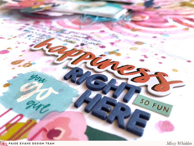
I created a title cluster down on the bottom half of the page using lots of items from the Pick-Me-Up collection. I used some of the Chipboard Stickers and Mini Thickers to create the title and then added some more Rub-Ons and Stickers.

I really love how this turned out. I hope it inspires you to try using a cut file as a stencil to make your own background design or embellishments or even patterned paper! Thanks so much for stopping by and have a great week!
SUPPLIES: PICK-ME-UP: Paper 01, Paper 02, Paper 16, Rub-Ons, Chipboard Stickers, Stickers, Mini Thickers; white cardstock; Distress Oxides inks; gesso; Silhouette Cameo 3; Cut file: Rainbows Background by Paige Evans
Using cut files as stencils is another fun way to add interest to your layout. I love the shapes this one created. It makes such a cool background. Once it was dry, I came back in with more of the sprays and used the packaging technique to spread more color around. I added in some blue sprays to play off the color in the photo. To add even more texture, I layered in some coordinating colors of thread along with some floral Stickers.

Since I had some white empty space on the left side of my photo, I layered the flower clusters over it. I tucked in some Stickers and a Rub-On. I added my journaling right under the bottom of the mixed media area of the page.

I created a title cluster down on the bottom half of the page using lots of items from the Pick-Me-Up collection. I used some of the Chipboard Stickers and Mini Thickers to create the title and then added some more Rub-Ons and Stickers.

I really love how this turned out. I hope it inspires you to try using a cut file as a stencil to make your own background design or embellishments or even patterned paper! Thanks so much for stopping by and have a great week!
SUPPLIES: PICK-ME-UP: Paper 01, Paper 02, Paper 16, Rub-Ons, Chipboard Stickers, Stickers, Mini Thickers; white cardstock; Distress Oxides inks; gesso; Silhouette Cameo 3; Cut file: Rainbows Background by Paige Evans
Blog: littlenuggetcreations.blogspot.com Instagram: @missywhidden Pinterest: @missywhidden
Facebook: missy.whidden YouTube: Missy Whidden
Facebook: missy.whidden YouTube: Missy Whidden
Love love love all the color and textures created from using the cut file as a stencil! Unbelievably beautiful!


Ohhhhhhh this is GORGEOUS! LOVING those colors!!!!!
ReplyDelete