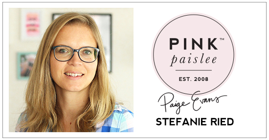
The way Stefanie Ried uses thread and sequins is like no other! Check out this beautiful ombre effect layout:
My last design team layout was very colorful, so on this page I focused on the color pink. I really like Paper 23 from the Pick-Me-Up collection with the ombre effect from light to dark. Accordingly, I also selected the string.
With the black and white photo, it looks delicate and light and that's why I used thin sewing thread.

First I wanted to sew the background with the sewing machine as I have often done. I tried it, but you couldn't see the colors of the string very well, so I chose thicker thread. But this did not look too great either. I ended up using a fine sewing thread because the background should be delicate and light.

I first stuck the paper on a cardboard so it does not curl when I wrap the yarn. Then I stabbed the holes with a piercer.

Now with the needle the thread is wound through the holes. I started with white sewing thread first. After that always a shade darker. This is how the ombre effect comes into its own. In some places I wrapped the thread twice and sometimes I added different sequins. I added a mini glue dot underneath the sequins so they stay put.

I hope you enjoy my layout today!
With the black and white photo, it looks delicate and light and that's why I used thin sewing thread.

First I wanted to sew the background with the sewing machine as I have often done. I tried it, but you couldn't see the colors of the string very well, so I chose thicker thread. But this did not look too great either. I ended up using a fine sewing thread because the background should be delicate and light.

I first stuck the paper on a cardboard so it does not curl when I wrap the yarn. Then I stabbed the holes with a piercer.

Now with the needle the thread is wound through the holes. I started with white sewing thread first. After that always a shade darker. This is how the ombre effect comes into its own. In some places I wrapped the thread twice and sometimes I added different sequins. I added a mini glue dot underneath the sequins so they stay put.

I hope you enjoy my layout today!
SUPPLIES: PICK-ME-UP: Paper 23, Chipboard Thickers, Chipboard Stickers, Ephemera Die Cuts, Puffy Stickers, Puffy Stickers, Stickers, Haberdashery Multi-Pack; Other: Sequins, threads, paper piercer, cardboard
Blog: steffiried.blogspot.com / Instagram: @steffiried / Pinterest: @steffiried / Facebook: stefanie.ried.96 YouTube: Steffi Ried


Very clever! Really turned out beautifully!
ReplyDeleteWow!! This is GORGEOUS! LOVING that stitching!!!!!!!!!!!!
ReplyDelete