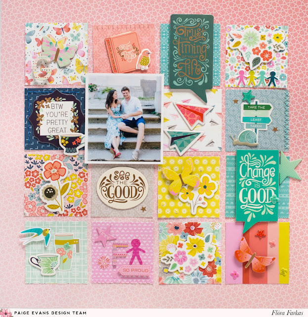
A grid-based layout is always an excellent design choice like on this new layout by design team member Flóra Farkas!
Hi girls! Today I'll show you one of the layouts I made last fall but I never shared it. I used the gorgeous Turn the Page collection to create a tone-on-tone technique page. I used the B-side of Paper 01 for my background and Paper 12 for all of the squares.
I cut apart the small squares and selected 15 pieces. I arranged them on the background paper and glued them down. I placed my 3x4 photo which I highlighted with foam tape.
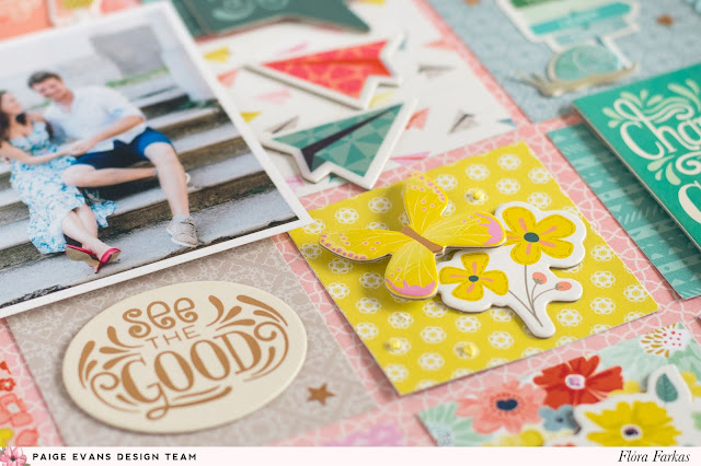
The fun started and I decorated all the little squares with matching colored embellishments. I added Chipboard Stickers, Puffy Stickers, Thickers, and pieces from the Sticker Book. I adhered some of them with foam tape to create more dimension.
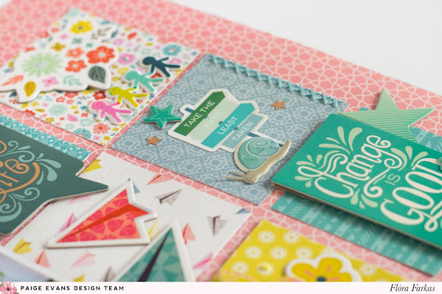
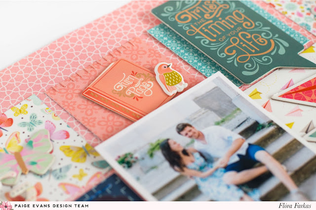
In the end, I added hand stitching here and there. I love the simplicity of the page but I still managed to add many cute details.
Thanks for stopping by!
SUPPLIES: TURN THE PAGE: Paper 01, Paper 12, Chipboard Stickers, Puffy Stickers, Sticker Book, Thickers
 Blog: pinkandpapergift.blogspot.com Instagram: @floramfarkas Pinterest: @floramfarkas
Facebook: pinkandpapergift YouTube: Flora Monika Farkas
I cut apart the small squares and selected 15 pieces. I arranged them on the background paper and glued them down. I placed my 3x4 photo which I highlighted with foam tape.

The fun started and I decorated all the little squares with matching colored embellishments. I added Chipboard Stickers, Puffy Stickers, Thickers, and pieces from the Sticker Book. I adhered some of them with foam tape to create more dimension.

In the end, I added hand stitching here and there. I love the simplicity of the page but I still managed to add many cute details.

Thanks for stopping by!
SUPPLIES: TURN THE PAGE: Paper 01, Paper 12, Chipboard Stickers, Puffy Stickers, Sticker Book, Thickers
 Blog: pinkandpapergift.blogspot.com Instagram: @floramfarkas Pinterest: @floramfarkas
Facebook: pinkandpapergift YouTube: Flora Monika Farkas



Post a Comment