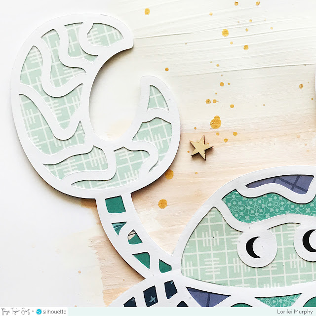
We all have those days where life gets us down, but even the not-so-fun times need to be documented! I love this new layout by design team member Lorilei Murphy pairing a cute critter with a silly saying.
I just had to! I know it is silly and goofy but it's fun! When I saw Paige's Crab cut file I immediately thought of the "don't be crabby" title and I knew I had a few pictures to pick from. I like to take all kinds of photos and if I happen to capture someone in a not so great mood, that's ok with me!
I started out with white cardstock and cut the crab using my Silhouette Cameo 3. At the same time, I cut a "crabby" title just to have on hand, in case I wanted to use it on my page. I went through my Paige collections and decided on Pick-Me-Up and Turn the Page. I thought the blues would make a fun page.

Before I got to work on my cut file I painted some washes of white and sandy colored paint onto my background so that could dry. I also added a few splatters with Heidi Swapp Gold Color Shine. I backed the crab with a mix of all the blue papers - I intended to have an ombre effect but I ended up liking darker arms and the darker spots on top of his head, I think it gave the crab more dimension to vary the blues.

I kept the layout simple. I layered some ephemera behind the photo and tucked it in by the crab legs. I used the super cute alpha that comes with Pick-Me-Up and then added my cut paper title. I love how the page turned out!
SUPPLIES: PICK-ME-UP: 12x12 Paper Pad, Rub-Ons, Ephemera Die Cuts, Stickers, 2x2 Paper Pads; TURN THE PAGE: 6x6 Paper Pad, Wood Veneer; Cut file: Crab by Paige Evans; Die cut machine: Silhouette Cameo; white cardstock; Heidi Swapp Gold Color Shine
Blog: roseyposeystudio.com / Instagram: @roseyposey_studio / Pinterest: @roseyposeygirl /
Facebook: Rosey Posey Studio / YouTube: Lorilei Murphy
Facebook: Rosey Posey Studio / YouTube: Lorilei Murphy


HA!!!!! Tooooooooo funny! I love love love this! LOVING that crab and the title is perfect!!!!
ReplyDelete