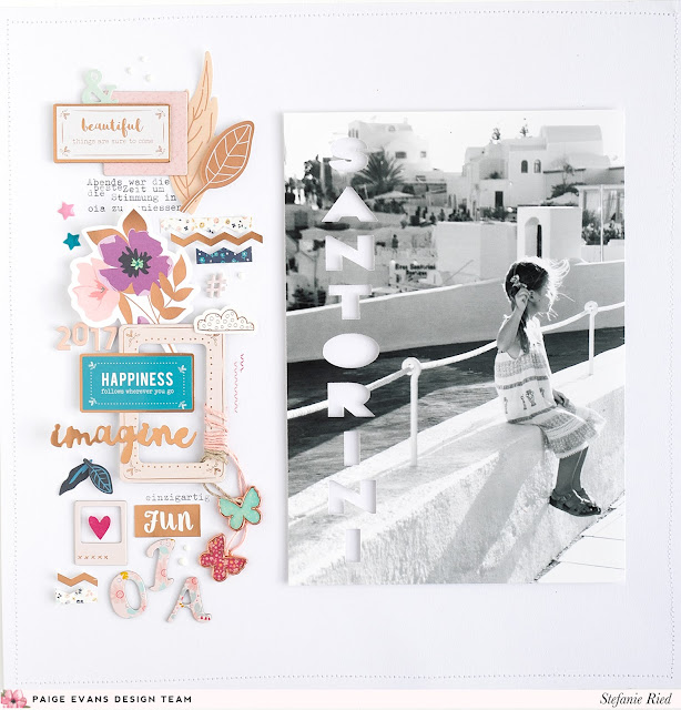
Hello and welcome to another layout from me, Stefanie Ried! Today I show you another layout with the Whimsical collection. This time I dared to change the color scheme. I don't think you can tell right away that it's the colorful Whimsical collection right?!
I like to experiment with colors schemes right now. The possibilities are endless. Since the collection contains all colors, it is even more fun to play with them :)
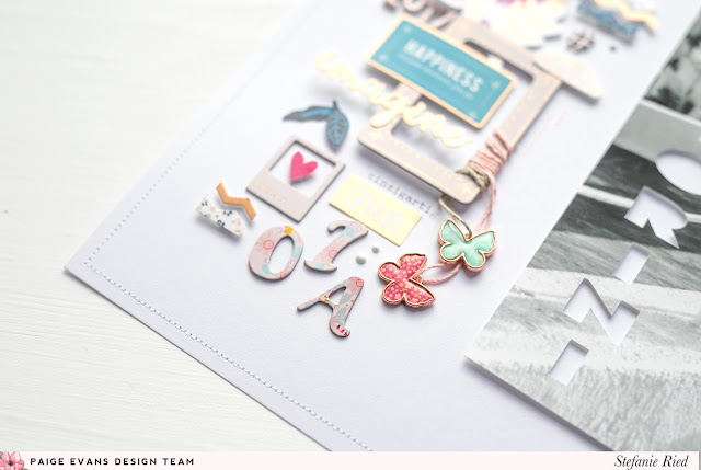
I once again used a large photo and a 12x12 format (I usually stick to 8.5 x 11!). First I wanted to place the embellishments around the photo, but then I decided for this design. I thought about the placement of the title a lot. Where should I put it? At some point I had the idea to cut the title out of the photo using a Silhouette Cameo.
I hope you like it and see you next time!
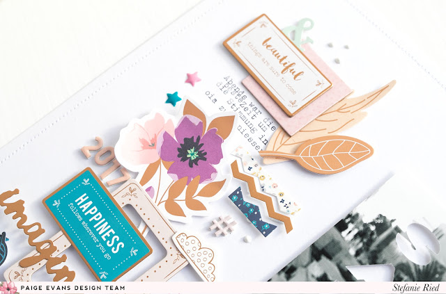
SUPPLIES: WHIMSICAL: Chipboard Thickers, Foam Mini Thickers, Chipboard Stickers, Ephemera Die Cuts, Puffy Stickers, Stickers, Rub-Ons, Sticker Book, Butterfly Charms, Floral Die Cuts, Enamel Shapes
Blog: steffiried.blogspot.com / Instagram: @steffiried / Pinterest: @steffiried / Facebook: stefanie.ried.96 YouTube: Steffi Ried


Just gorgeous! LOVING that photo and the cluster of goodies!!!
ReplyDeleteWhat a great idea to cut the title from the actual photo!
ReplyDelete