Hello lovelies, Zsoka Marko back today with a new layout! Awhile back I was working on some cards for Spellbinders (you can check the blog post here) for some of which I used Paige's older collections and all of a sudden I felt the urge to use one of those for my new layout. I chose Take Me Away because it's what I used least in the past. At the time it came out I still refused to use flowers and feminine colors on my boy layouts so I didn't buy a whole lot of the collection. It's a shame really because it is gorgeous!

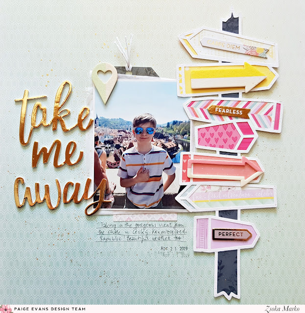
Now that I use whatever I want/like on my layouts, I totally could have gone with flowers, right?! Then what do I do? I pick a cut file that is not all that feminine nor does it have anything to do with flowers hahaha! The most photos we have are from our travels and now that I don't make a lot of layouts I wanted to make sure I scrap those photos first. So I guess give me all the travel themed collections, ha! Anyhooo... The cut file I chose is called Signage Post, I thought it would be perfect for a travel layout. I totally love road signs. I backed the cut file with different patterned papers: I started with yellow tones at the top then pinks and purples going down. For the pole itself I chose a stunning black floral paper.

I added some tissue paper, tags, and die cut frames behind my photo and glued it all down around the middle of my page. I placed the cut file on foam adhesive and attached it to my background, slightly overlapping my photo. I selected some embellies which I added on top of the signs: chipboard and wood veneer arrows. I also glued a wood veneer geo tag on my photo. These pieces are so cute!

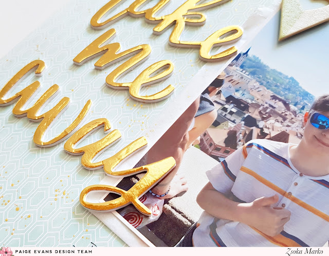
Lastly, I added my title, journaling, and date. The title is from the Foam Phrase Thickers pack. I think now I only have two words left (and I had two packs) which is so sad because it's one of my favorites! The font is perfection, the words/phrases are versatile, and there is a sheet of gold words as well as the most amazing pearl white I ever did see! I truly don't have anything else in that color and it literally fits everything.

That's it for today! I hope I could inspire you to dig into some of your older stash and create something lovely! I for one love working with older collections!

Now that I use whatever I want/like on my layouts, I totally could have gone with flowers, right?! Then what do I do? I pick a cut file that is not all that feminine nor does it have anything to do with flowers hahaha! The most photos we have are from our travels and now that I don't make a lot of layouts I wanted to make sure I scrap those photos first. So I guess give me all the travel themed collections, ha! Anyhooo... The cut file I chose is called Signage Post, I thought it would be perfect for a travel layout. I totally love road signs. I backed the cut file with different patterned papers: I started with yellow tones at the top then pinks and purples going down. For the pole itself I chose a stunning black floral paper.

I added some tissue paper, tags, and die cut frames behind my photo and glued it all down around the middle of my page. I placed the cut file on foam adhesive and attached it to my background, slightly overlapping my photo. I selected some embellies which I added on top of the signs: chipboard and wood veneer arrows. I also glued a wood veneer geo tag on my photo. These pieces are so cute!

Lastly, I added my title, journaling, and date. The title is from the Foam Phrase Thickers pack. I think now I only have two words left (and I had two packs) which is so sad because it's one of my favorites! The font is perfection, the words/phrases are versatile, and there is a sheet of gold words as well as the most amazing pearl white I ever did see! I truly don't have anything else in that color and it literally fits everything.

That's it for today! I hope I could inspire you to dig into some of your older stash and create something lovely! I for one love working with older collections!
SUPPLIES: TAKE ME AWAY: patterned paper, chipboard stickers, Thickers, wood veneer; white cardstock; Die cut machine: Silhouette Cameo; Cut file: Signage Post by Paige Evans
Blog: apocketfullofscrap.blogspot.com / Instagram: @zsoka_marko / Facebook: Zsoka Marko / YouTube: Zsoka Marko


This is AMAZING! LOVING all the arrows!!!
ReplyDelete