We Are Better Together Layout Layout by Kelly Daye


Friday, January 31, 2020

Hello friends, it’s Kelly Daye, here with a rainbow Valentine layout using one of my favorite collections by Paige - Horizon. I do hope you’re not tired of seeing rainbow layouts because I’m just crazy for color. Maybe you noticed, ha!
My whole design stemmed from wanting to use Paige’s You Are Background cut file. I think it’s so dang cute with phrases like, "you are the peanut butter to my jelly," "the cheese to my macaroni," "the water to my ocean," and many more sweet and whimsical notes of adoration. As always, I used white cardstock and cut it on my Silhouette Cameo. Paper 12 provided the perfect backing because of all the color that peeks through. I pretty much squealed when they came together. Do you get this excited?

Then, what else would there be on a Valentine page but a heart? The pretty rainbow heart is Paige’s Swirl Heart cut file and backed with glorious Paper 03. I wanted to surround the heart with a rainbow of sequins (from my stash) but didn’t want to cover up the outer white boarder of the heart. So I created a white backing, slightly bigger, using the offset feature in Silhouette Studio. I included holes for my stitching in the cut file so my sequins would be perfect. Sparkle and shine!

There’s a tiny heart opening in the very center of the Swirl Heart cut file and I tossed around some ideas to fill it. Maybe a shaker or some flowers laid beneath? I went through the 2x2 Paper Pads and found a very tiny "love you" in a pink heart - oh-so perfect! My rainbow infused heart was popped up with foam tape precisely over top so that it’s like a secret message waiting to be found.

I built up some colorful floral bouquets around my wedding photos using the Floral Die Cuts. Wow, you don’t quite notice the changes in yourself until you look at photos from 2001, ha! We’re still cute to each other though. My title is made using the Foam Mini Thickers from Paige’s Whimsical collection. You got tons in the set! Some of the butterflies are from both the Chipboard Stickers and some fussy cut from Paper 07. Finally, I splattered watered down white acrylic paint then dabbed on Prima Gold Paint and Stickles.

With that, I’ll wish you all a very happy Valentine’s celebration soon! See you again shortly!

SUPPLIES: Patterned papers, stickers, embellishments, die cuts: HORIZONFoam Mini ThickersWHIMSICALwhite cardstock; Die cut machine: Silhouette Cameo 3; Cut files: You Are Background and Swirl Heart by Paige Evans
 Location: Edmonton, Canada / Blog: Kelly Made It / Instagram: @kellymadeit / Facebook: Petals Daye / Pinterest: Kelly Made It

Love Layout by Zsoka Marko


Thursday, January 30, 2020

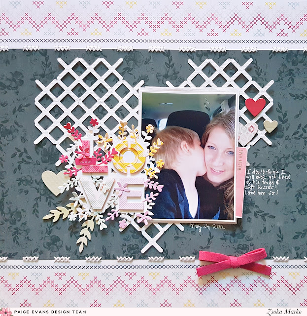
Hello there crafty peeps, Zsoka Marko stopping by to share a new layout I've created for the Paige Evans Design Team. I've used the wonderful Take Me Away collection again. As far as I remember, I've never made a layout with this gorgeous black floral paper before, so I wanted this to be my focal point. Unfortunately I didn't have a full 12x12 sheet so I had to come up with some solution to fill up my page!
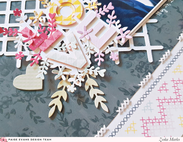
Eventually I decided to adhere the black floral paper onto this cross stitch paper. To play off that design, I added a few cross stitches using white embroidery floss. I modified Paige's Cross Stitch Heart cut file in that I moved the single crosses closer together and welded them. I then cut it from textured white cardstock. I glued it down in the middle of my page.

For my title I decided to use a stunning die from Spellbinders (it's actually the January 2020 Small die of the month kit). I cut the base from white cardstock then the letters and flowers from a bunch of patterned papers in four colors. I used foam tape to attach the letters to the base to create a dimensional piece.

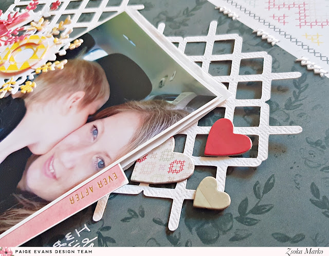
I layered white tissue paper behind my photo and tucked in die cuts from the ephemera pack. I barely have any embellies left from Take Me Away unfortunately but I managed to add a few chipboard hearts, a couple of chipboard leaves, and a suede bow. Last but not least I added my journaling and date using a white gel pen.

That's it for today! I hope I could inspire you in one way or another! Thanks so much for stopping by! Have an awesome day!

SUPPLIES: Patterned papers, die cuts, stickers, embellishments, bow: TAKE ME AWAYwhite cardstock; Die cut machine: Silhouette Cameo; Cut file: Cross Stitch Heart by Paige Evans
Blog: apocketfullofscrap.blogspot.com // Instagram: @zsoka_marko // Facebook: Zsoka Marko // YouTube: Zsoka Marko

Live Life in Full Bloom Layout


Wednesday, January 29, 2020

Hey there! Popping in to share a new layout made with Bloom Street!
Check out the process video to see how this page came together quickly & easily:

I started by die cutting my Flower Frame cut file from white cardstock using a Silhouette Cameo. To get a clean cut, I used textured white cardstock by American Crafts, a brand new Ratchet Blade set to a depth of 3, and speed of 2. It took about an hour for the machine to cut this design and then I took some time to peel it off the mat and clean out any hangers ons.

For the background I used the yellow floral B-side of Paper 14, lightly adhered the cut file on top, then machine stitched around the edges to secure the cut file in place. I added a photo of Jane standing in front of a HUGE flowerpot under the left side and began embellishing.

I created one big cluster focused around the left side of the photo and used all the remaining flowers I could find from Bloom Street - there are TONS of flowers throughout this collection, but for the first 8 layouts I made with it I challenged myself to only use 1 of everything as if it were a kit I got in the mail, no double dipping into new packs of products. So I had already used a lot of flowers at this point (this was layout 5 of 8 at the time) but still found plenty in the Ephemera Die CutsCardstock Stickers4-Page Sticker Book, and even a few fussy-cut florals.

Foam adhesive was used to attach all of the flowers to create depth and dimension and I started by placing the largest flowers first, followed by the medium-sized flowers, then the tiny ones. The main flower cluster and title is a sticker from the Cardstock Stickers with "live life in full bloom" overlapping the photo.

 I scattered colored jewels from the Mixed Embellishments around the flowers for bits of eye candy and wrote journaling with a blue pen around the bottom curve of the cut file to blend it into the design. I trimmed a scalloped card from the Ephemera Die Cuts to add to the bottom of the photo and layered a floral sticker strip from the 4-Page Sticker Book on top. That finishes up this page!

With the help of an intricate Flower Frame cut file and a smattering of floral embellishments, this page came together quickly (sans the time it took the machine to cut the file and peel it off the mat) and easily! I hope you are inspired to grab my brand new Bloom Street collection and start documenting all your favorite memories!

SUPPLIES: Patterned paper, stickers, die cuts, embellishments, jewels: BLOOM STREETwhite cardstock; Die cut machine: Silhouette Cameo; Cut file: Flower Frame by Paige Evans; sewing machinewhite thread; Printer: Canon Pro-100Canon photo paper

14 Days of Valentine/Love Cut Files


Tuesday, January 28, 2020

Similar to the 25 Days of Christmas Cut Files, I am offering 14 Days of Valentine/Love Cut files for $14!
💗💗💗
Celebrate the season of love and friendship with 1 new and exclusive love-themed cut file emailed to you every day From February 1st to Valentine's Day! These cut files will only be available as a bundle and not sold individually anywhere else. Purchase here
💗💗💗
The cut files will be emailed to you daily starting February 1st through 14th as a .zip folder which when opened will contain the .studio3, .SVG, .PNG, .DXF, .PDF, and .JPG files - so even if you don't have a cutting machine you can still print and cut out the designs for using on your crafty projects! There is a good mix of designs in this bundle - from flowers and hearts to tags, stamps, titles, and icons, these cut files will work for many occasions! 
💗💗💗
Let me know if you have any questions!

Shaker Pocket Lightbulbs Layout by Elsie Robinson


Hey everyone! It’s Elsie Robinson here with a new layout using one of my favorite of Paige’s cut files: Lightbulb Flowers. I’ve wanted to create some shaker elements on my layout using this cut file ever since I saw it, so I’m glad I finally got around to creating this page! I used the Truly Grateful collection to make this layout.
I firstly started in my Silhouette Studio software. I knew I wanted to have three the lightbulbs on my layout in different sizes, but I just wanted the largest one to have the flowers. So I took the knife tool and carefully cut away the stems of the flowers so I could delete them from the bulb. I then used the points editing tool to neaten up the edges, so I was left with a blank bulb. I cut the bulbs from white cardstock and went ahead and backed them with papers. For the large bulb I used Paper 14 that has all the different squares of patterns to back the flowers and leaves. I also backed each of the bulb screw caps with gold mirror cardstock to give the look of metal.

Next I created my shaker elements in the lightbulbs. To do this I firstly adhered the bulbs onto acetate. I then added clear and iridescent sequins (from my stash) onto the acetate and then adhered vellum over the top to seal the shaker pockets. I used transparent materials like vellum and acetate to recreate the transparent look of lightbulbs. I really love the interactivity and sparkle this adds to my layout.

Finally, I chose Paper 16 from Horizon as my background paper, as I really liked the contrast of the rich royal blue pattern against the soft and delicate light bulbs. I used a range of Truly Grateful embellishments to decorate my page like the Floral Die Cuts, the butterfly Puffy Stickers, and my ‘be a light’ title came from the Ephemera Die Cuts which works perfectly with the cut file!

Thanks for stopping by, make sure you check out all of Paige’s cut files for loads of crafty inspiration!

SUPPLIES: Patterned papers, stickers, die cuts: TRULY GRATEFUL; Patterned paper: HORIZONwhite cardstock; Die cut machine: Silhouette Cameo 3; Cut file: Lightbulb Flowers by Paige Evans
Location: England / Blog: Hey Elsie Instagram: @heyelsie_ / Facebook: Elsie Robinson / YouTube: Elsieeee / Pinterest: heyelsie

You Amaze Me Layout by Brianna Lepper


Monday, January 27, 2020

Hi friends! Brianna Lepper here with this fun monochromatic green layout using Paige's Stars Border Frame cut file along with her Truly GratefulHorizon, and Whimsical collections.
I challenged myself and stepped out of my comfort zone for this layout. I usually don't reach for or typically create with the color green as the base for a layout but when I saw how pretty the grass was in this photo, it inspired me to create this monochromatic page!

First, I cut the Stars Border Frame cut file out on white cardstock with my Silhouette Cameo. After that was finished cutting, I went back to the cut file on the Silhouette software and offset the inner star pieces so that I could cut them out and back my cut file with them. I went through Paige's collections and pulled green patterned papers and used those to cut the stars out. I let the Silhouette do the work for me! It honestly saved me so much time in fussy cutting. The star shape isn't too hard to fussy cut, but since there were so many in this cut file, I thought it would be easier this way.

After all of the stars were backed, I splattered white acrylic paint around the page and then I popped the entire thing up on dimensional adhesive. I love how it creates that extra pop and adds shadows to the whole page. For my title I used one of the 2x2 Paper Pads from Whimsical and backed it with a Journaling Spot from Truly Grateful. I went through my embellishment stash and pulled some green items here and there. I pulled Chipboard Stickers and Epoxy Stickers from HorizonEpoxy Stickers from Truly Grateful, and sPuffy Stickers from Whimsical. I love that even though I've used different things from several of Paige's collections, it all goes together so well!

Thank you so much for stopping by today and I hope that I've inspired you to step out of your creative box and try something new! If you haven't given a monochromatic layout a try yet, I encourage you to do so! It's so much fun and it gets you to use some of those small bits. See you in my next post!

SUPPLIES: Patterned papers, stickers, die cuts, embellishments: TRULY GRATEFULHORIZON, and WHIMSICALwhite cardstockwhite acrylic paint; Die cut machine: Silhouette Cameo; Cut file: Stars Border Frame by Paige Evans
Location: Louisiana, USA / Blog: I Love Paper Blog / Instagram: @briannalepper / Facebook: Brianna Nichole
YouTube: Brianna Lepper / Pinterest: Brianna Lepper

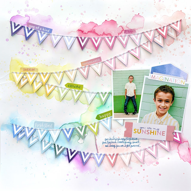
You Are My Sunshine Layout


Sunday, January 26, 2020

Yay I scrapped a layout for Fox using Bloom Street! :)
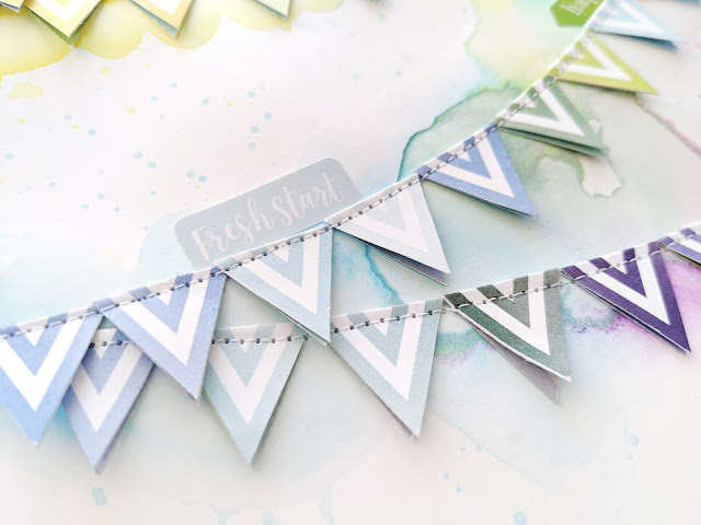
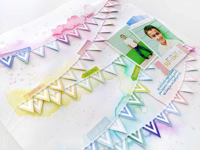
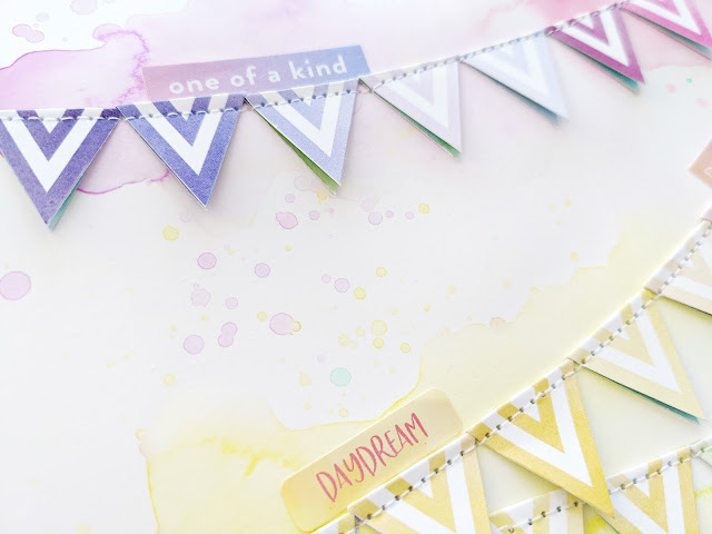
As soon as I saw the colorful diamond Paper 10 I immediately thought of banners and pennants. So I started cutting out the diamonds into their individual shapes and sorted them by color. Note - I didn't cut all of them out, I'd say about 1/3, maybe half.

I knew I wanted some mixed media on the background so I grabbed a sheet of Vicki Boutin White Foundations Media Paper and Pastel Dreams watercolors. I pooled big puddles of water in a swooping banner design across the background, dropped in a rainbow of pastel watercolors, and set it aside to dry.

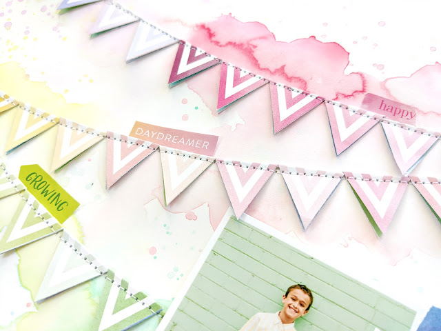
While the background was drying I folded all of the colored paper diamonds in half to make pennants. I placed the pennants color-on-color over the dried watercolors and then machine stitched with white thread over the tops to finish the banner look. I added two pics of Fox overlapping on the right side.

To embellish I grabbed a few sentiment stickers from the Cardstock Stickers and 4-Page Sticker Book and placed them also color-on-color above the pennants. I chose words that reminded me of Fox. From the Ephemera Die Cuts I grabbed a purple tag and "you are my sunshine" ticket and layered them under/over the photos. Paper 04 is filled with words and phrases so I fussy cut "imagination" and placed it at the top of one photo. To finish I wrote journaling with a blue pen in the open space below the pictures.

I hope this page inspires you to scrap photos of your little guy using Bloom Street!

SUPPLIES: Patterned papers, stickers, die cuts, embellishments: BLOOM STREET; Watercolors: Pastel Dreamssewing machinewhite thread; Printer: Canon Pro-100Canon photo paperVicki Boutin White Foundations Media Paper

Love Cards by Jamie Pate


Can you even believe it? It's the end of January already. And me (Jamie Pate) being a very seasonally driven paper craft artist, my heart is already turning to Valentine's Day.
Using several of Paige's heart-themed cut files, I just went with some creative play time.
Using a heavy cardstock (think a posterboard weight) I cut several heart background files into 6x6 dimensions. These were then used as stencils for several cards I had in mind.

This is not a new to me technique. But it is a technique I love to play with time and again. After the 'stencils' were cut, I then used modeling paste and a palette knife to add dimension through the stencil.

For some of the cards I kept the cardstock white and kept the texture paste white. For a couple of the cards, I added stamp ink for color to the texture paste. This gave a subtle hue to the paste and simply added to the variation on a theme I had going here with these cards.

The scheme of each of the cards stayed mostly the same: texture paste through the stencil onto cardstock. Cardstock trimmed down to a card size. Truly Grateful Ephemera Die Cuts, wood veneer and sequins from the Mixed Embellishments, and patterned paper added to the card embellishing and sentiment.

In this LOVE card you can see the subtle color of the texture paste as it is stenciled all over the card base.

It was very effective to start all these cards with a similar base. And then use Truly Grateful to add to the embellishment and even the sentiment here and there. This is always a great technique with any card making. This time it was made even more spectacular with Paige's Cut Files and Truly Grateful collection. My hope is that you too are inspired to create the same!

SUPPLIES: Patterned papers, stickers, embellishments, wood veneer, sequins, die cuts: TRULY GRATEFUL;  white cardstockmodeling paste; Die cut machine: Silhouette Cameo 3; Cut files: Wonky Hearts Background, Hearts Border, Hearts Background, and Heart Squares Texture Background by Paige Evans
Location: Colorado, USA / Blog: Jamie Pate Designs / Instagram: @jamiepate
YouTube: Jamie Pate / Pinterest: @jamiepate / Facebook: Jamie Pate Designs

Adore You Meow Layout by Anita Bownds


Saturday, January 25, 2020

Hi crafty friends, Anita Bownds with you today sharing a fun layout of our kitty Luna sleeping on top of her scratching post. I started off with a color scheme for my layout in blue and green tones from the Truly Grateful collection.
I went through the 12x12 Paper Pad and pulled out the colorful polka dot paper and the green paper with leaves all over it. I cut out the Star Confetti cut file with my Silhouette Cameo 3 from the colorful polka dot paper, backed it with the green leaves paper, and machine stitched around the edges.
Then using Paper 09 I cut out the Star Flake cut file in different sizes, placed them around my background, and adhered them with double sided foam tape in the centers. Then I backed my photo on paper from the 12x12 Paper Pad6x8 Paper Pad, and Journaling Spots, and adhered it down and then tucked a sticker in the layers. Using the floral paper from the 12x12 Paper Pad, I fussy cut out mint flowers and added them in middles of the stars and a little birdie on the corner of my photo.
Then using the Epoxy Stickers I added stars and hearts in the centers of the mint flower and mini stars around the layout and then for my title I used the Epoxy Stickers to spell out "adore" "you" and "meow" that I backed with white cardstock and popped up on double sided foam tape to add dimension. Then using the Floral Die Cuts I added a little cluster of flowers in one corner of my photo to add extra pop of color.
I scattered the epoxy dots from the Epoxy Stickers around the layout and finished it off with a mini Wooden Button in the center of the flower. Check out my process video:

Thanks for stopping by! Happy crafting!
SUPPLIES: Patterned papers, stickers, button, die cuts: TRULY GRATEFUL; Die cut machine: Silhouette Cameo 3Cut files: Star Confetti and Starflake by Paige Evans
Location: Australia / Blog: Neat-N-Crafty / Instagram: @anitabownds / Facebook: Anita Bownds
YouTube: Anita B / Pinterest: Anita Bownds

Sunshine Layout by Missy Whidden


Friday, January 24, 2020

Hey, friends! Missy Whidden here with a layout featuring Paige’s new Bloom Street collection. I also used Paige’s Butterfly Background cut file. I honestly can’t choose a favorite paper from this line, so I decided to use a lot of them! Cutting multiple shapes like this allows for lots of patterns and colors. I let the papers do all the talking on this page with just a few added embellishments at the bottom. I created a soft and subtle mixed media background using gesso and Shimmerz on thick white cardstock.
I chose my background colors to match the butterflies. I sprayed the colors down first, spritzed it with water, and let the colors run and blend. I also added splatters using the same colors. Next, I arranged all the butterflies. I made sure to scatter the colors around to make sure all the colors were spaced out. I also used an old Martha Stewart Crafts butterfly punch from my stash to add even more smaller butterflies.
Once they were all glued down, I machine stitched through some of them with white thread. I added in some of the Bloom Street Butterfly Stickers and also fussy cut a few really tiny ones from a roll of Washi Tape. I rolled the tape onto some white scrap cardstock and cut them out. There are also a few butterflies from the 4-Page Sticker Book. Butterfly wings create such wonderful dimension. The wings just naturally want to curl up.
I went light on the embellishments and only added a few things around the photos. I fussy cut a flower and leaves from Paper 02 to tuck under the photos. My title is from the Puffy Word Stickers. I added more tiny Washi Tape butterflies on top of the photos. Finally, I tucked in tangled thread.
I love how this came together with only patterned papers and a few embellishments. I hope this layout gives you a few hints of what’s to come with Bloom Street! It’s a really gorgeous collection and you will want to get your hands on all of it! Thanks so much for stopping by and have a great day!

SUPPLIES: Patterned papers, stickers, washi tape, embellishments: BLOOM STREETgessowhite cardstock; Cut file: Butterfly Background by Paige Evans
Blog: littlenuggetcreations.blogspot.com // Instagram: @missywhidden // Pinterest: @missywhidden
Facebook: missy.whidden // YouTube: Missy Whidden
Paige Taylor Evans © // Quinn Creatives DESIGN