Everyday Magic Layout by Stefanie Ried


Friday, July 31, 2020

Hi friends, Stefanie Ried here! My next layout is once again a big photo. In the last months I had my camera with me again and again so I took some new photos like this one. This photo was taken when we went on a little tour on a skateboard around our village.
With Paige's collections there are always little details that I fall in love with immediately :) And I have included such a detail in this photo. I like the colorful hearts arch with the title on Paper 01 from the Bloom Street collection. I wanted to include this idea as a central point on my layout.

I cut out that hearts arch title card from Paper 01 and more hearts from Paper 06 and from the 6x8 Paper Pad. I cut some hearts from vellum and then layered them in rainbow order on the photo page. I machine stitched through a few of them and bent up all the edges to create a lot of texture.

I hope you like it and see you next time! Thanks for stopping by :)

SUPPLIES: Patterned papers: BLOOM STREET
Blog: steffiried.blogspot.com / Instagram: @steffiried / Pinterest: @steffiried / Facebook: stefanie.ried.96 YouTube: Steffi Ried

Tag Flip Book with the Tag Punch Board


Thursday, July 30, 2020

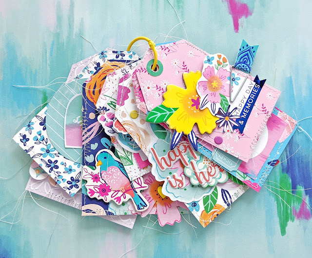
Hey there! I have a new tag flip mini album to share with you today, including a start-to-finish process video, featuring the Tag Punch Board by WeR and my new Go the Scenic Route collection!

Check out how to create this tag flip book in this video:

I began by trimming 8 floral papers found in Go the Scenic Route (Paper 2Paper 9Paper 12Paper 14Paper 16Paper 18Paper 23, and Paper 24) into different sizes of rectangles ranging from 3x5" to 2 1/4x3" and everything between!

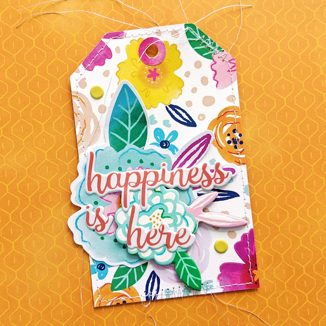
Using the Tag Punch Board I angled the top edges of each rectangle to complete the tag shape and then used the included punch piece to make a hole through the tops. For added interest I used a hole punch to make the hole bigger and then used the Hole Reinforcer Punch to make a little ring punched from the colorful blocks B-side of Paper 21 to adhere around the holes - not only does this help reinforce the hole to withstand wear-and-tear, it also adds a fun pop of color to each tag!
To add extra texture I used a sewing machine and white thread with a basic running stitch and stitched around all of the edges of each tag. Then I switched the thread and bobbin to a silver thread and added zig zag stitching to a lot of the edges. I left the thread ends long for whimsy.

Time for embellishing! I didn't add any photos to this tag flip book, but I did add lots of positive affirmations and sentiments so that it brings a smile to my face as I turn through all of the tags. I used Chipboard StickersFloral Die CutsPuffy Phrase ThickersEnamel DotsEphemera Die Cuts, and Flag Paperclips to embellish each of the tags as shown in the photos above and below.
I hope you are inspired to pick up the Tag Punch Board and my Go the Scenic Route collection so you can quickly and easily create your own tags and mini flip book! Thanks for stopping by today!
SUPPLIES: Patterned papers, stickers, paperclips, die cuts, embellishments: GO THE SCENIC ROUTETag Punch BoardHole Reinforcer PunchSewing machine: Brother; Threads: Coats & Clark

Foil Quill Planner Dashboard by Mik Godinho


Wednesday, July 29, 2020

Hi friends! It’s Mik from Papermiks back here sharing some more planner inspiration. You may have noticed that I love changing my planner. Making dashboards and covers is something that makes me happy and makes time go by without my realizing it! Today I decided to bring something different than most of what I have shown you.
Who knows the Foil Quill tool from WeR Memory Keepers? There is a Paige Evans USB Drive with 200 designs in SVG and PNG formats. This time I didn't use my Silhouette to cut, but to draw some elements on my new planner cover. From this cover I selected a banner, a bouquet of flowers and three butterflies within the files on the thumb drive and organized them in order to assemble a new cover. After organizing these drawings, I used the Foil Quill cutting machine adapters “A” (for Silhouette), the standard tip heat pen (1.5mm), a heat activated 6” rolls of silver foil and a 6x8.5” acetate to make my cover.

With the help of the Planner Punch Board and Disc Punch Inserts I punched my cover and added it to my planner.

I hope you got some inspiration from this idea and enjoyed it! If you have any questions or want to talk more about planners, leave a comment below or check out my IG account. Thanks for stopping by and have a creative day!

SUPPLIES: Patterned paper: HORIZONFoil QuillPaige Evans USB Drive; Die cut machine: Silhouette CameoPlanner Punch BoardDisc Punch Inserts
Location: Bolivia / Instagram: @papermiks / Facebook: mik.godinho.papermiks 

Ballet Slippers Planner Page by Paula Fiihr


Tuesday, July 28, 2020

Hello friends! Paula Fiihr here today I’m sharing a ballet layout for my planner. My daughter’s dance recital looked much different this year due to social distancing but I wanted to make sure I recorded the memory in a way that captured how much joy she gets from dancing.
I used the Ballet Slippers cut file and printed it on white cardstock. The pink inside pieces are from the Bloom Street Project Pad. After sewing ribbons on each shoe, I glued the shoes onto the pink polka dot paper from the 12x12 Paper Pad and then sewed it as a pocket onto Paper 04. The pocket is decorated with two pictures of my daughter and embellished with Cardstock Stickers and Puffy Word Stickers. Inside the pocket is a card with a couple more pictures and some journaling. I finished with white Enamel Dots and punched holes to fit it into my A5 ring binder.

All in all, I think it captures a really fun day! Thanks for stopping by!

SUPPLIES: Patterned papers, stickers, die cuts, enamel dots, embellishments: BLOOM STREET; Die cut machine: Cricut; Cut file: Ballet Slippers by Paige Evans
Location: Texas, USA / Instagram: @psplannergirl / Pinterest: pfiihr / Facebook: Paula Fiihr

10 Months by Nidia Rubio


Monday, July 27, 2020

Hi, friends! Nidia Rubio from Scrapamundi sharing with you my newest project with the Bloom Street collection and Paige's cut files. This is also my last project for Paige's Cut File Design Team. It has been an absolute pleasure for me being a part of this team by the side of all these talented women. I have to thank you Paige and Silhouette for counting on me. For this project I wanted to create something special, so here you have this beautiful number for monthly photos of my baby.
I used the Paige Font to cut the word and the numbers. To make the numbers I cut the template of numbers and lifted it up with cardboard, then I covered it with a white cardstock. I used Rolled Flower and Rolled Flower cut files with white cardstock and Paper 08 to fill the 3D numbers.

Maybe it took too much time just to take some photos of her 10th month but... you know! It was so fun to make it and I have lovely photos of her 10th month :)

I hope you have been inspired! Thank you sooo much for all of your support and beautiful comments from this past year!

SUPPLIES: Patterned papers: BLOOM STREETwhite cardstock; Die cut machine: Silhouette Cameo; Cut files: Paige FontRolled Flower, and Rolled Flower by Paige Evans
Location: Spain/ Blog: Scrapamundi / Instagram: @scrapamundi Facebook: Scrapamundi
YouTube: Scrapamundi / Pinterest: Scrapamundi

Love and Adore Layout by Shimelle


Sunday, July 26, 2020

Good morning friends! Shimelle here today and I have a scrapbook page to share that illustrates just how the simplest of cut files can change the look of a page! I'm working with this Banner cut file.
I started with the beautiful rainbow hearts Paper 06 from Bloom Street then moved over to the darker-toned collection, Truly Grateful. I matted my 4x6 photo with three colors of patterned paper: green, blue, then purple.

Next up, three areas of embellishment to surround the photo in a triangle! These were made mostly with small Truly Grateful die cuts from the Journaling Spots, though the large blue 'love' is from a Bloom Street cut apart sheet, Paper 01.

Further details were added with Epoxy Stickers in both lettering and motifs, with small stickers gathered in groups of three. At this point, my page looked like the one on the left, and there's nothing wrong with that page of course. But the page on the right adds that banner to bring motion, color, and more life to the layout!

I cut the Banner cut file from smooth white cardstock then backed it with three different patterns from the Truly Grateful 2x2 Paper Pads. I only needed one square of each of the colors to back the full banner.

A simple design with plenty of layers, but the perfect placement of the Banner cut file brings all the colors and patterns together. I hope you give it a try the next time your page is feeling a little lacking!

SUPPLIES: Patterned papers, stickers, die cuts: BLOOM STREET & TRULY GRATEFULwhite cardstock; Die cut machine: Silhouette Cameo; Cut file: Banner by Paige Evans
Location: London / Blog: Shimelle / Instagram: @shimelle / Facebook: Shimelle / YouTube: Shimelle Laine / Pinterest: glittershim

Seven Layout by Maija Männistö


Saturday, July 25, 2020

Hi, Maija Männistö here to share a layout made with Truly Grateful and Paige's Stars Border Frame cut file. I wanted to get everything out of a cut file so I used the actual file and the negative too! Today is my son’s 7th birthday so I made these layouts to celebrate the birthday boy!
I cut the Stars Border Frame cut file from the gorgeous rainbow sunburst Paper 08. Also as a title I used Paige's Seven cut file, backing them with papers from the 12x12 Paper Pad and the 6x8 Paper Pad.

For this page I used the positive part of the cut file. I love how perfectly the paper works with it! For the background I used Paige’s Star Stencil with modeling paste to make the background more detailed and add even more stars. For the photo I used some patterned papers from the 6x8 Paper Pad to back it and to create a tiny pennant. Together with the papers I added some pieces from the Journaling Spots to add different shapes. For embellishments I chose little words from the Cardstock Stickers, along with stars from the Epoxy Stickers. When a cut file is this amazing and colorful you don’t need a lot of embellishments!

After cutting I realized I just couldn’t throw away those inner stars! So I used the cut file as a guide and glued the stars to the right places. I only added a little speckle of glue to the center of each star and then bent the edges up a bit to make them more dimensional.

With embellishments I went with the tone-on-tone method. I used the same word stickers from the Cardstock Stickers and also the circles and hearts from the Epoxy Stickers. For the pink and purple parts I cut words out of the 2x2 Paper Pads phrases to get matching sentiments for them too. And for the minty green one I used a piece from the Ephemera Die Cuts.

Thank you so much for stopping by today, have a lovely and crafty day!

SUPPLIES: Patterned papers, stickers, die cuts: TRULY GRATEFULwhite cardstockmodeling pasteStencil; Die cut machine: Silhouette Cameo; Cut files: Stars Border Frame and Seven by Paige Evans
Location: Finland / Blog: Mai Makings / Instagram: @maimakings / YouTube: Mai Makings / Pinterest: Mai Loves

Relax Layout


Friday, July 24, 2020

Hey friends! I have a new layout to share with you today with the first samples of my brand new Go the Scenic Route collection!
Check out the process video:

If you know me and my style, you know I loooooooove patterned papers. The more I can include on a layout, the merrier! But, I didn't have any 12x12 papers, so I got creative :) First I started fussy cutting some diamonds from one of the papers in the 6x8 Paper Pad, but I gave up quickly because they were too small. Then I pulled out a set of papers from the 2x2 Paper Pads and started arranging them in a grid design. But I got stuck. Then I fussy cut ALL of the butterflies from one of the papers in the 6x8 Paper Pad. I was most inspired by these butterflies, but again, I got stuck! Holy cow I never knew I was so dependent on 12x12 papers for my mojo!
 I plopped all of the butterflies onto a pink cardstock background, added these two recent photos of Jane (the colors match perfectly with this collection!), and there the layout sat for 24 hours. Occasionally I would come back and push the butterflies around to see if the creative juices would start flowing. They didn't. I was trying to think of a new way to use butterflies. I went through images of all my layouts and found 25(!) pages featuring butterflies! What hasn't been done?!
I decided to just start. Somewhere. Anywhere. I grabbed white acrylic paint and painted stripes across the pink cardstock background then splashed more watered down white acrylic paint on top. Layer one done. I splashed my favorite Pastel Dreams watercolors in lots of coordinating colors on top. Layer two done. Then I ripped off the left and right edges, heavily distressed them, and then replaced those edges with a blue floral paper from the 6x8 Paper Pad for contrast and color. It was a start!
Next I used my Tiles Stencil and scraped white modeling paste through randomly across the background. Once the paste dried I used a few matching colors of Dina Wakley Gloss Sprays and spritzed, sprayed, and dropped them all across the background. I grabbed my photos and fussy cut butterflies again, put them on top for a minute, and FINALLY the creative juices started flowing!! Hooray! It was looking pretty cool! It may look like a hot mess underneath, but building layer upon layer, topped with photos and embellishments, makes it all come together in unexpected ways. I was so relieved and happy about all of this after my mojo had completely ran out on me. It was found again :) By the simple act of playing and persistence!
 Continuing on - I took the perforated strips from the tops of five papers in the 6x8 Paper Pad and punched them into scalloped strips. I chose a rainbow of colors: blue, yellow, green, orange, and pink. I layered the photos diagonally and then machine stitched the scalloped strips in place. Another layer done!
 Then came the fussy cut butterflies. I sprinkled them all around the page and then adhered them in place with a dot of liquid glue so the wings can bend up as if they're in flight. I also found three butterfly Chipboard Stickers and placed them in a visual triangle to help draw the eye all around the layout.
 The title is "RELAX" from the Puffy Word Stickers. I wrote journaling with a blue pen near the title. I added a flower Cardstock Sticker to the edge of each photo for a little bit of pretty. To finish, I added a few of the tiny Enamel Dots here and there between the butterflies for little bits of sparkle & shine. They're like little drops of candy!
 I hope this layout inspires you to pick up my new Go the Scenic Route collection and also helps you when you're feeling in a creative rut. Sometimes just the act of pushing yourself to do things you normally wouldn't do or refusing to give up will get the creative juices flowing again!
  I'll be back soon with more inspiration! Have a great day!
SUPPLIES: Patterned papers, stickers, enamel dots: GO THE SCENIC ROUTE; Stencil: Tiles by Paige Evans; Cardstock: American Crafts; modeling pastewhite acrylic paintPastel Dreams watercolorsDina Wakley Gloss Sprays

Summer Layout by Zsoka Marko


Thursday, July 23, 2020

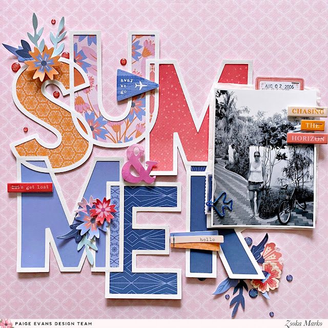
Hello crafty peeps, Zsoka Marko stopping by today to share a new layout I've created for the Paige Evans Design Team. I've used the Horizon collection because it's travel-themed so I find it very easy to work with it! I can't wait for Paige's new collection, Go the Scenic Route, because it's also travel-themed yay! It's my favorite type of scrapbook collection!
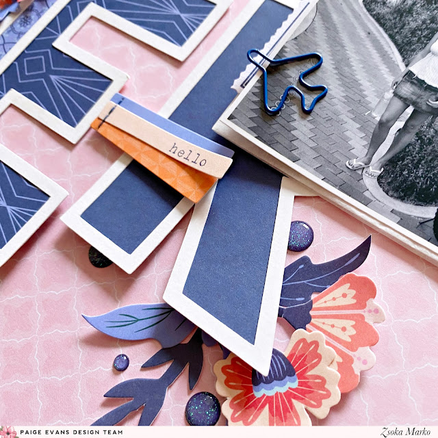
I die cut the Summer cut file from white cardstock then backed it with a variety of patterned papers in orange, pink, and blue. I adhered it down on my chosen background paper.

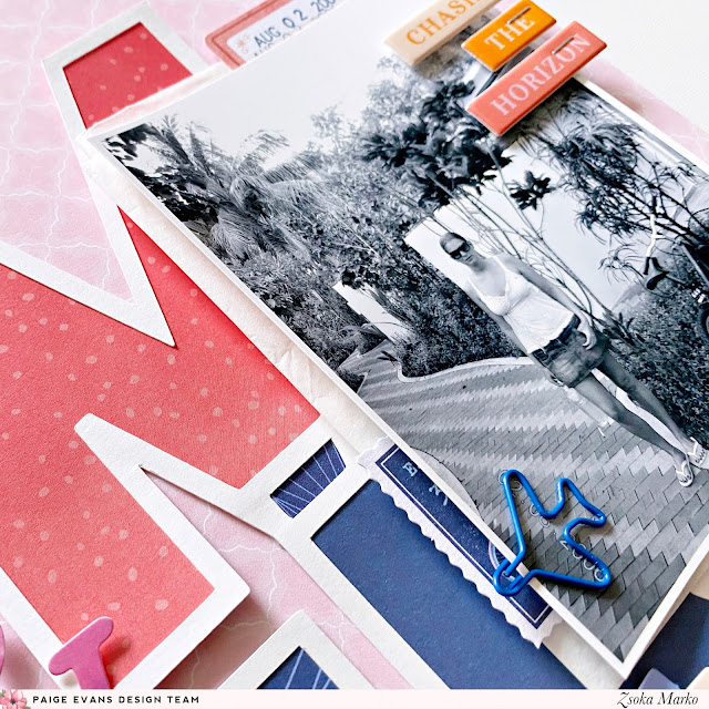
I added tissue paper behind my photo as well as some little bits and pieces of paper for color: a die cut stamp and a tag with my date. I popped colorful sentiments on my photo and I also placed a paper clip airplane on it.

I then checked my embellishments, what else would fit my theme/colors, and I found a few flowers and other die cuts, plus some puffy stickers. I scattered these around my page. Last but not least, I added a few enamel dots! I didn't bother with journaling because it was just a random photo of me standing in front of our holiday home - now that I think about it, I could have at least written that or? I mean, sure I remember now where this was, but who knows if I'll still remember later? I can go back and add it.

That's it for today! I hope I could inspire you in some small way! Thanks for stopping by! Have a wonderful day!

SUPPLIES: Patterned papers, die cuts, stickers, paperclip, embellishments: HORIZONwhite cardstock; Die cut machine: Silhouette Cameo; Cut file: Summer by Paige Evans
Blog: apocketfullofscrap.blogspot.com // Instagram: @zsoka_marko // Facebook: Zsoka Marko // YouTube: Zsoka Marko
Paige Taylor Evans © // Quinn Creatives DESIGN