I Love Scrapbooking Layout by Maija Männistö


Monday, November 30, 2020

  Hi friends, Maija Männistö here to share a layout made with Go the Scenic Route and one of Paige's cut files. I realized when finding inspiration for this photo that I very rarely, if ever, make layouts with myself alone as the subject. So this time I decided to focus on me and something I love: scrapbooking and crafts.

And as always, Paige has the perfect cut file for any purpose! I chose the I Love Scrapbooking cut file for this layout. With so many letters this cut file allowed me to add so many patterned papers on the layout.

For the background I wanted something other than just plain white cardstock so I sized Paige's Heart Confetti Background cut file slightly bigger for it to show behind the title and placed Paper 13 underneath. I love the subtle color and texture this brings to the layout!

A little fun fact: We had a little impromptu photoshoot with my husband to get these photos that would match the theme of the page! To even more highlight the crafty part I fussy cut cameras and notebooks from Paper 6. I also added the “document this” journaling tag from the Ephemera Die Cuts. For the final touch I added a few flowers from the Floral Die Cuts, the color of the flower matching the color of the letter.

Thank you so much for stopping by today, have a lovely and crafty day!


SUPPLIES: Patterned papers, stickers, die cuts: GO THE SCENIC ROUTEwhite cardstock; Die cut machine: Silhouette Cameo; Cut files: I Love Scrapbooking and Heart Confetti Background by Paige Evans
Location: Finland / Blog: Mai Makings / Instagram: @maimakings / YouTube: Mai Makings / Pinterest: Mai Loves

Quilted Background Layout by Paige Evans


Sunday, November 29, 2020

Did you see Zsoka's stunning cards yesterday? I was soooo inspired by the layers and textures, I just had to try the same technique on a layout! This layout features Paper 11 from my Go the Scenic Route collection.

And guess what? I have a process video! My first in months! All I can say is, life. It's been quite the year. So check out exactly how this layout came together:
To begin, I grabbed two pieces of Paper 11. I trimmed out a quadrant of the circles from the center of one piece of Paper 11. Then I took a 2" circle punch and used it to punch out all the circles from the other piece of Paper 11.
Using the same 2" circle punch, I punched out the four petals from every circle and placed them back on top of the first piece of Paper 11.
Once all of the petals were punched out, I very lightly tacked them down with a dab of adhesive. Then I stitched over the entire background through all of the petals to create the quilted look.
Using the flat edge of a palette knife, I bent up both sides of every petal to create lots of texture, shadows, dimension, and interest. All good things!
I backed the open space of the frame with a piece of smooth white cardstock then added a 3" square photo of Jane to the center. She's sitting on top of the quilt on her bed which is fitting for this quilted background! Perfect!
The title is made from a custom mix of letters from the Puffy Word Stickers to say "virtual playdate" placed along the bottom of the photo. I slipped a Flag Paperclip with the same pattern as the paper onto the left edge of the photo and added a trio of floral Cardstock Stickers to the right.
To finish I wrote journaling with a light blue pen around the edge of the photo to tie it into the overall design of the layout.
Here are some extra detail photos of this page:
I hope you are as inspired as I was by Zsoka's cards and this technique and give it a whirl! I'd love to see what you make! Thanks for stopping by, see you again soon!

SUPPLIES: Patterned paper, stickers, paperclip: GO THE SCENIC ROUTE2" circle punchpalette knifeSewing machine: Brother; Thread: Coats & Clark

Textured Cards by Zsoka Marko


Saturday, November 28, 2020

    Hi there friends, Zsoka Marko stopping by today to share my latest project I've created for the Paige Evans Design Team. This time I have cards for you made with the Go the Scenic Route collection. This year it's been even more important than before to tell our friends and family that they are loved, life is beautiful, and everything is going to be alright. What simpler way is there than to create some handmade cards and send them in the mail?

I decided to make some slimline cards that are all the rage now. Generally my slimline cards are about 3.5x8.5" but these three cards ended up being slightly wider, 4", because of the quilt patterned papers. I wanted to leave the circles complete, and luckily I got a full pattern with the 4" width.

For my first card, I chose a quilt patterned paper from the 6x8 Paper Pad. I cut it down to 4" wide, I'm not sure about the length, I just made sure that I have full circles - probably it's about 6.5"? There are two of this paper in the pad and I fussy cut out the white shapes from the second paper. I then adhered these down on top of the other paper, using only a tiny amount of glue in the middle of each shape because I wanted to stitch them down and bend them up later. This creates such a wonderful texture and dimension!

I glued the patterned paper piece onto a white cardstock and then adhered these both to my card base. To finish off the card, I added a sentiment, for which I used some tickets from the Ephemera Die Cuts and I also placed some butterflies around it.

For my second card, I fussy cut a bunch of simple leaf shapes from a variety of Go the Scenic Route patterned papers. I went with a blue-red-pink-orange color combo. To do this, I just drew a simple leaf shape onto a piece of heavy weight cardstock and fussy cut it out. This served as a template for all the other leaves. Easy and quick, and one doesn't need any fancy tools! 

I cut two layers for each leaf - sometimes when I do this design, I go with more layers, but 2 is perfectly enough. So I glued the two layers together, but only in the middle, because I wanted to stitch these down and bend up the sides as well. Once I was done with all the stitching, I adhered the leaves to my card base. I added some gold splatter for interest. I trimmed down a die cut from the Ephemera Die Cuts for a sentiment and using foam tape, I added this to my card too.

The third card is very similar to the first one, the paper has the same pattern, only a different scale. But I did the same thing with it: added a second layer of shapes, stitched them down in the middle, and bent up the sides.

I added three strands of twine above the patterned panel as well as a bow. For my sentiment I used the lovely colorful Foam Thickers from this collection!

That wraps up today's post, I hope I could inspire you in some way! I also have a process video, that you can watch here: https://youtu.be/LoLHvrEoBBM Thank you so much for stopping by! Have a wonderful day!


SUPPLIES: Patterned papers, Thickers, die cuts, stickers, embellishments: GO THE SCENIC ROUTEwhite cardstock

Blog: apocketfullofscrap.blogspot.com // Instagram: @zsoka_marko // Facebook: Zsoka Marko // YouTube: Zsoka Marko

Grateful for Aventures Layout by Brianna Lepper


Friday, November 27, 2020

   Hey friends! Brianna Lepper here here today sharing a new layout! I hope all of you crafty US friends had a happy Thanksgiving! Now we are in full on Christmas mode! In honor of being being thankful all month long and since Go the Scenic Route has fun travel elements, I thought it would be fun to create a page featuring one of our many adventures. I took this photo of Elijah running on a bridge while we were vacationing in Florida in 2009. We were on our way to Day 3 of Disney World and he was alllll about it! I am so grateful for all of our travels and adventures!

To start, I went through the patterned papers of the collection and decided on Paper 21. It’s one of my favorites and I needed to stop hoarding it. Hahaha! I ended up choosing the Butterfly Heart cut file to go with it since it would cut out a lot the pattern and would be highlighted really nicely! I ended up cutting the cut file on my Silhouette Cameo twice. Once on Paper 21 and again on a piece of textured white cardstock. I used that second cut file negative both as a guide and another layer under the butterflies. I added another piece of plain white cardstock as my base and popped each of my butterflies up on a foam dot. I fluffed up their wings to give them even more interest and dimension.

Here’s where I had to make a big decision: I could either leave the layout as is with the butterflies all adhered down with lots of white space. Or I could create a heart frame back in Silhouette Software and place it over the butterflies. While I do love lots of white space, I thought let’s go for more color and so I cut a heart frame using Paper 20. The bright and bold pink patterned paper is gorgeous right on top of those butterflies! I am so glad I decided to frame them!

Next, I layered up a few pieces of patterned paper from the 6x8 Paper Pad under my photo. I attached a Flag Paperclip to the layers and got to work on my title. I used the Foam Thickers along with both the Puffy Phrase Stickers and Puffy Word Stickers. So fun and colorful! Next, I embellished using a few of the Floral Die Cuts around my photo and title. I also added a few Chipboard Stickers to those clusters. To help bring everything together, I added faux stitching around the large heart frame with a white gel pen and also splattered white acrylic paint around the entire page.

And that wraps up my layout for this post! I am loving all of the layers and dimension! I hope that I’ve inspired you in some way today! Thank you for being here and I’ll see you in my next post! 


SUPPLIES: Patterned papers, stickers, die cuts, Thickers, flag paperclip, embellishments: GO THE SCENIC ROUTEwhite cardstock; Die cut machine: Silhouette Cameo; Cut file: Butterfly Heart by Paige Evans
Location: Louisiana, USA / Blog: I Love Paper Blog / Instagram: @briannalepper / Facebook: Brianna Nichole
YouTube: Brianna Lepper / Pinterest: Brianna Lepper

Sweet Memories Layout by Kelly Daye


Thursday, November 26, 2020

   Hello, hello! Kelly Daye here with more colorful Christmas inspiration for Paige’s Silhouette Design Team. I’ve mixed traditional a Gingerbread Men Background cut file with non-traditional colors via Paige’s gorgeous Go the Scenic Route collection and I’m so excited to share it with you.

I cut the Gingerbread Men Background cut file from white cardstock and backed the cut file with the B-side of Paper 21 by releasing the compound path in Silhouette Studio and dragging out everything except the outline of the Gingerbread men. I glued the gingerbread men to the cut file and added foam tape behind each one. I chose the colorful ticket Paper 17 for the background but wanted it to be a bit more subtle and allow the gingerbread men to stand out. Rather than use gesso to mute the color, I used a sheet of vellum. It provided the change I was looking for in a more even way without warping the paper. That made it easier to sew. I always love to add a bit of stitching and selected DMC embroidery thread in a color that matched each row.

After lightly adhering the corners together I made holes with a pin and hand stitched a two-tone zig-zag across each row. That added some nice texture and more interest to the background. But also, zig-zag seems really nostalgic to me and I wanted that feeling on my layout. I think it’s a nice balance to the non-traditional colors. I’ve also added a smattering of Prima’s Opal Magic Paint around. I love the way both peek through around the cut file.

Now for all the pretties and fun embellishments. I have an old Die by Impression Obsession (DIE224-0 is still available on Amazon) that cuts out really small bowties and moustaches so I enhanced a few of the gingerbread men with extra personality, ha! My title is a combination of the Foam ThickersPuffy Word Stickers, and ‘HAPPY’ from the Puffy Phrase Stickers. Since it’ll soon be summer in a good part of the world, I’ve surrounded my photos with gorgeous large flowers from the Floral Die Cuts. It doesn’t have to be all about snow does it?

The little yellow doilies are from my stash but you could easily cut some on your Cameo using one of Paige’s Doily cut files, there are many to choose from. I used a couple of papers from the 2x2 Paper Pads. One is the fussy cut heart that says ‘Smile’ and the other mats the smaller photo. I love the tiny prints on these papers! Finally, a bit of metallic gold thread was tucked in and hearts from the Enamel Dots popped here and there.

Can you see a more colourful Christmas ahead? Have lots of fun! 


SUPPLIES:
 Patterned papers, die cuts, stickers, Thickers, enamel dots, embellishments: GO THE SCENIC ROUTEwhite cardstock; Die cut machine: Silhouette Cameo; Cut file: Gingerbread Men Background by Paige Evans

Location: Edmonton, Canada / Blog: Kelly Made It / Instagram: @kellymadeit / Facebook: Petals Daye / Pinterest: Kelly Made It

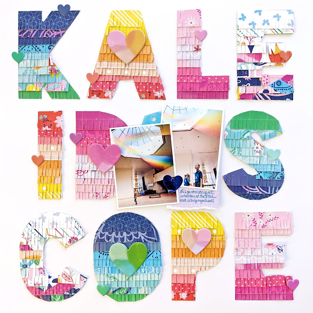
Kaleidoscope Layout by Paige Evans


Wednesday, November 25, 2020

Hey there! I have a new layout to share with you today featuring my Go the Scenic Route collection and fringe letters!

I started by die cutting the word KALEIDOSCOPE from smooth white cardstock. Then I trimmed 3/4" strips from almost all of the Go the Scenic Route patterned papers. I snipped them with fringe scissors and then put the papers in rainbow order.
I then divided the rainbow papers into four groups: blues/greens, reds/oranges/yellows, purples/pinks, and whites with colors. I spent some time layering each die cut letter with the different groups of fringe papers.
I used the positive die cut to put the letters back into place on a scrap piece of paper and glued everything into place. I covered the middle "O" with two overlapping photos of the kids in the Museum of Art at BYU. The rainbow string art installation in the ceiling is so cool and colorful! Perfect photos for this layout.
I embellished minimally with lots of hearts from the Puffy Phrase Stickers placed tone-on-tone and then wrote journaling on a torn piece of a purple journaling spot found in the Ephemera Die Cuts and tucked under the photos. I added a small piece of a blue tag Cardstock Sticker tucked up under the photos.

I hope you are inspired in some shape, way, or form by this layout and pick up my Go the Scenic Route collection to try your hand at some rainbow fringe!
See you again soon!
SUPPLIES: Patterned papers, stickers, die cuts: GO THE SCENIC ROUTE

Wanderlust Mini Album by Amber Mitchell


Tuesday, November 24, 2020

    Hello crafty friends! Amber Mitchell here on Paige's blog today to share with you how I created this fun chipboard journal using the beautiful Bloom Street collection and a handful of Paige's cut files! Cut files are a great way to embellish projects - I used Paige's cut files to decorate the covers of the four journals I created.

Chipboard books have been a favorite project of mine to create for the past couple of years. I love how sturdy and long lasting they are! This book consists of four journals that can be removed, replaced, or refilled once the pages are full, so I needed to create a base that could withstand the test of time. That's why I decided to use chipboard for this project.

The base of this project consists of three pieces of chipboard; the two covers measure 4.5x7.5" and the spine measures 1.5x7.5". I wrapped these pieces using papers from the Bloom Street Digital Collection. With the base wrapped, I moved on to the pages. I created four journals that consist of three pages each. To make these, I took three sheets of paper that measure 7x8", folded them in half along the 8" side, and stacked them. To add the journals to the base of the book, I used white elastic string. This will allow the journals to be removed from the base of the book itself for easy documenting and for new pages to be added if needed. To embellish the spine, I threaded a mixture of acrylic beads, handmade paper beads, and various charms (like the Bloom Street Flower Charms) from my stash onto each elastic thread before tying them around the spine of the book.

For the first journal, I used the Layered Flower and Leaves cut file to create three flowers that I clustered together in the center of the cover. I further embellished these with digital floral and leaf die cuts from Bloom Street. To finish this cover, I used a Rolled Flower cut file to create three small flowers that tied everything together.

For the second journal I used the Geometric Heart cut file. I backed it using various patterned papers from Bloom Street. I love how bright and colorful this is and how all of the patterns pop! I added a few Floral Die Cuts as well as a butterfly from the Layered Butterfly Stickers to finish this cover.

For the third journal, I used one of my favorite cut files, which is the Half Flower cut file, as a statement piece. I backed it using a beautiful purple patterned paper from Bloom Street. Purple is one of my favorite colors so this journal cover makes me happy! I once again used Floral Die Cuts and a butterfly from the Layered Butterfly Stickers as embellishments.

For the fourth and final journal, I created another cluster of flowers using another Layered Flower and Leaves cut file. I love the shape of this flower! I once again cut three, but for this journal cover, I placed them diagonally across the length of it.

With all of my journals embellished, I slipped them into the album using the elastic string and moved onto the cover. Since the spine of this album is quite embellished and bright, I decided to keep the cover simple. I used the Wanderlust cut file and backed it using a light pink polka dot paper from Bloom Street. I love how this title is so simple yet stands out and catches the eye.

And with that, this journal book is complete! Thanks so much for stopping by the blog today! I'll see you next time with another fun project!


SUPPLIES: Patterned papers, stickers, Thickers, die cuts, charms, embellishments: BLOOM STREET; Die cut machine: Cricut; Cut files: Layered Flower and LeavesWanderlustHalf Flower, and Geometric Heart by Paige Evans
Location: California, USA / Blog: Happy Crafty Studio / Instagram: @bambidearr / YouTube: bambidearr / Pinterest: bambidearr
Paige Taylor Evans © // Quinn Creatives DESIGN