Hi there friends, I hope you guys are well! Zsoka Marko stopping by to share with you my latest project I've created for the Paige Evans Design Team. I've used the awesome Go the Scenic Route collection on this layout. Apropos collection - are you as excited as me about getting Paige's latest collection, Wonders?! It's so gorgeous and perfect for spring! I need sunshine and colors! Today's page is proof of just how much I miss sunshine hehe!
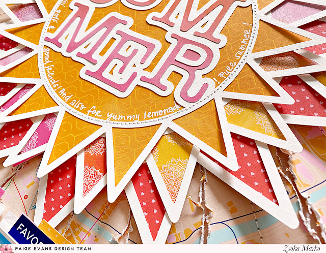
I chose the Summer cut file and die cut it in 3 sizes from white cardstock. I left the smallest one as is, I just cropped the top off in Silhouette Studio. I did, however, remove all lines from inside the circle on the other two sizes because I knew they would only serve as layers. To make my life easier, and not having to back the rays one by one, I just die cut the sun from three patterned papers. For this, I released the compound path on the cut file, then welded all lines together to create a fill shape rather than having outlines. Then I also did an internal offset a bit smaller than the original design (all three sizes), just so that they are easier to line up and there's no overhang in case I'm not precise. I hope that makes sense! Then I adhered the patterned papers to the white outlines, but I didn't add glue to the rays as I wanted them to be more dimensional. I added machine stitching to the smallest sun and I also die cut the letters from a pink/orange patterned paper to place on top. I wrote my journaling inside the sun with a white gel pen.
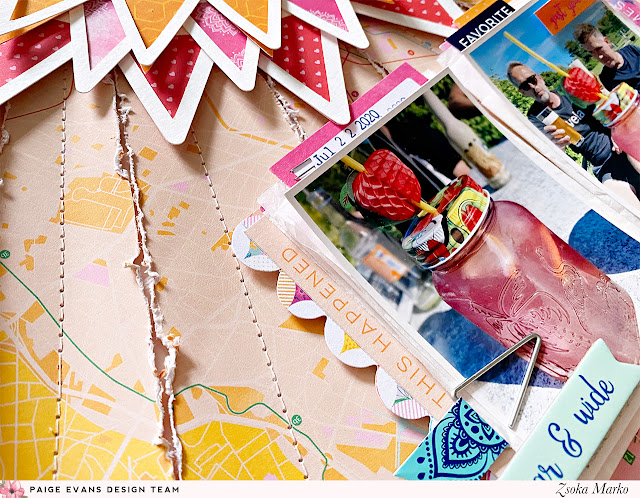
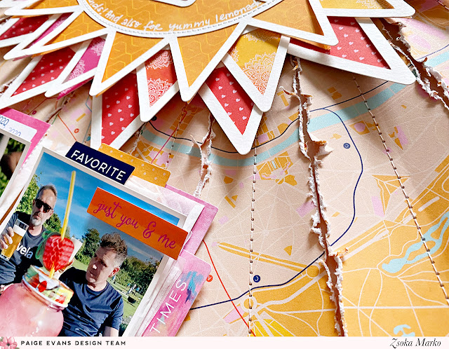
To emphasize the sunny theme, I cut my background paper in strips that look like sun rays. Using my Tim Holtz serrated edge scissors, I distressed all edges. I then added a tiny amount of glue along the middle of each ray and placed them on a heavy weight cardstock. Just so that they stayed in place while I stitched them down in the middle. Once done, I adhered the sun to the background too. I layered some tissue paper, Ephemera Die Cuts, labels and such from the Cardstock Stickers behind my photos, then glued these stacks down too. I added a Flag Paperclip, a Chipboard Sticker, and Cardstock Stickers to embellish my photos. I wanted to keep embellishing to a minimum since the page already had a lot going on, lots of dimension and texture. I stamped my date on one of the labels and was done!
That's it guys! What do you think? These bright colors make me so happy!
If you want to see how this layout came together, you can watch my process video here: https://youtu.be/me8kQl0wuIg.
I hope I could inspire you in some small way! Thank you so much for stopping by! Have a wonderful day!

Blog: apocketfullofscrap.blogspot.com // Instagram: @zsoka_marko // Facebook: Zsoka Marko // YouTube: Zsoka Marko


Gasp! Looking at all the gorgeous texture in those sun-rays! The sunshine radiates all the way to Canada, ha! Love the sun made in layers to! LOVE it Zsoka! xK
ReplyDeleteThanks so much dear X
Delete