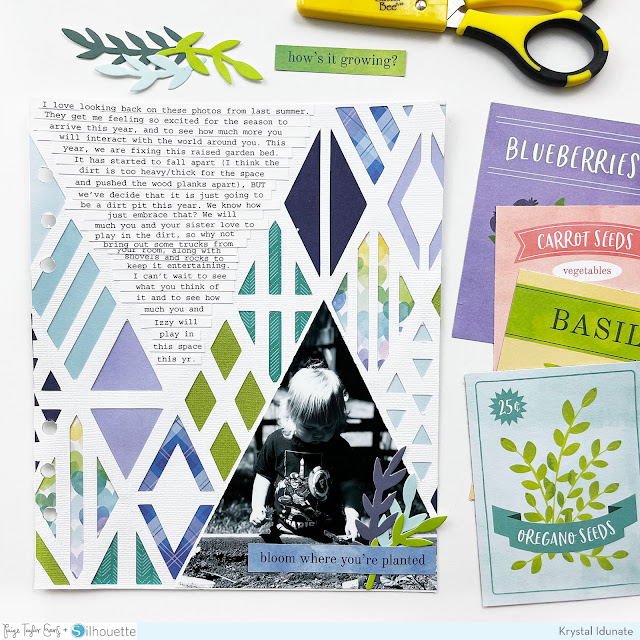
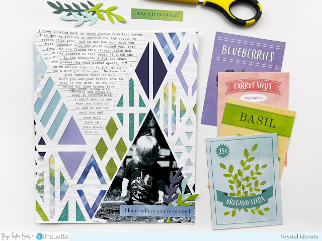
Hello friends! Krystal Idunate here today sharing a new spread I created using Paige’s Aztec Geometric Background cut file along with different components from the Bloom Street collection. When I saw this awesome background design, I knew I wanted to use it to tell a story about my son. I selected a photo of him playing in the garden bed last year to use on this 6x8” layout in order to tell the story of his love for digging in the dirt.
There is nothing I love more than a super bold background and I loved the opportunity to create my own using the Aztec Geometric Background cut file. I knew I would be able to select whatever colors went best with my photo, which made this cut file really versatile. First, I needed to adjust the size of the cut file in my Silhouette software so it would fit on a page for my 6x8” album. I like to make my pages just slightly bigger (6.875x8.25”) so they can remain outside of a page protector. After adjusting the file size, I also removed two larger triangular sections so I could add my photo + text later. Then, I went ahead and cut the background out using white cardstock. If you would like to see further details of how I adjusted and cut out this file, you can check out a process video for this spread here.
After my file was done cutting, I went ahead and trimmed it down to my desired size. Now it was ready to back with patterned/colored papers. I used different patterns from the Bloom Street Boxed Cards Set to back my file, and I added in an extra solid green textured cardstock from my scrap stash to coordinate as well. I primarily choose the blues and greens from the fronts and backs of the Boxed Cards to give the spread a more earthy feel. I love the way the colors work together!
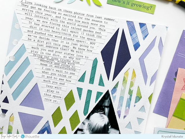
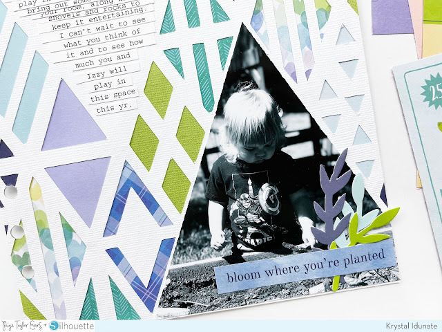
Once the background was completely backed with coordinating papers, I turned my attention to the photo + journaling. I printed my photo at 5x5” and then trimmed it into a triangle shape which allowed it to fit into one of those solid triangle areas I created before cutting the file out. For my journaling, I typed up my text in Photoshop and did my best to taper it into an upside-down triangle shape. I then cut the text into strips and adhered them onto the solid triangle shape at the top of the page. Lastly, I decided I wanted to add some light embellishments onto the page to help give it those finishing touches. I created a cluster of three leafy sprigs using the floral die cuts from the Horizon collection in the same blue and green tones. I also debated on a couple of tiny phrase strips from the Bloom Street Paper 13. Ultimately, I chose the blue phrase strip that says “Bloom Where You’re Planted”. I thought that both the title and the color were perfect. I added the cluster of embellishments to the bottom right corner of the page, then called this layout done.
I really love everything about this spread - from the fun, colorful, bold background to the larger photo feature, and of course all those words! I hope this layout inspires you to look for creative ways to use Paige's cut files to help you tell your stories. Thank you so much for stopping by today and I hope you have an awesome rest of your day!
SUPPLIES: Patterned papers, die cuts, box cards, embellishments: BLOOM STREET; vellum; white cardstock; Die cut machine: Silhouette Cameo; Cut file: Aztec Geometric Background by Paige Evans
Location: Michigan, USA / Instagram: @krystal.idunate / YouTube: Krystal Idunate / Pinterest: Krystal Idunate / Patreon: Krystal Idunate



Post a Comment