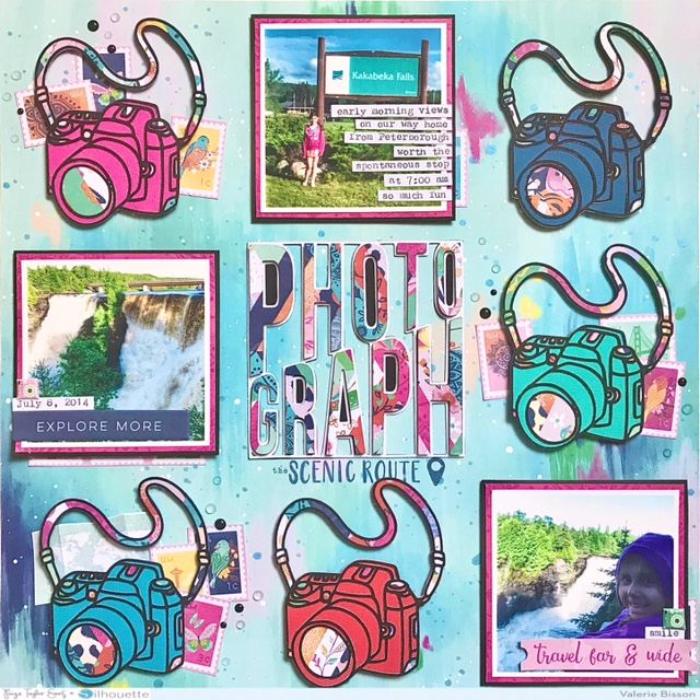
Hi there, Valerie Bisson back on the blog today with another scrapbook layout, hoping to spark your creativity! My layout features the Go the Scenic Route collection, the Camera cut file, and the Photograph cut file. These cut files are perfect for any theme, whether it’s travel, birthday, selfies, even baby photos.
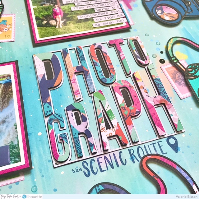
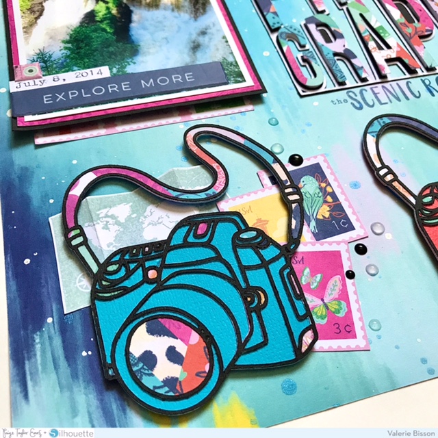
My thought process for this page was that I wanted to make a grid layout with multiple cut files. Once I made a decision on my design I started by cutting the Camera cut file in black cardstock 5 times at 3.5 inches in height. I also created 2 more layers for the camera, one with a solid backing using vibrant cardstock colors and another layer using a patterned paper from the 12x12 Paper Pad, picking out a few areas of the camera and strap for this. Then onto the next cut file, the Photograph cut file, which I thought worked perfectly for the title on my page. I cut this out from white cardstock at 3.75 inches and then backed this in solid black. Then I decided to cut out the inside letters with the same patterned paper that I used on the cameras and popped them up with some dimensional foam adhesive which seems to be my favorite way lately to do word cut files. Once all my cut files were ready I needed to decide on a background paper. Eventually I decided on Paper 2, one of my favorites from Go the Scenic Route. Of course I had to splatter some paint on the background for a little something extra, so I used Heidi Swapp Color Shine in Ocean and Dylusions ink spray in white linen.
I printed my photos at 3 inches plus a white border. Before adding them to the page I matted them with Paper 20 and black cardstock. I also used Paper 3 to cut out several of the stamps to scatter on the page in a few spots behind the cameras and a small strip of the same paper on the edge of each photo. I adhered the cameras and photos to the page with dimensional foam adhesive and because the title block already had the dimensional letters it went flat to the background, everything in a grid style design. Next I decided to use the Acrylic Stamps, stamping the map on white cardstock and then cutting it out and tucking it under the camera in the lower left corner. Also to add to the title I stamped directly on the background paper right below the cut file with the geo tag stamps. I used Distress Oxides in speckled egg and chipped sapphire for my stamping. To embellish two of the photos I added a Puffy Phrase Sticker to the photo on the left and to photo on the right I added the phrase travel far & wide from the Ephemera Die Cuts. For my journaling I used my WRMK Typecast Typewriter on white cardstock and then trimmed it into strips, placing them directly on top of my photo. I also added a date strip to one photo and smile to another photo. For some final touches to the layout I added two tiny camera puffy stickers, black enamel dots, and clear nuvo crystal drops to look like water droplets.
Thanks so much for stopping by! I had a great time creating this layout using Paige's cut files. Which one are you going to use on your next project?
SUPPLIES: Patterned papers, stickers, die cuts, enamel dots, stamps, embellishments: GO THE SCENIC ROUTE; white cardstock; white acrylic paint; Distress Oxides; Die cut machine: Cricut Explore Air 2; Cut files: Camera and Photograph by Paige Evans
Location: Manitoba, Canada / Instagram: @valeriearts2 / Pinterest: valeriearts2 / Facebook: Valerie Bisson


Very cool layout 😎
ReplyDeleteThank you!
Delete