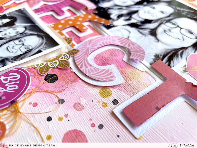
Hey friends! Missy Whidden here with a new almost monochromatic layout featuring Paige’s Wonders collection along with her The Perfect Day cut file. I used all pink with a touch orange for the color scheme. I love large title cut files because not only does it automatically give you the title, but it also serves as the main design element. Since it takes up so much space on the page, it helps determine where to place photos and embellishments. I love how that can help make a page come together quickly. I used a soft pink textured cardstock for the background and I cut the title using textured white cardstock on my Silhouette Cameo. I coated a lot of the paper with white gesso to prep the paper for ink sprays as well as giving the pink a bit of a hazy and cloudy effect. I traced each letter from the title on several Wonders patterned papers and a few from the 6x8 Paper Pad and cut them out. I chose my ink sprays in various pinks and oranges to match.
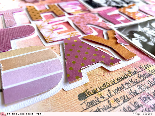
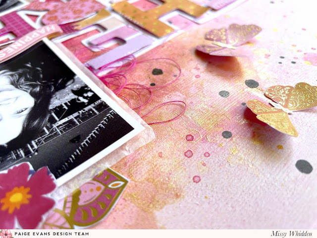
To create the background, I sprayed a few pink and orange Shimmerz onto the cardstock and used a brush and a bit of water to move the colors around. I wanted a large color wash area with various shades of the colors. I also splattered in gold paint to give it some shine. Once that dried, I glued down the cut file and then replaced the letters with adhesive foam underneath to pop them up off the page. I tucked a larger photo on top of the big title and two smaller photos under it. I overlapped the letters on top of the large photo and then fussy cut a few mandala shapes from the 6x8 Paper Pad to tuck in around them. I also used a few stickers from the 8-Page Sticker Book along with matching colors of tangled thread.
I love the dimension that this technique creates - it’s another option instead of backing the cut file. I ran the letters through my edge distressing tool and gave them a bit of texture. I wrote my journaling using a black fine tip Sharpie.
I couldn’t resist adding a few of the beautiful gold foiled butterflies from the 6x8 Paper Pad. Look how they shine in the light! I cut a pink and orange one for the top of the page. I also layered a few pink flowers from the 8-Page Sticker Book on top of a few of the photos.
I hope this has inspired you in some way today! I love the challenge of only using one or two colors on a layout - it helps narrow down what you can use and makes your options less overwhelming. I love how this turned out and I encourage you to give it a try if you haven’t! Thanks for stopping by!
Facebook: missy.whidden // YouTube: Missy Whidden


Post a Comment