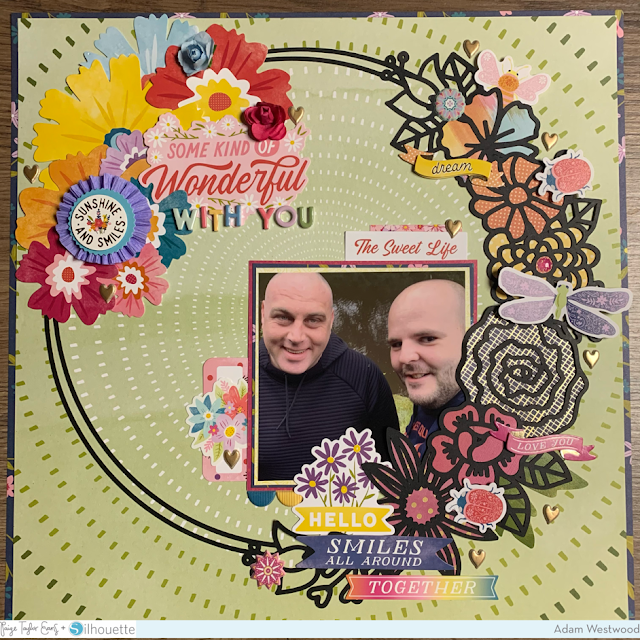
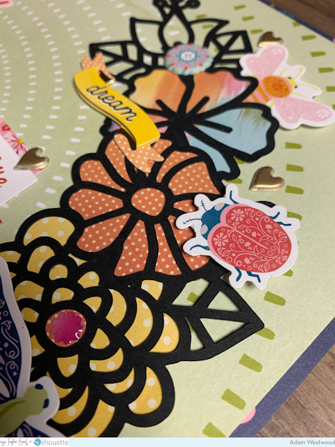
Hi! ScrappyAdam here and I'm very excited to be back on Paige’s blog with another Wonders layout for you. I have used one of Paige’s exclusive cut files available in the 20 Days of Spring bundle - the Flower Wreath.
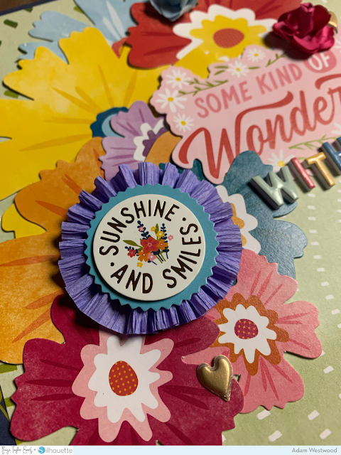
I started with the green sunburst style Paper 24 as my background and backed it with the gorgeous navy floral paper, giving ¼” border around the page, something I generally always do to finish the layout off. I then cut the Flower Wreath in black as I wanted it to really pop. The page came together quite quickly because the cut file really does take centre stage! I dived into lots of Wonders goodies including the Floral Die Cuts, Ephemera Die Cuts, Banner Stickers, Cardstock Stickers, Paper Flowers, and Puffy Stickers. It’s hard to choose a favourite product in this awesome collection but I do love the Lollies and I popped one on this page.
I created a floral cluster on the opposite side of the cut file florals which I had backed with papers from the 6x8 Paper Pad and the 2x2 Paper Pads - both perfect for backing cut files and small details so you don’t have to cut into the big 12x12” sheets! I have used a 4x4” photo to document a lockdown walk along the canal over here in England. It was then a case of layering lots of the lovely embellishments. This collection has so many embellishments to give your layouts and projects dimension and texture.
I hope you have enjoyed this page, thank you for taking the time to be here! You can find me on Instagram and I’ll be back soon with another wonderful Wonders project! In the meantime, do check out all the other awesome creatives right here on the blog - and don’t forget to join Paige’s Facebook group where there’s so much inspiration!
SUPPLIES: Patterned papers, stickers, die cuts, embellishments: WONDERS; Die cutting machine: Silhouette Cameo; Cut file: Flower Wreath by Paige Evans


OOoohh I love this layout! Using black for the cut file really does make it pop, though not enough to overpower the wonderful photo. Well done!
ReplyDelete