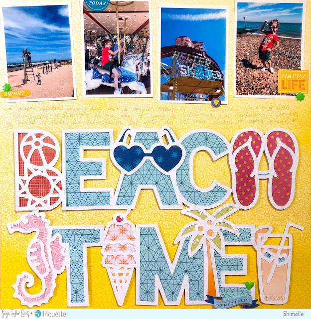
Hello crafty friends! Shimelle here today, and I wanted to share with you just how simple a seemingly intricate title like this can be! I'm using Paige's Beach Time cut file along with her Wonders collection and four small photos measuring 2.5x3.5 inches. I started by cutting the title from white cardstock and then considered options for backing the letters and shapes. You can, of course, back every single space with a different paper when you work with a cut file, and that can look absolutely stunning! But it's definitely not a requirement and you can make a striking title that is considerably less time intensive!
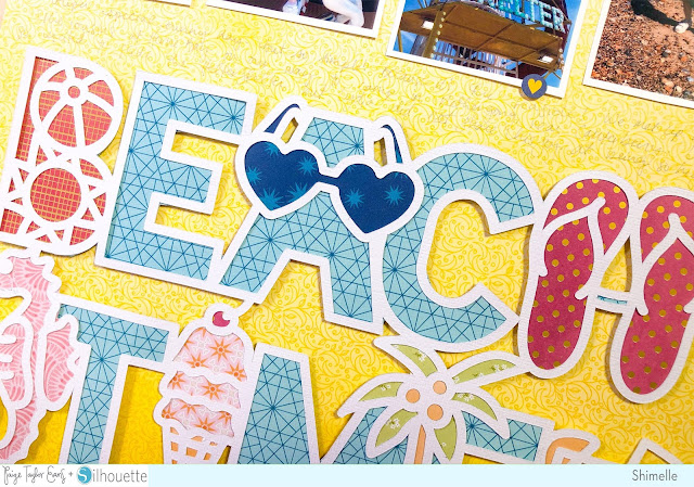
I started by choosing one pattern (the blue B-side Paper 15) to back everything that was an actual letter shape: E, A, C, T, M, and the final E. That's a significant amount of the title from just one paper, so it helps with legibility as well as saving time! With those cut and waiting, I started tracing all the shapes - beachball, sunshine, sunglasses, sandals, seahorse, ice cream cone, palm tree and drink - and the 6x8 Paper Pad is perfect for this as you don't need to cut into any full sheets and the patterns are a fab small scale! Scraps are great for backing cut files too. This is the second place where I kept it simple: the seahorse is all one colour, for example, and the ball and the sun to make the B are all one colour. It's still eye-catching and this is a great way to compromise making something detailed even with limited time or supplies.
I used the beautiful yellow Paper 1 for my 12x12 background and adhered the photos along the top, then added a cardstock sticker to each one. Then I covered the back of the title piece with foam tape and attached that right along the bottom edge of the page. This left a perfect gap in the middle of the page for my writing! I wrote straight onto the background with a grey pen, but you could also write or type onto strips of white cardstock for a bright and clean look if you like your storytelling to be a bit more obvious on the page. The last finishing details are small and simple: a Banner Sticker along the bottom of the E, and three green enamel shapes to add just a bit more summery colour!
Paige has plenty of different cut files that mix a few themed motifs in with lettering, a wreath, or a banner shape, so I hope this gives you the courage to give the look a try! We'd love to see what you create next!
SUPPLIES: Patterned papers, stickers, die cuts, embellishments: WONDERS; white cardstock; Die cutting machine: Silhouette Cameo; Cut file: Beach Time by Paige Evans


Great layout! Love the cut file and the colors!
ReplyDeleteGreat tips and beautiful page!
ReplyDeleteGreat layout! Thanks for the tips!
ReplyDeleteAnother beautiful Shimelle layout with some excellent tips!! Thanks!!
ReplyDeleteBeautiful!
ReplyDeleteLove it! great way to use that title
ReplyDeleteLove how you simplified the backing. Sometimes they are just too complicated to even think about. Thank you
ReplyDeleteI love the colors you chose Shimelle. Such a fun layout!
ReplyDeleteLove this!
ReplyDeleteAlways love Shimelle's work!
ReplyDelete