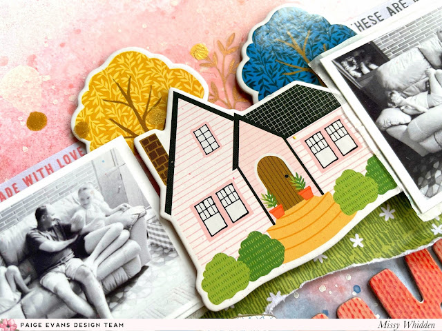
Hey friends! Missy Whidden here with a new layout featuring Paige’s Bungalow Lane collection. I wanted to create a layout about our little family at home so I began with my photos and some of the Chipboard Stickers. I created a little landscape with one of the houses and two cute trees and arranged them along with my photos in a horizontal design going across the page. I tore a piece of Paper 24 to layer underneath everything to give the illusion of grass, and this also gives the house and photos a place to sit. I embellished below that with lots of Floral Die Cuts. I used thick white cardstock for the base and added pink and blue Shimmerz to create pretty watercolor effects behind everything.
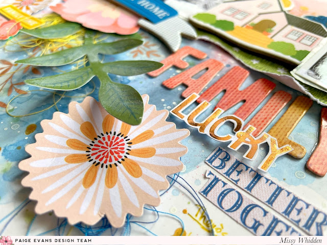
I love creating clusters, so I chose a few of the large Floral Die Cuts to add down below the photos. I used another Chipboard Sticker for the title. I tucked in yellow thread and then added in a few of the metallic gold leaf stems from the 8-Page Sticker Book. For a larger title here, I used some of the Thickers to say “FAMILY.” I fussy cut “lucky” from an Ephemera Die Cut and “Better Together” from Paper 23. I love all the dimension here. I popped up this large flower with adhesive foam and “LUCKY” is glued at the bottom of the “FAMILY” which gives it shadowing.
This little house was perfect for this page and I tucked in a few trees behind it. This is a great way to create depth and give the images a more realistic look. The Chipboard Stickers are already pretty thick, so layered on top of each other like this gives the page even more dimension.
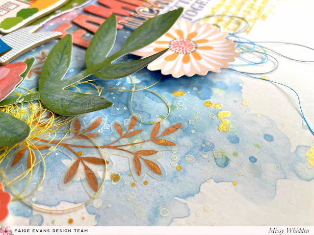
For the background, I first coated the cardstock with clear gesso. This primes the paper and allows the inks to spread around and blend together before soaking into the paper. I used blue Shimmerz paint to create this pretty watercolor look on the bottom half of the page. I used a brush and water to spread the paint around. I chose blue because all of the other pieces here are contrasting colors. I splattered white acrylic paint over the blue and then layered gold glitter spray. I did the same effect on the top half of the page but with pink sprays.
I hope this gives you some ideas to try on your next layout! Have you ever tried to create any type of scene on a layout? That was how this page started - just by looking at the Chipboard Stickers the landscape idea popped into my head. Always look at how you could possibly layer pieces together and it could be a great starting point for your design. Thanks so much for stopping by and have a great day!
Facebook: missy.whidden // YouTube: Missy Whidden


Post a Comment